Adams Point is a Democratic stronghold. About 91% of voters here vote Democratic and 9% Republican.
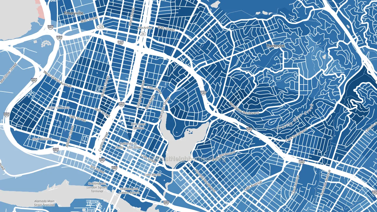
About 60% of adults in Adams Point typically vote, near the U.S. average of about 62%. Among adults in Adams Point, ~55% vote Democratic, ~5% Republican, and ~40% don't vote. The map below shows estimated turnout by block group.
How Adams Point compares
Among neighborhoods within 5 miles, Adams Point leans more Democratic than 52 of 61 neighbors.
Adams Point runs about 62 points more Democratic than California as a whole.
Why Adams Point leans the way it does
This analysis examined 14,881 data points per neighborhood to find what predicts political lean and turnout. The items below are a few correlations that stood out for Adams Point, not a ranked or complete list of what matters most.
Dense areas vote Democratic. More than 99% of residents in Adams Point live in densely developed areas, about 64 points above the U.S. average of 36%. High college attainment predicts Democratic voting, and Adams Point sits in the top quarter (about 69%, above 90% of neighborhoods). A high never-married share predicts Democratic voting, and about 58% of adults in Adams Point have never been married, above 91% of neighborhoods.
Population density and Democratic lean
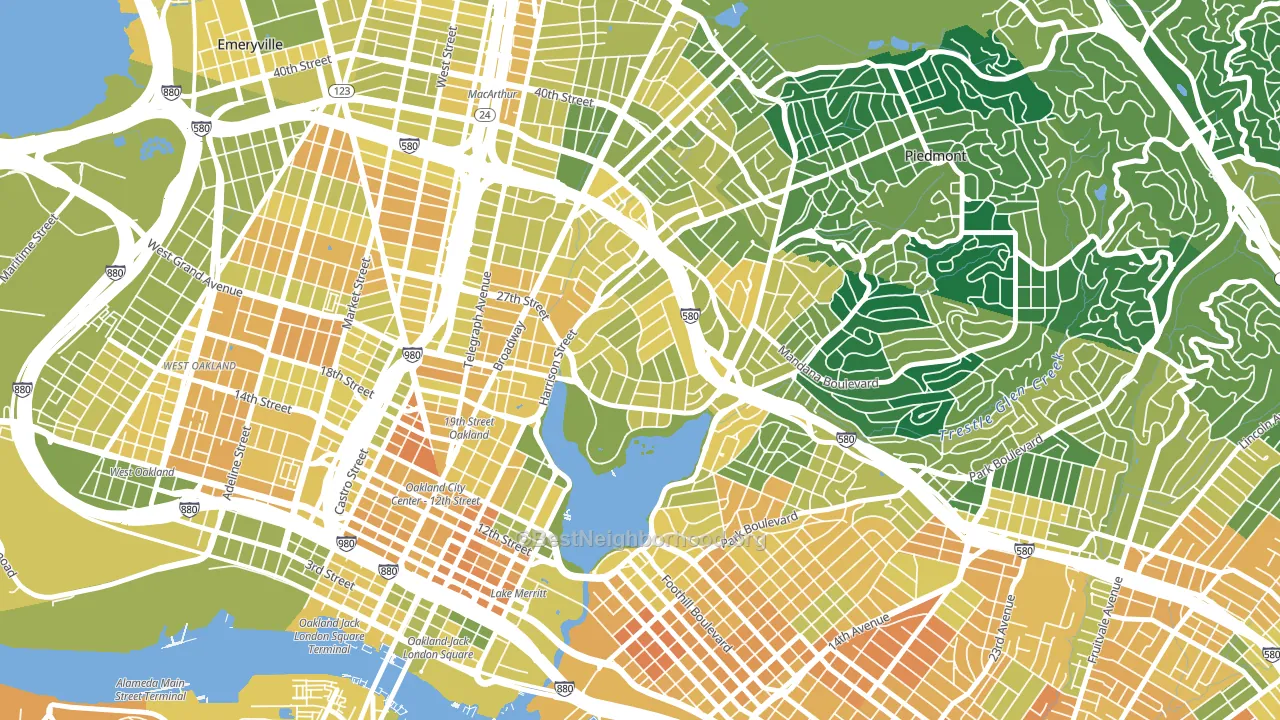
Places with high population density tend to lean Democratic; Adams Point, Oakland, CA sits in the top tenth nationally on this measure.
Why turnout in Adams Point looks the way it does
Renters vote less often than owners. About 84% of households in Adams Point rent, about 59 points above the U.S. average of 25%. Crowded housing lines up with lower turnout, and about 6% of homes in Adams Point have more than one occupant per room, above 80% of neighborhoods. Learn more about the findings and methodology on the political spectrum map.
Nearby Neighborhoods
- Oakland Ave-Harrison Street, Oakland, CA D+81
- Grand Lake, Oakland, CA D+83
- Downtown Oakland, Oakland, CA D+66
- Lakeshore-Oakland, Oakland, CA D+85
- Lakewide, Oakland, CA D+75
- Pill Hill, Oakland, CA D+79
- Cleveland Heights, Oakland, CA D+74
- Merritt, Oakland, CA D+64
- Piedmont Avenue, Oakland, CA D+84
- San Pablo Gateway, Oakland, CA D+69
Neighborhoods with Similar Populations
- Lindenwood Park, St. Louis, MO D+39
- Jewell Heights-Hoffman Heights, Aurora, CO D+37
- Hatchville, East Falmouth, MA D+17
- Sorrento Valley, San Diego, CA D+26
- Kenfield, Buffalo, NY D+79
- Downtown Hampton, Hampton, VA D+67
- Turner, Kansas City, KS Even
- Downtown Columbus, Columbus, OH D+55
- North Oakland, Pittsburgh, PA D+65
- Donelson, Nashville, TN D+5
Sources and methodology
Precinct-level voting records used to fit the model come from California Secretary of State, Elections, distributed by the Voting and Election Science Team. Demographic inputs come from the U.S. Census Bureau (ACS 5-year estimates and the 2020 Decennial Census). Health and environmental inputs come from the CDC (PLACES and the Environmental Justice Index). Land cover comes from the USGS and EPA. Election-day and lead-up weather come from PRISM 4km daily grids and the NOAA Global Historical Climatology Network. Mail-voting and election-administration patterns come from the MIT Election Lab's Survey of the Performance of American Elections. Block-group crime detail comes from CrimeGrade. Internet data and modeling support provided by ISPreports.org.
Modeling and analysis by the BestNeighborhood data science team. Full methodology and findings: political spectrum map.
Methodology reviewed by the BestNeighborhood data team. Last updated May 2026.