Enter your city or zip code below to see the Walk Grade for any neighborhood in the US:
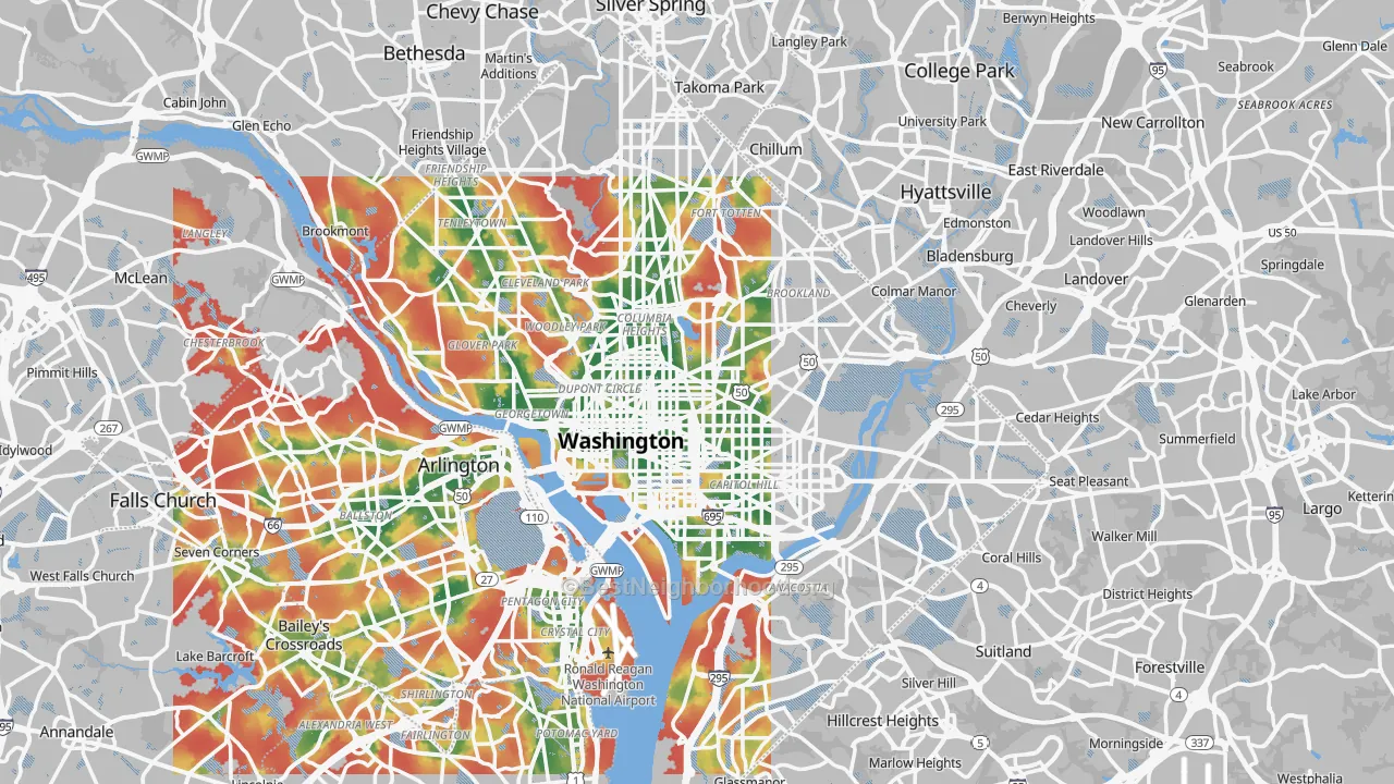
An example Walk Grade map of Washington, DC. Areas in green have a higher/better Walk Grade.
Why You Can Trust Our Walk Grade Number
Imagine visiting a place after being told it was “walkable.” The sun beats down on your face. You are sweating, walking over grass and sometimes in the road because the sidewalk just ended. At one point you walk a few feet from cars moving 50 miles per hour, and the road noise is hard to talk over. You can see your destination across the street, but to reach it you have to cross a road over 100 feet wide. You step out and cross, hoping every driver sees you, the only person on foot in sight. The restaurant you are headed to sits in a strip mall with no path in except the parking lot.
The frustrating part is that someone told you this place was walkable. Often that someone is another walkability-scoring site, probably one owned by a large real estate company.
BestNeighborhood built Walk Grade on one idea. Walkability is not only whether you can walk to a place. It is whether a reasonable person would want to. Walk Grade reads sidewalks, road noise, tree canopy, traffic speed, what you pass along the way, how many wide roads you have to cross, and more. It measures the walk you would actually take, step by step, along the real street network.
New to the word “stroad”? Not Just Bikes has a good short intro on YouTube.
On This Page
- How car-dependent America really is
- Two real places, two very different walks
- What we found about pedestrian deaths
- How walkable are the big US cities?
- Why walkability matters
- How Walk Grade is calculated
- Data sources
Summary and Top Findings
Most US cities are built for cars, not people. Walk Grade is an honest measure of how walkable a place is. It scores both whether you can walk to daily destinations and whether you would want to make the walk. Four things set it apart:
- Walk Grade follows the real route. Most walkability scores measure straight-line distance, as if you could walk through buildings and across freeways at a steady pace. Walk Grade traces the actual path you would walk to each grocery store, coffee shop, park, and clinic, one destination at a time, along every sidewalk, footpath, crossing, and street.
- Every route is scored for what the walk is like. Will you walk on a sidewalk, or did the sidewalk end and leave you in a ditch? Does the route run along a loud arterial or a quiet tree-lined street? How many roads do you cross, how wide are they, and how fast does traffic move? Are you in full sun the whole way, or under shade? Each of these adds or removes a little “distance” from the walk.
- Destinations have to cluster, not just exist. Under most models a home near nine good destinations scores high even if those nine sit in nine different directions. Walk Grade rewards places where the destinations sit near each other, so you can run several errands in one trip on foot. A coffee, a meal, a grocery run, and a park in one afternoon beats a long drive between nine nearby strip malls.
- Essentials count for more. Grocery stores are paramount, pharmacies and bus stops count more than a hair salon.
How car-dependent America really is
A population-weighted analysis yields a depressing picture. More than half of Americans live in places with Walk Grades between 0 and 10. These areas are extremely car dependent, and that dependence is costly. It shapes health, poverty, and wellbeing in ways covered in the impact section below. Only 9% of Americans live somewhere that scores above 70. This is the baseline the country starts from, and it is why a car-dependent suburb earns a D or an F even though it is the most common way Americans live.
Share of US residents at each Walk Grade level, from least walkable (0) to most (100). Source: BestNeighborhood Walk Grade, population-weighted across all US census blocks.
Two real places, two very different walks
The grade is easier to feel than to define. Here are two places at opposite ends. Open each in street view and the difference is immediate.
A walk you would want to take. Take Ladd's Addition in Portland, Oregon, a diagonal grid of tree-lined streets just east of the river. The route to a grocery store, a cafe, and a park runs along sidewalks under a full tree canopy and crosses only quiet local streets. Street canopy here is among the highest of any US neighborhood, around 24%. Walk Grade rates blocks like these in the A range, and the trees alone shave a few percent off the effective distance, because a shaded walk is one people actually make.
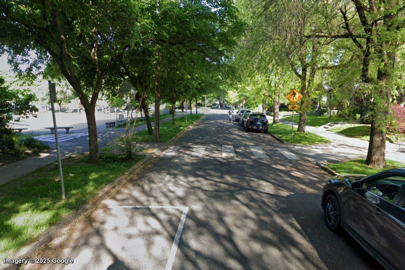
Ladd's Addition, Portland: sidewalks under a full canopy, crossing only calm local streets. Walk Grade rates blocks like this an A. Street View imagery © Google, captured April 2025.
A walk almost nobody takes. Now take the Serramonte area of Daly City, California, near San Francisco. The errand means walking a treeless arterial with fast traffic, then crossing many lanes to reach a store marooned behind a mall parking lot. The straight-line distance looks short. The real walk is long, loud, and exposed, so Walk Grade scores blocks here in the F range. Another popular walkability metric rates this same spot in the 80s, because it measures how close the store is, not what it takes to get there.
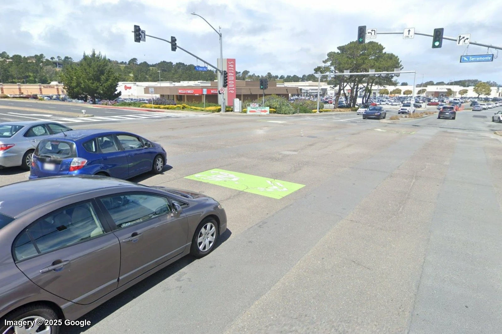
The Serramonte arterial in Daly City: many lanes to cross, parking lots, no shade. Walk Grade rates blocks like this an F, though another popular metric scores it in the 80s. Street View imagery © Google, captured April 2025.
This is far from the only example where only Walk Grade captures the reality of car-dependency better. The methodology section below explains exactly how the route penalties produce that gap.
What we found about pedestrian deaths
While building Walk Grade we studied a lot of data. One finding was hard to look away from. We took ten years of pedestrian traffic deaths from the federal crash record and divided them not by total population, but by the number of people who actually walk or take transit to work, the people exposed to the danger. The result is the rate of being killed per person who commutes by walking.
The spread is enormous. In Boston, a pedestrian is killed at a rate of about 0.7 per 10,000 walking and transit commuters per year. In Memphis the rate is about 67, roughly 90 times higher. New York's boroughs run even lower than Boston, near 0.4. Most analyses we've seen attempt a per capita safety rate. Done the lazy way, the safest cities to walk appear just 4x safer than the most dangerous. Our analysis reveals a difference of over 387x between a places like Manhattan and Bakersfield, CA.
There are many reasons for the egregious disparity, but the main reason is that places built for people also prioritize human safety over commute times.
Annual pedestrian deaths per 10,000 residents who walk or take transit to work, pooled over the most recent ten years of federal crash data (NHTSA FARS) and divided by walk-plus-transit commuters from the Census. This is research we ran alongside Walk Grade. It is not an input to the Walk Grade map itself.
How walkable are the big US cities?
Walk Grade runs everywhere, so it can place whole cities on one scale. New York is in a class of its own. A second group, San Francisco, Boston, Chicago, and Philadelphia, scores well on the strength of dense, connected cores. Most large Sun Belt cities, built around the car, land in the D range no matter how big they have grown.
Population-weighted average Walk Grade by city. Source: BestNeighborhood Walk Grade.
Why Walkability Matters
Walk Grade scores the walk you would actually take, including how safe and how pleasant it is. That makes it more than a convenience score. The things that pull a grade down are traffic to cross, road noise, missing shade, and errands too far to reach on foot. Researchers link each of these to worse health, higher costs, and weaker communities, so a low Walk Grade is a fair warning about all of them.
The cost of car dependence falls hardest on the poor
According to The International Association for Vehicle Transparency & Accountability (IAVTA.org), most vehicles cost between $10,000 and $15,000 per year to own and operate. AAA pegs the average new vehicle at $11,577 a year. The Bureau of Labor Statistics finds transportation is the second-largest household expense, behind only housing. In a car-dependent place that bill is not optional, and it lands hardest on people with the least. The lowest-income households spend about 32% of their income on transportation, against under 10% for the highest earners. A cheap house far from everything is often a trap: once the driving it forces is counted, the share of US neighborhoods a typical family can truly afford drops from 55% to 26%. A high Walk Grade is one of the few ways a household can cut that cost, by needing one less car or none.
Walkable places keep people active and healthier
Daily walking is the cheapest exercise there is, and the built environment decides who gets it. People in the most walkable neighborhoods log over an hour more physical activity a week than people in car-dependent ones, and fewer are overweight. A study of nearly 11,000 Atlanta residents found each extra hour a day spent in a car was associated with 6% higher odds of obesity, while each kilometer walked was tied to nearly 5% lower odds. Tracking three million people over twelve years, researchers reported in JAMA that the most walkable neighborhoods saw diabetes fall and obesity hold steady, while less walkable areas kept getting heavier. People who travel under their own power do better still: among 263,000 UK adults, those who biked to work had about 40% lower risk of early death over the follow-up, and those who walked had fewer heart problems.
Car-dependent streets are more dangerous on foot
The pedestrian-death research above found that the risk of being killed runs roughly a hundred times higher in the most car-dependent cities than the safest, once it is counted per person who actually walks. The national picture is grim. The US recorded 7,522 pedestrian deaths in 2022, the most since 1981, and pedestrian deaths have risen 77% since 2010. The US pedestrian death rate is now about three times the median of other wealthy nations, and climbing while theirs fall. Wide, fast roads with long crossings are exactly what Walk Grade charges a route for, because they are exactly what gets people hurt.
Driving fouls the air and warms the climate
Tailpipes are the largest single source of US greenhouse gas emissions, at 28% of the total. The harm is local too. Living near heavy traffic raises children's risk of asthma; one global study tied 4 million new childhood asthma cases a year to nitrogen dioxide, the marker pollutant for vehicle exhaust. Every errand a neighborhood lets people walk is a car trip that never runs.
Traffic noise is a health hazard Walk Grade measures directly
Most walkability scores stop at whether a destination is close. Walk Grade also reads the road noise along each route, and that matters because noise is more than an annoyance. Long-term road noise above 55 dBA is linked to a 29% higher rate of depression, and chronic traffic noise is tied to heart disease and early death. A walk along a loud arterial counts for up to 60% more effective distance, so a block bathed in traffic noise earns a lower grade. The full noise method is in the BestNeighborhood noise map and methodology. A straight-line walk score cannot flag this exposure; Walk Grade can.
Walkable neighborhoods build stronger communities
Streets shape social life. In Donald Appleyard's San Francisco study, residents of a light-traffic street had three more friends and twice the acquaintances of people on a near-identical street with heavy traffic. People in walkable neighborhoods are also more likely to know their neighbors, trust others, and take part in local life. The change is sharpest for children. The share of American kids who walk or bike to school fell from 41% in 1969 to 13% in 2001, trading independence and daily movement for a seat in a car.
The hidden bill everyone pays, and the value walkability returns
Long car commutes wear people down. Economists call it the commuting paradox: people with longer commutes report lower wellbeing, and the raise or cheaper rent that drew them rarely makes up for it. The costs reach past drivers, because roads do not pay for themselves. Gas taxes and driver fees cover less than half of US road spending, and the average household pays more than $1,100 a year in general taxes and other costs toward driving whether or not it owns a car. Free parking at work adds a hidden subsidy worth triple a car's operating cost for the average commuter. Walkable places, by contrast, return more than they cost. Each point of walkability adds $700 to $3,000 to a typical home's value. After New York added a protected bike lane and better crossings on one Manhattan avenue, local retail sales rose 49%, against 3% borough-wide. And a small walkable storefront often generates several times the tax value per acre of a big-box store surrounded by parking.
How Walk Grade Is Calculated
Walk Grade asks one question of every location: could you live here and meet daily life on foot, and would you want to? The score is built on a 0 to 100 scale and then mapped to a letter grade. A complete, connected, essentials-rich neighborhood approaches 100 on its own. Nothing is rescaled to force a curve, so the letter reflects how walkable a place actually is, not how it ranks against other mostly car-dependent places.
Real routes, not straight lines
Every destination is reached along the real pedestrian network: every footpath, sidewalk, crossing, and street, from Overture Maps. A grocery store 200 meters away across a freeway is correctly far, because the only way there is the long detour to the nearest bridge. Distance is measured along the route you would actually walk, then turned into a score with a steep decay. A destination inside a 5-minute walk counts fully. By a mile out it counts for almost nothing, because a place you would drive to should not make a neighborhood look walkable.
The route is charged for what it is like to walk
Each unpleasant or unsafe feature of a route adds “distance,” so a hostile walk reads as farther:
- Crossing a big road costs you. Crossing a major arterial adds the wait at the light plus a charge for the danger. A marked crosswalk keeps the wait but removes much of the danger. Crossing wide with no crosswalk roughly doubles the cost. Stepping across a quiet two-lane street costs almost nothing.
- Freeways cut the map. You cannot walk along or across a freeway or its ramps, so they are removed from the walking network entirely.
- Walking along a loud road is unpleasant. A stretch next to fast, heavy traffic counts for up to about 60% more distance, scaled by the modeled road noise, which already reflects how many cars, how fast, and how many lanes.
- Shade helps, bare pavement hurts. A tree-lined street counts as slightly shorter and a treeless one slightly longer, from satellite canopy data measured right along the road, not averaged over the area. Street canopy runs from over 20% on many blocks in Seattle and Portland to under 1% on Phoenix and Las Vegas arterials, and the model reads that difference where you would actually walk.
- Surface parking and driveways count against a route. Acres of surface parking and a curb cut every few car-lengths both make a walk worse, and both shave the score.
- A nice path is a small plus. A dedicated trail or pedestrian street counts as slightly shorter, a reward for a walk you would enjoy.
Where a sidewalk is recorded, the route gets a small credit. A missing sidewalk is never penalized, because sidewalk mapping is wildly uneven between cities. The real “no safe path” problem is captured instead by the road and crossing penalties, which rest on road data that is complete everywhere.
Destinations: close and clustered, with the essentials required
Destinations are grouped into categories such as daily needs, food and shopping, parks and trails, and schools. Breadth beats depth: a grocery plus a pharmacy plus a clinic fills the daily-needs category, while three of the same shop barely move it. A close grocery store opens a gate on the whole score, so a place with restaurants and a bus stop but no grocery cannot score as fully walkable. Finally, a clustering term rewards places where many destination types sit within one short walk, so a real main street beats the same destinations scattered in every direction.
Bike and Transit grades
Two companion grades share the same engine and the same map of real routes. Transit Grade measures whether you could live car-free on transit. It scores the service at your door in time, walking distance to the nearest stop plus the expected wait from the national schedule, so a 30-minute bus five minutes away barely counts. It then adds where those lines can actually take you. Bike Grade measures whether a bike could replace a car. It weighs protected bike infrastructure, destinations over a longer bike range, hills, local bike-commute rates, and bike-to-transit links, and it discounts a painted lane next to fast traffic. A place whose streets are mostly high-stress is held to a floor, so destinations alone cannot make a stroad-only suburb read as bikeable.
Output and a small safety check
Walk Grade is computed on a fine hex grid (about 66-meter hexes), then rolled up to neighborhoods, cities, zip codes, metros, counties, and states by weighting each census block by where residents actually live. A place's grade is then nudged by up to plus or minus 1% for overall neighborhood crime, using our sibling product CrimeGrade. The nudge is deliberately tiny and applied only to where people live, not to the destinations or the route. The map itself stays pure walkability.
Data Sources
- Overture Maps Foundation. Three layers: Places (the destinations), Transportation (every street, footpath, sidewalk, crossing, and driveway in the routing graph), and Buildings (footprints used to estimate store size and to filter out home-based businesses registered at a house).
- Highway Performance Monitoring System (HPMS), U.S. Federal Highway Administration. Traffic volume, speed, and lane counts behind the modeled road-noise surface that drives the crossing and walk-along-a-stroad penalties. Processed through the BestNeighborhood road-noise model.
- National Land Cover Database, Tree Canopy Cover, U.S. Geological Survey and the MRLC Consortium. Satellite tree-canopy percentage sampled along each road segment for the shade term.
- USGS 3D Elevation Program (3DEP). Elevation used to compute street grade for the Bike Grade hill term.
- National GTFS transit feeds. Full published schedules (routes, trips, frequencies) for the Transit Grade.
- OpenStreetMap (via Geofabrik). On-street bike-lane tagging that supplements the Overture network for the Bike Grade.
- Census LEHD LODES, U.S. Census Bureau. Jobs by workplace, used to weight where transit can take you.
- Census TIGER/Line geography and block population, U.S. Census Bureau. Block and block-group boundaries and resident counts used to roll hex grades up to neighborhoods, cities, zip codes, metros, counties, and states.
- American Community Survey 5-year estimates, U.S. Census Bureau. Commute-mode shares (walk, bike, transit) used for the Bike Grade and for the pedestrian-death research above.
- Kontur Population. Population density used to set the metro extent and normalize the score.
- Google Places. A selective backfill that classifies a small set of food stores Overture leaves uncategorized. Overture remains the primary source of destinations.
- Fatality Analysis Reporting System (FARS), U.S. National Highway Traffic Safety Administration. Pedestrian and cyclist traffic deaths used in the safety research. Not an input to the Walk Grade map.
- CrimeGrade. Neighborhood crime percentiles used for the small safety nudge.
- PeopleForBikes Bicycle Network Analysis and the Furth-Mekuria Level-of-Traffic-Stress framework it builds on. Inspiration for the Bike Grade traffic-stress gate, adapted to our data, not copied.