
Every neighborhood in the United States is scored here on 40 measures of daily life, then shaded on a map so the areas that fit what a reader cares about read green. Neighborhoods average about 1,250 residents, so the map changes several times inside a single zip code. There are 240,160 of them, covering 338 million people.
This page is for people who have settled on a city or region and now have to pick a neighborhood inside it. Readers still deciding between cities should start with the best places to live tool, which ranks 387 metro areas, 445 cities, and 50,333 towns on the same 40 measures and lets you re-weight all of them.
Find your city or zip code
Enter a city name or a five-digit zip code to open the neighborhood map for that area.
Or browse by state
- Alabama
- Alaska
- Arizona
- Arkansas
- California
- Colorado
- Connecticut
- Delaware
- District of Columbia
- Florida
- Georgia
- Hawaii
- Idaho
- Illinois
- Indiana
- Iowa
- Kansas
- Kentucky
- Louisiana
- Maine
- Maryland
- Massachusetts
- Michigan
- Minnesota
- Mississippi
- Missouri
- Montana
- Nebraska
- Nevada
- New Hampshire
- New Jersey
- New Mexico
- New York
- North Carolina
- North Dakota
- Ohio
- Oklahoma
- Oregon
- Pennsylvania
- Rhode Island
- South Carolina
- South Dakota
- Tennessee
- Texas
- Utah
- Vermont
- Virginia
- Washington
- West Virginia
- Wisconsin
- Wyoming
One metro area holds almost the country's whole range
Rankings of cities imply that a city is one thing. It is not. Nationally, nine out of ten Americans live in a neighborhood scoring between 40.1 and 58.7 on the default weighting, an 18.6-point band. Inside the Chicago metro alone, nine out of ten residents live in a neighborhood between 40.6 and 58.3. A single metro area covers nearly the entire national spread.
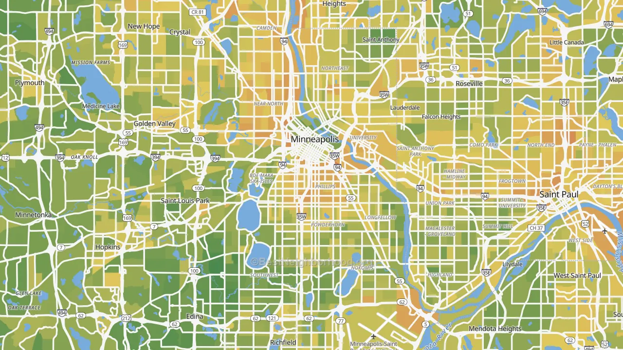
Minneapolis and Saint Paul. The Minneapolis metro ranks 15th of 387 under the default weighting, which sounds like a settled answer. It is not one. One in ten residents of this metro lives in a neighborhood below the national 39th percentile, and one in ten lives above the national 97th. Fulton, in southwest Minneapolis, scores better than 99% of American neighborhoods. Ventura Village, less than five miles away and inside the same city limits, scores better than 14%.
The pattern holds in the other direction too. A metro that ranks badly still contains neighborhoods that beat almost everywhere else, which is the part a city ranking hides completely.
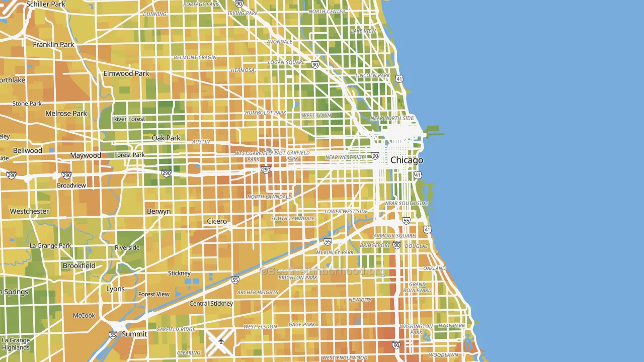
Chicago. The metro ranks 166th of 387, a middling result that describes none of its 6,709 neighborhoods. Lincoln Park scores better than 86% of American neighborhoods. Englewood, ten miles south and in the same city, scores better than 4%. The gap between those two Chicago neighborhoods is 20.8 points, wider than the 18.6 points that separate the 10th and 90th percentile of the entire country.
What a city ranking leaves out
Each bar below is the range its neighborhoods cover, from the 10th to the 90th percentile, against the single score the metro gets ranked on. The grey bar at the top is the same range for the whole country. Every metro reproduces most of the national range on its own, and in Houston and Washington the range inside one metro is wider than the national range.
Population-weighted 10th to 90th percentile of neighborhood scores within each metro, default weighting, July 2026. Metro rank is out of 387.
Picking a city gets a mover part of the way. Picking the neighborhood is where most of the remaining difference lives, and it is the part almost nobody publishes.
What is behind the sliders
Most sites rank cities on a handful of measures. BestNeighborhood does that as well, and lets a reader decide which measures count. The harder part is the data underneath, which took years to build and is free to use. A few of the inputs exist nowhere else.
Cost of living, down to the block
Large data companies sell cost-of-living figures for a few hundred cities. BestNeighborhood publishes it free for every neighborhood in the country. Housing is the biggest and most variable piece of what it costs to live somewhere, and it swings further from one neighborhood to the next than from one city to the next: in the median metro area, the gap between the cheapest and most expensive tenth of neighborhoods covers 55% of the entire national gap. That single fact is why a neighborhood map beats a city ranking.
The slider asks which question is being answered. One setting scores what local pay buys after local costs, which is what matters to someone taking a job in the area. Another scores the raw cost of living on its own, which is what matters to someone bringing an income with them. Choosing one changes the map and the ranking.
Crime for 1,250 people, not a whole county
Crime is usually published by county, covering hundreds of thousands or millions of residents. That averages a city's safest streets together with its most dangerous ones and returns a number that describes neither. CrimeGrade maps it to neighborhoods of roughly 1,250 residents instead.
The underlying figure is dollars of tangible crime cost per resident, adjusted for the fact that some states report far less crime than they experience. Reporting is measured against evidence that cannot be under-reported, homicide deaths and stolen vehicles, and the reporting gap is divided back out before anything is scored.
Politics at the same fine grain
Some people want neighbors who vote the way they do. Others want the opposite, and plenty do not care. The political lean map is modeled neighborhood by neighborhood from precinct returns, so the choice is available at the scale a person moves at.
It ships turned off. A reader who wants it moves the slider toward the side they prefer, and everything else in the ranking keeps its own weight.
Religious or secular, mapped
Whether a community is churchgoing or secular changes daily life, and no other site maps it to small areas. BestNeighborhood does, using a proprietary religious signal measurement that resolves adherence to organized religion down to the neighborhood.
Years of work end up as one slider that can be pulled toward religious or toward secular, and a map that redraws. It ships turned off, like political lean.
Walking measured as a walk, not a distance
How many wide, fast roads stand between a house and the grocery store. How long the walk to coffee runs alongside traffic. How many trees shade the way to the park. BestNeighborhood asked those questions and built its own Walk Grade, plus separate bike and transit grades, that score the quality and safety of the trip rather than the straight-line distance.
The result shows where a person can live a healthier, less car-dependent life, which distance-only walk scores routinely get wrong.
The list keeps going
The remaining measures are built to the same standard. Every one is a slider, and every one redraws the map.
- Traffic and aviation noise, modeled at 100-meter resolution from road, rail, and flight-path data.
- School grade, an A+ to F score assembled from test results and rolled down to the neighborhood.
- Extreme heat risk, estimated as heat deaths per year from weather, housing, age, and exposure.
- Housing crash risk, fitted against the factors that predicted the 2008 collapse.
- Air quality, weather, and commute time, each rebuilt to finer detail than the published versions.
- Property, income, sales, and gas taxes, including thousands of local and municipal rates gathered from dozens of separate sources.
- Internet speed and cell coverage, distilled from millions of rows of FCC filings.
- Tree shade, mapped from satellite canopy cover and weighted toward the canopy over walkways.
- Childcare cost, car insurance cost, household income, and educational attainment.
- Healthcare access and community health outlook, kept separate so neither double-counts the other.
- Disaster risk from the FEMA National Risk Index, and reach to a large city's jobs, airports, and specialty hospitals.
- How built up the surroundings are, from in town to out in the country, for readers who want one or the other.
- State power reliability, drinking water safety, road and bridge condition, waterway cleanliness, cash reserves, pension funding, debt, and budget balance.
How to read the map
Green means a better match for the weights currently set, red means worse, and the middle of the scale is the national median rather than the local one. A neighborhood that looks average on a Chicago map is average for the country, not average for Chicago.
Scores are absolute, not curved. A 60 for schools means the same real thing in Fulton as it does in Englewood, which is what makes the two comparable at all. Measures are blended on those absolute values, and a measure with no data for an area is dropped and the remaining weights rebalanced, so a gap never counts against a place as a zero.
Every measure starts at a default weight and every default can be changed. Set crime high and childcare cost to zero, or turn religion all the way toward secular, and the map redraws for the place you would live in. Each measure's sources and construction are documented in the methodology.
Where to start
Use the search box above for any of the 53,313 ranked places, or open one of these.
The 10 best metro areas
The 10 largest, and where they rank
- New York, NY #67 of 387
- Los Angeles, CA #178
- Chicago, IL #166
- Dallas, TX #91
- Houston, TX #242
- Washington, DC #27
- Philadelphia, PA #106
- Miami, FL #309
- Atlanta, GA #173
- Phoenix, AZ #105