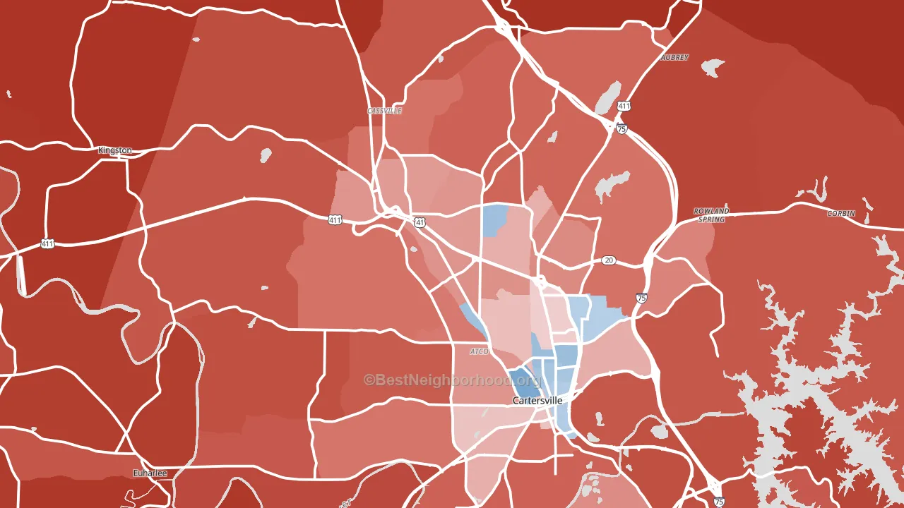
Bartow County leans heavily Republican by roughly 46 points: about 27% of voters vote Democratic and 73% Republican.
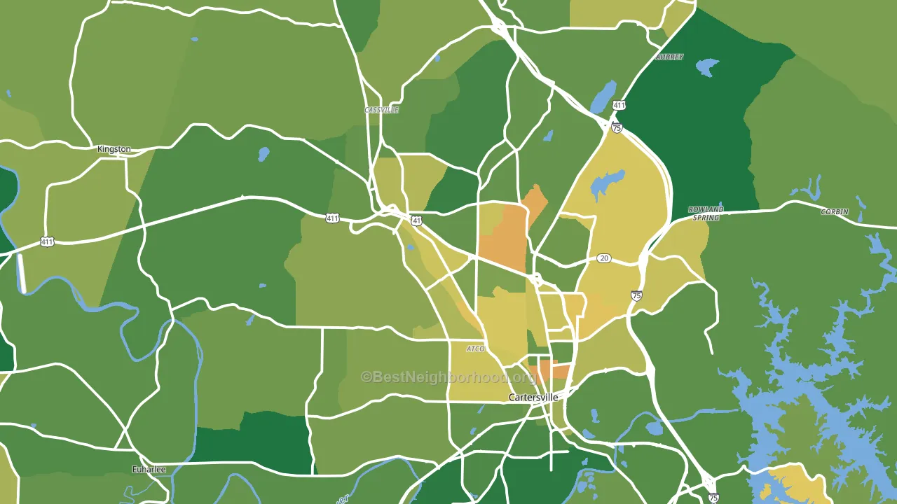
About 75% of adults in Bartow County typically vote, above the U.S. average of about 62%. Among adults in Bartow County, ~20% vote Democratic, ~55% Republican, and ~25% don't vote. The map below shows estimated turnout by block group.
How Bartow County compares
Among counties within 50 miles, Bartow County leans more Republican than 11 of 20 neighbors.
Bartow County runs about 44 points more Republican than Georgia as a whole.
Politics vary noticeably by city within Bartow County. The northeast side is the most Republican-leaning (R+69) and the east side is the least Republican-leaning (R+24), a spread of about 45 points.
Why Bartow County leans the way it does
This analysis examined 14,881 data points per county to find what predicts political lean and turnout. The items below are a few correlations that stood out for Bartow County, not a ranked or complete list of what matters most.
Areas with many family households vote Republican. About 73% of households in Bartow County are family households, about 7 points above the U.S. average of 67%.
Cancer-screening access and voter turnout
Places with low colon-cancer-screening access tend to turn out at a lower rate; Bartow County, GA sits below the national average on this measure. Cancer screening does not drive turnout; it reflects income, insurance, and healthcare access.
Why turnout in Bartow County looks the way it does
Turnout in Bartow County sits close to the national pattern. Routine healthcare access, homeownership, education, and food security all land near their national averages here. Learn more about the findings and methodology on the political spectrum map.
Nearby Counties
- Cherokee County, GA R+33
- Paulding County, GA R+20
- Floyd County, GA R+37
- Gordon County, GA R+60
- Polk County, GA R+53
- Cobb County, GA D+20
- Pickens County, GA R+59
- Douglas County, GA D+28
- Chattooga County, GA R+58
- Fulton County, GA D+46
Counties with Similar Populations
- Miami County, OH R+42
- Madison County, MS R+5
- Eaton County, MI R+8
- Bradley County, TN R+48
- Pennington County, SD R+28
- St. Lawrence County, NY R+18
- Terrebonne Parish, LA R+42
- Warren County, NJ R+16
- LaSalle County, IL R+21
- Cass County, MO R+32
Sources and methodology
Precinct-level voting records used to fit the model come from Georgia Elections Division, distributed by the Voting and Election Science Team. Demographic inputs come from the U.S. Census Bureau (ACS 5-year estimates and the 2020 Decennial Census). Health and environmental inputs come from the CDC (PLACES and the Environmental Justice Index). Land cover comes from the USGS and EPA. Election-day and lead-up weather come from PRISM 4km daily grids and the NOAA Global Historical Climatology Network. Mail-voting and election-administration patterns come from the MIT Election Lab's Survey of the Performance of American Elections. Block-group crime detail comes from CrimeGrade. Internet data and modeling support provided by ISPreports.org.
Modeling and analysis by the BestNeighborhood data science team. Full methodology and findings: political spectrum map.
Methodology reviewed by the BestNeighborhood data team. Last updated May 2026.