Belcher Square is a Democratic stronghold. About 82% of voters here vote Democratic and 18% Republican.
About 55% of adults in Belcher Square typically vote, below the U.S. average of about 62%. Among adults in Belcher Square, ~45% vote Democratic, ~10% Republican, and ~45% don't vote. The map below shows estimated turnout by block group.
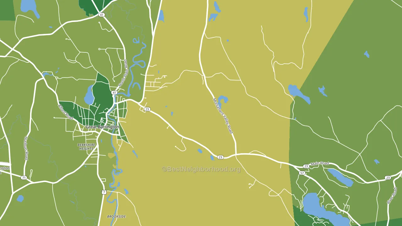
How Belcher Square compares
Among cities within 25 miles, Belcher Square is the most Democratic-leaning.
Belcher Square runs about 39 points more Democratic than Massachusetts as a whole.
Why Belcher Square leans the way it does
This analysis examined 14,881 data points per city to find what predicts political lean and turnout. The items below are a few correlations that stood out for Belcher Square, not a ranked or complete list of what matters most.
Areas with high college attainment vote Democratic. About 60% of adults in Belcher Square hold a bachelor's degree, about 31 points above the U.S. average of 28%. A high never-married share predicts Democratic voting, and about 37% of adults in Belcher Square have never been married, above 90% of cities.
Walkability and Democratic lean
Places with a highly walkable street grid tend to lean Democratic; Belcher Square, MA sits in the top tenth nationally on this measure. A walkable street grid does not change how people vote; it mostly reflects how urban a place is.
Why turnout in Belcher Square looks the way it does
Renters vote less often than owners. About 32% of households in Belcher Square rent, about 7 points above the U.S. average of 25%. Strong routine healthcare access lines up with higher turnout, and Belcher Square sits in the top quarter on routine-care measures. Learn more about the findings and methodology on the political spectrum map.
Nearby Cities
- Berkshire Heights, MA D+61
- Great Barrington, MA D+54
- Housatonic, MA D+32
- Hartsville, MA D+42
- South Lee, MA D+45
- South Egremont, MA D+54
- Monterey, MA D+55
- North Egremont, MA D+56
- Stockbridge, MA D+58
- Mill River, MA D+28
Cities with Similar Populations
- Young, WV R+62
- Magnolia, WV R+60
- Edgerton Junction, MO R+51
- Thackeray, IL R+71
- Crag, WV R+66
- Rinn, CO D+7
- Half Acre, NY R+26
- Kukuihaele, HI D+23
- Buffalo Springs, VA R+39
- Hodges, MT R+75
Sources and methodology
Precinct-level voting records used to fit the model come from Massachusetts Secretary of the Commonwealth, Elections, distributed by the Voting and Election Science Team. Demographic inputs come from the U.S. Census Bureau (ACS 5-year estimates and the 2020 Decennial Census). Health and environmental inputs come from the CDC (PLACES and the Environmental Justice Index). Land cover comes from the USGS and EPA. Election-day and lead-up weather come from PRISM 4km daily grids and the NOAA Global Historical Climatology Network. Mail-voting and election-administration patterns come from the MIT Election Lab's Survey of the Performance of American Elections. Block-group crime detail comes from CrimeGrade. Internet data and modeling support provided by ISPreports.org.
Modeling and analysis by the BestNeighborhood data science team. Full methodology and findings: political spectrum map.
Methodology reviewed by the BestNeighborhood data team. Last updated May 2026.