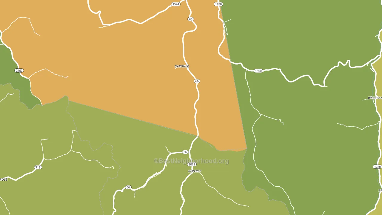
Beverly is a Republican stronghold. About 13% of voters here vote Democratic and 87% Republican.
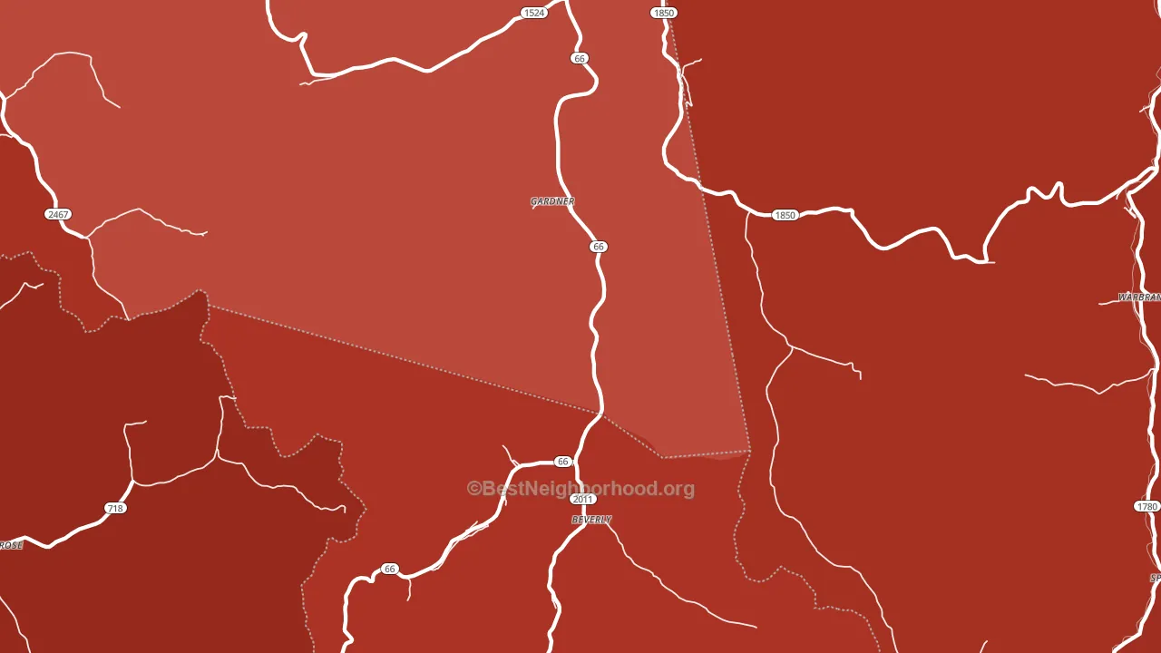
About 62% of adults in Beverly typically vote, near the U.S. average of about 62%. Among adults in Beverly, ~8% vote Democratic, ~54% Republican, and ~38% don't vote. The map below shows estimated turnout by block group.
How Beverly compares
Among cities within 25 miles, Beverly leans more Republican than 30 of 121 neighbors.
Beverly runs about 43 points more Republican than Kentucky as a whole.
Why Beverly leans the way it does
This analysis examined 14,881 data points per city to find what predicts political lean and turnout. The items below are a few correlations that stood out for Beverly, not a ranked or complete list of what matters most.
Rural areas vote Republican. About 4% of residents in Beverly live in densely developed areas, about 14 points below the Kentucky average of 18%. Low college attainment predicts Republican voting, and Beverly sits in the bottom quarter (about 7%, below 97% of cities).
Paved land cover and Republican lean
Places with little paved surface tend to lean Republican; Beverly, KY sits in the bottom tenth nationally on this measure. Paved ground does not change how people vote; it mostly reflects how urban and built-up a place is.
Why turnout in Beverly looks the way it does
Limited routine healthcare access lines up with lower turnout, and Beverly sits in the bottom quarter on routine-care measures. Learn more about the findings and methodology on the political spectrum map.
Nearby Cities
- Roark, KY R+74
- Warbranch, KY R+77
- Mills, KY R+75
- Helton, KY R+79
- Asher, KY R+78
- Stoney Fork, KY R+81
- Brightshade, KY R+79
- Spring Creek, KY R+77
- Essie, KY R+78
- Lewis Creek, KY R+83
Cities with Similar Populations
- Wiborg, KY R+76
- Oaky Streak, AL R+78
- Dentville, MS D+6
- Weedhaven, TX R+76
- Manny Corners, NY R+20
- Yellow Rock, KY R+66
- Ferrin, IL R+59
- Cascade-Chipita Park, CO D+3
- Normanda, IN R+57
- Timpas, CO R+38
Sources and methodology
Precinct-level voting records used to fit the model come from Kentucky State Board of Elections, distributed by the Voting and Election Science Team. Demographic inputs come from the U.S. Census Bureau (ACS 5-year estimates and the 2020 Decennial Census). Health and environmental inputs come from the CDC (PLACES and the Environmental Justice Index). Land cover comes from the USGS and EPA. Election-day and lead-up weather come from PRISM 4km daily grids and the NOAA Global Historical Climatology Network. Mail-voting and election-administration patterns come from the MIT Election Lab's Survey of the Performance of American Elections. Block-group crime detail comes from CrimeGrade. Internet data and modeling support provided by ISPreports.org.
Modeling and analysis by the BestNeighborhood data science team. Full methodology and findings: political spectrum map.
Methodology reviewed by the BestNeighborhood data team. Last updated May 2026.