Bloomfield is a Republican stronghold. About 15% of voters here vote Democratic and 85% Republican.
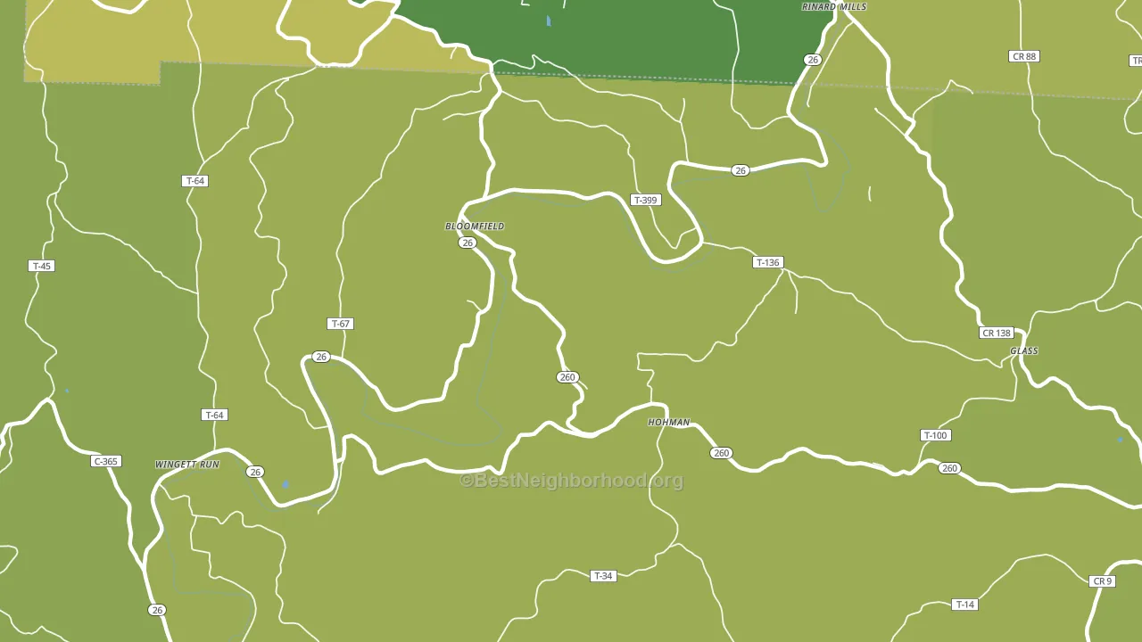
About 70% of adults in Bloomfield typically vote, above the U.S. average of about 62%. Among adults in Bloomfield, ~11% vote Democratic, ~59% Republican, and ~30% don't vote. The map below shows estimated turnout by block group.
How Bloomfield compares
Among cities within 25 miles, Bloomfield leans more Republican than 93 of 98 neighbors.
Bloomfield runs about 59 points more Republican than Ohio as a whole.
Why Bloomfield leans the way it does
This analysis examined 14,881 data points per city to find what predicts political lean and turnout. The items below are a few correlations that stood out for Bloomfield, not a ranked or complete list of what matters most.
Areas with a high white share and below-average college attainment vote Republican. In Bloomfield, more than 99% of residents are non-Hispanic white, about 27 points above the U.S. average of 72%; about 5% of adults hold a bachelor's degree, about 19 points below the Ohio average of 23%. Rural areas vote Republican, and Bloomfield sits in the bottom quarter on density (about 5%, below 77% of cities). A high family-household share predicts Republican voting, and about 76% of households in Bloomfield are family households, above 78% of cities.
Population density and Republican lean
Places with low population density tend to lean Republican; Bloomfield, OH sits in the bottom quarter nationally on this measure.
Why turnout in Bloomfield looks the way it does
Areas with high high-school completion turn out at higher rates. About 97% of adults in Bloomfield have completed high school, about 6 points above the Ohio average of 91%. Learn more about the findings and methodology on the political spectrum map.
Nearby Cities
- Rinard Mills, OH R+67
- Wingett Run, OH R+64
- New Matamoras, OH R+64
- Beavertown, OH R+64
- Graysville, OH R+67
- Matamoras, OH R+61
- Sycamore Valley, OH R+66
- Moss Run, OH R+62
- Lower Salem, OH R+65
Cities with Similar Populations
- Landgraff, WV R+30
- Fowlerton, TX R+51
- Robb, PA R+51
- Sharon Center, PA R+63
- Fort Seybert, WV R+63
- Platten, NY R+45
- Dean, LA R+82
- Fox Hill, IN R+50
- Davisville, AL D+76
- Mc Bride, MO R+69
Sources and methodology
Precinct-level voting records used to fit the model come from Ohio Secretary of State, Elections, distributed by the Voting and Election Science Team. Demographic inputs come from the U.S. Census Bureau (ACS 5-year estimates and the 2020 Decennial Census). Health and environmental inputs come from the CDC (PLACES and the Environmental Justice Index). Land cover comes from the USGS and EPA. Election-day and lead-up weather come from PRISM 4km daily grids and the NOAA Global Historical Climatology Network. Mail-voting and election-administration patterns come from the MIT Election Lab's Survey of the Performance of American Elections. Block-group crime detail comes from CrimeGrade. Internet data and modeling support provided by ISPreports.org.
Modeling and analysis by the BestNeighborhood data science team. Full methodology and findings: political spectrum map.
Methodology reviewed by the BestNeighborhood data team. Last updated May 2026.