Bronzeville is a Democratic stronghold. About 88% of voters here vote Democratic and 12% Republican.
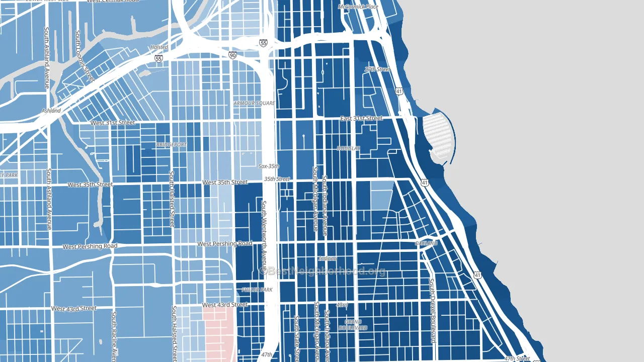
About 42% of adults in Bronzeville typically vote, below the U.S. average of about 62%. Among adults in Bronzeville, ~37% vote Democratic, ~5% Republican, and ~58% don't vote. The map below shows estimated turnout by block group.
How Bronzeville compares
Among neighborhoods within 5 miles, Bronzeville leans more Democratic than 24 of 35 neighbors.
Bronzeville runs about 65 points more Democratic than Illinois as a whole.
Politics vary noticeably by block within Bronzeville. The southeast side is the most Democratic-leaning (D+84) and the northwest side is the least Democratic-leaning (D+60), a spread of about 24 points.
Why Bronzeville leans the way it does
This analysis examined 14,881 data points per neighborhood to find what predicts political lean and turnout. The items below are a few correlations that stood out for Bronzeville, not a ranked or complete list of what matters most.
Dense areas vote Democratic. More than 99% of residents in Bronzeville live in densely developed areas, about 64 points above the U.S. average of 36%. A high never-married share predicts Democratic voting, and about 61% of adults in Bronzeville have never been married, above 93% of neighborhoods.
Population density and Democratic lean
Places with high population density tend to lean Democratic; Bronzeville, Chicago, IL sits in the top tenth nationally on this measure.
Why turnout in Bronzeville looks the way it does
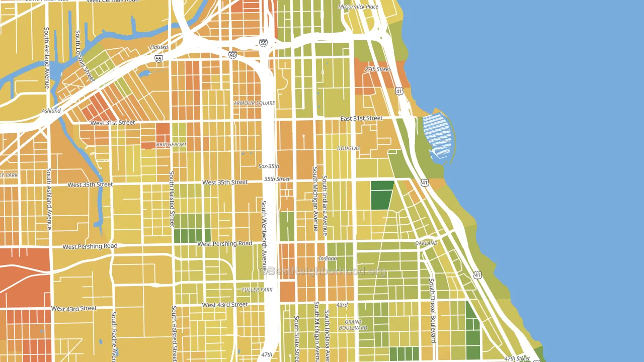
Areas with high food insecurity turn out at lower rates. About 28% of adults in Bronzeville report food insecurity, about 12 points above the U.S. average of 16%. Learn more about the findings and methodology on the political spectrum map.
Nearby Neighborhoods
Neighborhoods with Similar Populations
- South Winds, Oxnard, CA D+33
- San Jose, Jacksonville, FL D+16
- Rimmon Heights, Manchester, NH D+24
- Depot Bench, Boise, ID D+35
- Memorial Parkway, Katy, TX R+11
- Scenic Heights, Arvada, CO D+19
- San Pablo Gateway, Oakland, CA D+69
- Crest Drive, Eugene, OR D+65
- Central Business District, Newark, NJ D+72
- South River City, Austin, TX D+56
Sources and methodology
Precinct-level voting records used to fit the model come from Illinois State Board of Elections, distributed by the Voting and Election Science Team. Demographic inputs come from the U.S. Census Bureau (ACS 5-year estimates and the 2020 Decennial Census). Health and environmental inputs come from the CDC (PLACES and the Environmental Justice Index). Land cover comes from the USGS and EPA. Election-day and lead-up weather come from PRISM 4km daily grids and the NOAA Global Historical Climatology Network. Mail-voting and election-administration patterns come from the MIT Election Lab's Survey of the Performance of American Elections. Block-group crime detail comes from CrimeGrade. Internet data and modeling support provided by ISPreports.org.
Modeling and analysis by the BestNeighborhood data science team. Full methodology and findings: political spectrum map.
Methodology reviewed by the BestNeighborhood data team. Last updated May 2026.