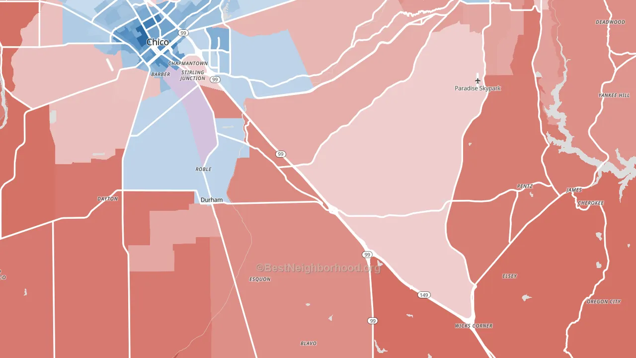
Butte County is a true toss-up. About 49% of voters here vote Democratic and 51% Republican.
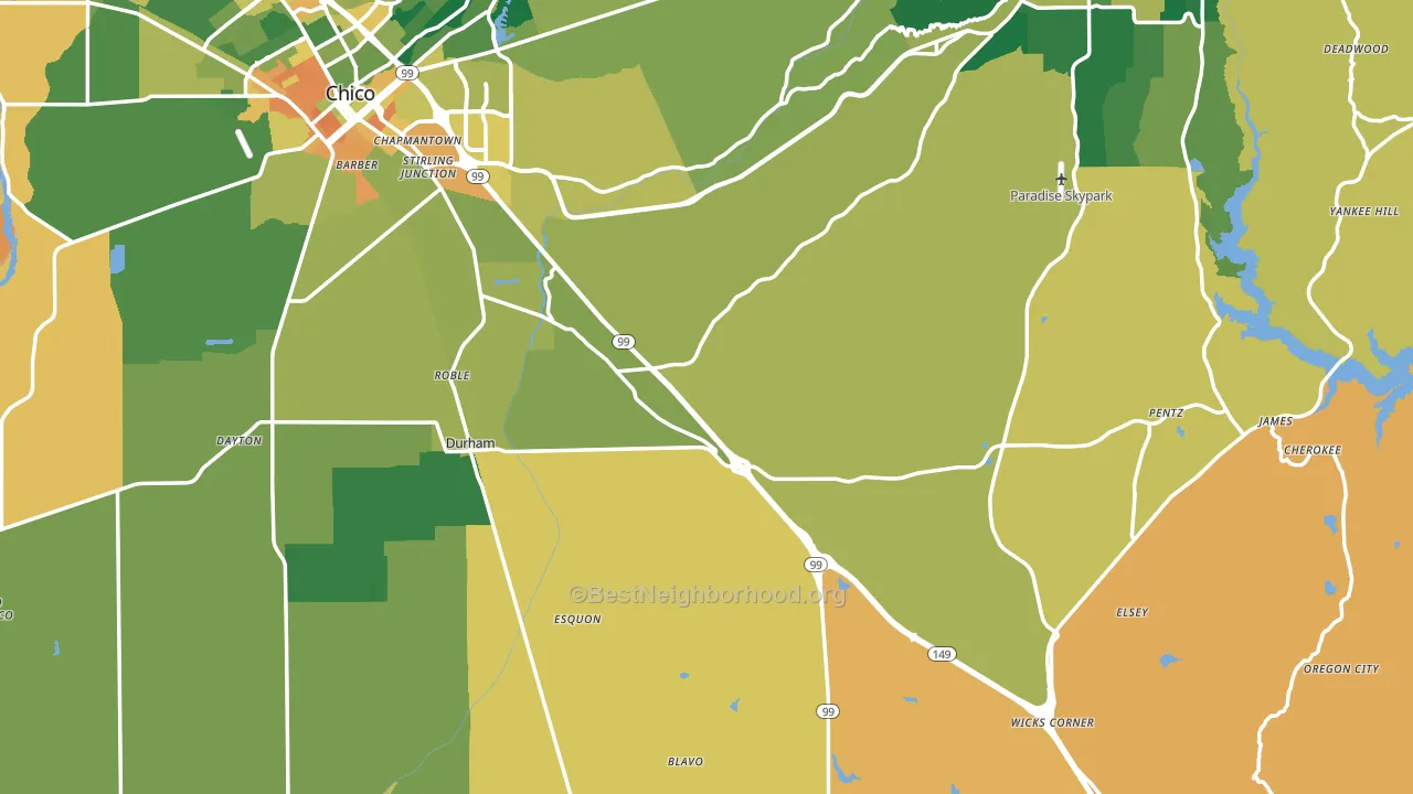
About 62% of adults in Butte County typically vote, near the U.S. average of about 62%. Among adults in Butte County, ~30% vote Democratic, ~32% Republican, and ~38% don't vote. The map below shows estimated turnout by block group.
How Butte County compares
Among counties within 50 miles, Butte County sits roughly in the middle of the political spectrum, with 0 neighbors leaning further in the place's direction and 5 leaning the other way.
Butte County runs about 23 points more Republican than California as a whole. California leans Democratic overall, while Butte County sits closer to the political middle.
Politics vary noticeably by city within Butte County. The west side runs the most Democratic (D+19) and the southwest side runs the most Republican (R+51), a spread of about 71 points.
Why Butte County leans the way it does
This analysis examined 14,881 data points per county to find what predicts political lean and turnout. The items below are a few correlations that stood out for Butte County, not a ranked or complete list of what matters most.
Butte County votes against the grain of California. California leans Democratic overall, while Butte County runs about 23 points more Republican.
Population density and Democratic lean
Places with high population density tend to lean Democratic; Butte County, CA sits in the top tenth nationally on this measure.
Why turnout in Butte County looks the way it does
Turnout in Butte County sits close to the national pattern. Routine healthcare access, homeownership, education, and food security all land near their national averages here. Learn more about the findings and methodology on the political spectrum map.
Nearby Counties
- Glenn County, CA R+32
- Sutter County, CA R+23
- Yuba County, CA R+16
- Colusa County, CA R+20
- Tehama County, CA R+35
- Nevada County, CA D+11
- Plumas County, CA R+23
- Placer County, CA R+11
- Sierra County, CA R+19
- Shasta County, CA R+30
Counties with Similar Populations
- Okaloosa County, FL R+34
- York County, ME R+2
- Niagara County, NY R+10
- Mohave County, AZ R+37
- Washington County, PA R+24
- Delaware County, OH R+5
- Harrison County, MS R+18
- Clermont County, OH R+37
- Lackawanna County, PA Even
- Johnston County, NC R+21
Sources and methodology
Precinct-level voting records used to fit the model come from California Secretary of State, Elections, distributed by the Voting and Election Science Team. Demographic inputs come from the U.S. Census Bureau (ACS 5-year estimates and the 2020 Decennial Census). Health and environmental inputs come from the CDC (PLACES and the Environmental Justice Index). Land cover comes from the USGS and EPA. Election-day and lead-up weather come from PRISM 4km daily grids and the NOAA Global Historical Climatology Network. Mail-voting and election-administration patterns come from the MIT Election Lab's Survey of the Performance of American Elections. Block-group crime detail comes from CrimeGrade. Internet data and modeling support provided by ISPreports.org.
Modeling and analysis by the BestNeighborhood data science team. Full methodology and findings: political spectrum map.
Methodology reviewed by the BestNeighborhood data team. Last updated May 2026.