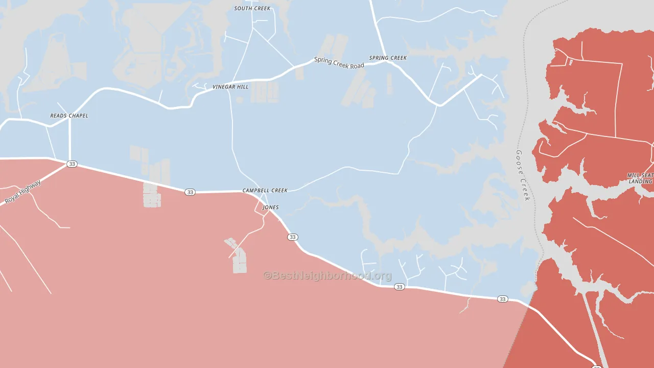
Campbell Creek leans slightly Republican by roughly 10 points: about 45% of voters vote Democratic and 55% Republican.
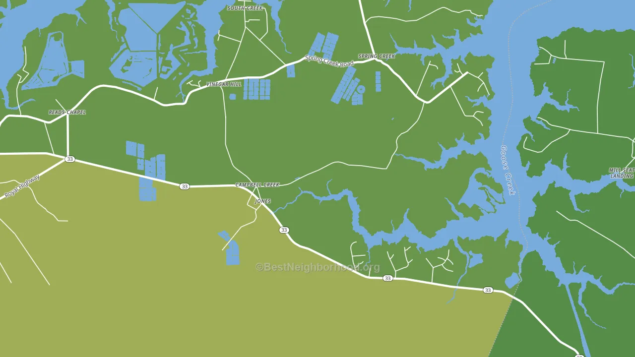
About 80% of adults in Campbell Creek typically vote, above the U.S. average of about 62%. Among adults in Campbell Creek, ~36% vote Democratic, ~44% Republican, and ~20% don't vote. The map below shows estimated turnout by block group.
How Campbell Creek compares
Among cities within 25 miles, Campbell Creek leans more Republican than 3 of 55 neighbors.
Campbell Creek runs about 7 points more Republican than North Carolina as a whole.
Politics vary noticeably by neighborhood within Campbell Creek. The west side is the most Republican-leaning (R+28) and the north side is the least Republican-leaning (R+7), a spread of about 21 points.
Why Campbell Creek leans the way it does
This analysis examined 14,881 data points per city to find what predicts political lean and turnout. The items below are a few correlations that stood out for Campbell Creek, not a ranked or complete list of what matters most.
Rural areas vote Republican. About 4% of residents in Campbell Creek live in densely developed areas, about 22 points below the North Carolina average of 27%.
Population density and Republican lean
Places with low population density tend to lean Republican; Campbell Creek, NC sits in the bottom quarter nationally on this measure.
Why turnout in Campbell Creek looks the way it does
Homeowners vote more often than renters. About 98% of households in Campbell Creek own their home, about 24 points above the North Carolina average of 74%. Limited routine healthcare access lines up with lower turnout, and Campbell Creek sits in the bottom quarter on routine-care measures. Learn more about the findings and methodology on the political spectrum map.
Nearby Cities
- Lowland, NC R+38
- Royal, NC R+23
- Hobucken, NC R+38
- Mesic, NC R+38
- Aurora, NC R+11
- Vandemere, NC D+11
- Gaylord, NC R+28
- Wades Point, NC R+58
- Bayboro, NC R+23
Cities with Similar Populations
- Zylks, LA R+39
- Coyote, CA R+6
- Cross Fork, PA R+58
- Grahams Forge, VA R+73
- Perryville, NY R+22
- Warren, UT R+69
- Massillon, IA R+46
- Reserve, WI D+50
- Waldo, KS R+68
- Middlegrove, IL R+41
Sources and methodology
Precinct-level voting records used to fit the model come from North Carolina State Board of Elections, distributed by the Voting and Election Science Team. Demographic inputs come from the U.S. Census Bureau (ACS 5-year estimates and the 2020 Decennial Census). Health and environmental inputs come from the CDC (PLACES and the Environmental Justice Index). Land cover comes from the USGS and EPA. Election-day and lead-up weather come from PRISM 4km daily grids and the NOAA Global Historical Climatology Network. Mail-voting and election-administration patterns come from the MIT Election Lab's Survey of the Performance of American Elections. Block-group crime detail comes from CrimeGrade. Internet data and modeling support provided by ISPreports.org.
Modeling and analysis by the BestNeighborhood data science team. Full methodology and findings: political spectrum map.
Methodology reviewed by the BestNeighborhood data team. Last updated May 2026.