Coffey Park leans heavily Democratic by roughly 36 points: about 68% of voters vote Democratic and 32% Republican.
[sc name="abovemapcta"]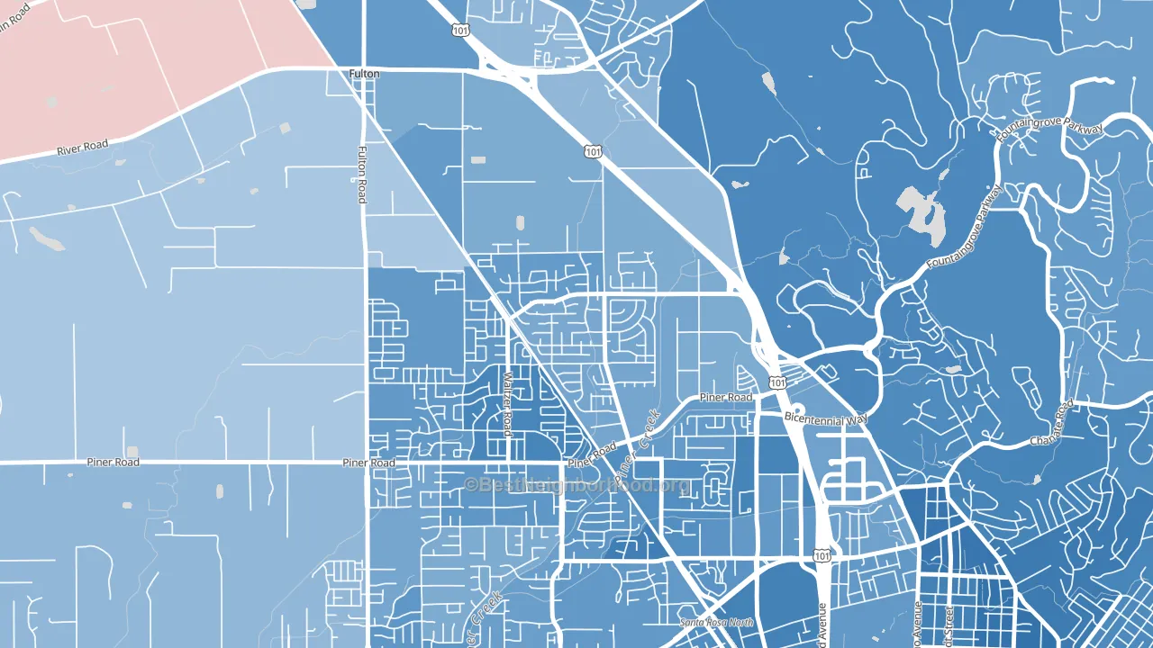 [bestneighborhood_map_controls]
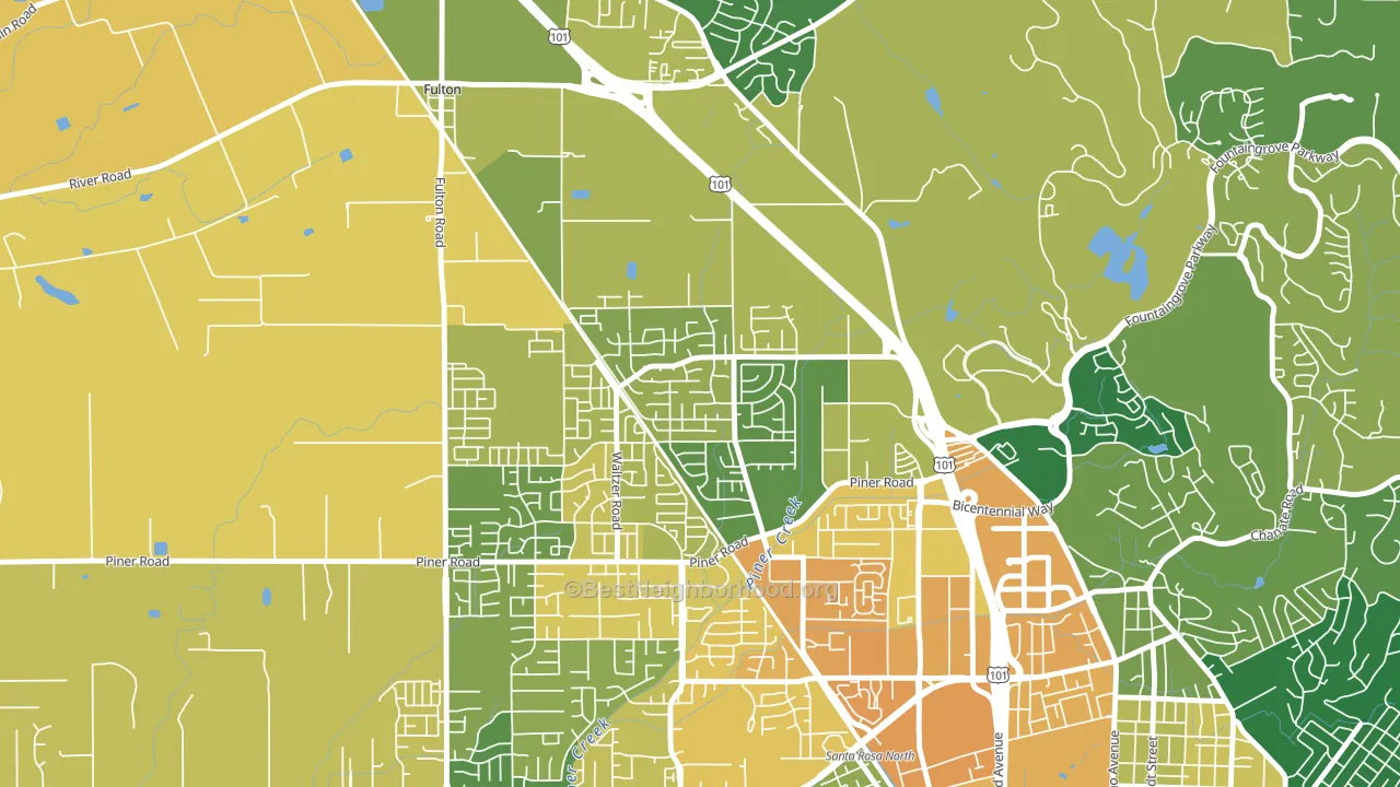
About 73% of adults in Coffey Park typically vote, above the U.S. average of about 62%. Among adults in Coffey Park, ~49% vote Democratic, ~23% Republican, and ~28% don't vote. The map below shows estimated turnout by block group.
 [bestneighborhood_map_controls]
How Coffey Park compares
Among neighborhoods within 5 miles, Coffey Park leans more Democratic than 2 of 4 neighbors.
Coffey Park runs about 15 points more Democratic than California as a whole.
Why Coffey Park leans the way it does
Density, race composition, education, and family structure all sit close to their national averages in Coffey Park. The lean here lands roughly where demographic data alone would predict.
Population density and Democratic lean
Places with high population density tend to lean Democratic; Coffey Park, Santa Rosa, CA sits above the national average on this measure.
Why turnout in Coffey Park looks the way it does
Turnout in Coffey Park sits close to the national pattern. Routine healthcare access, homeownership, education, and food security all land near their national averages here. Learn more about the findings and methodology on the political spectrum map.
[one_half]Nearby Neighborhoods
- Larkfield-Wikiup, Santa Rosa, CA D+31
- Junior College Neighborhood Assc., Santa Rosa, CA D+62
- Wright Area, Santa Rosa, CA D+29
- SouthWest Santa Rosa, Santa Rosa, CA D+40
- East Petaluma, Petaluma, CA D+58
- Browns Valley, Napa, CA D+30
- Linda Vista-San Francisco, Napa, CA D+24
- Vintage, Napa, CA D+28
- Beard, Napa, CA D+37
- Westwood-San Francisco, Napa, CA D+35
Neighborhoods with Similar Populations
- Castle Manor, Milwaukee, WI D+15
- Hudson, San Bernardino, CA D+12
- Raleigh West, Beaverton, OR D+46
- Canterbury, Mobile, AL R+5
- Floral Park, Butte, MT D+6
- Gibbs, Canton, OH D+33
- Thornhill, Mobile, AL R+3
- Goodrich-Kirtland Park, Cleveland, OH D+45
- Cherokee Triangle, Louisville, KY D+60
- Hillendale, Parkville, MD D+76
Sources and methodology
Precinct-level voting records used to fit the model come from California Secretary of State, Elections, distributed by the Voting and Election Science Team. Demographic inputs come from the U.S. Census Bureau (ACS 5-year estimates and the 2020 Decennial Census). Health and environmental inputs come from the CDC (PLACES and the Environmental Justice Index). Land cover comes from the USGS and EPA. Election-day and lead-up weather come from PRISM 4km daily grids and the NOAA Global Historical Climatology Network. Mail-voting and election-administration patterns come from the MIT Election Lab's Survey of the Performance of American Elections. Block-group crime detail comes from CrimeGrade. Internet data and modeling support provided by ISPreports.org.
Modeling and analysis by the BestNeighborhood data science team. Full methodology and findings: political spectrum map.
Methodology reviewed by the BestNeighborhood data team. Last updated May 2026.