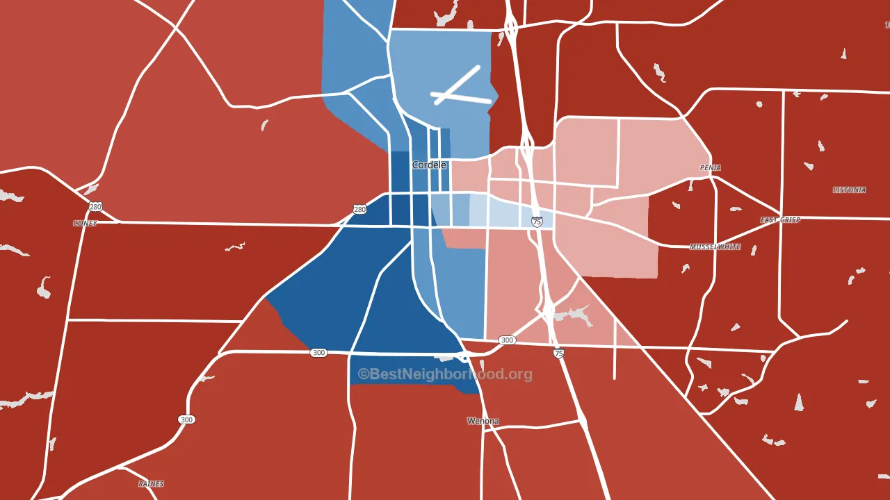
Crisp County leans slightly Republican by roughly 6 points: about 47% of voters vote Democratic and 53% Republican.
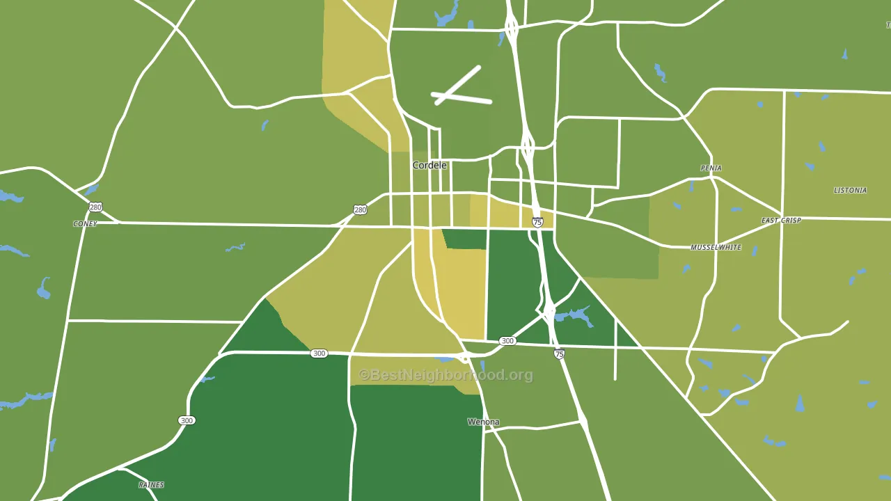
About 72% of adults in Crisp County typically vote, above the U.S. average of about 62%. Among adults in Crisp County, ~34% vote Democratic, ~38% Republican, and ~28% don't vote. The map below shows estimated turnout by block group.
How Crisp County compares
Among counties within 50 miles, Crisp County leans more Republican than 7 of 20 neighbors.
Crisp County runs about 4 points more Republican than Georgia as a whole.
Politics vary noticeably by city within Crisp County. The west side runs the most Democratic (D+48) and the northeast side runs the most Republican (R+69), a spread of about 117 points.
Why Crisp County leans the way it does
This analysis examined 14,881 data points per county to find what predicts political lean and turnout. The items below are a few correlations that stood out for Crisp County, not a ranked or complete list of what matters most.
Areas with low college attainment vote Republican. About 15% of adults in Crisp County hold a bachelor's degree, about 9 points below the Georgia average of 24%.
Housing overcrowding and voter turnout
Places with low overcrowding tend to turn out at a higher rate; Crisp County, GA sits in the bottom quarter nationally on this measure.
Why turnout in Crisp County looks the way it does
Areas with limited routine healthcare access turn out at lower rates. Crisp County is in the bottom quarter nationally for routine-care measures such as insurance coverage, preventive screenings, and dental visits. Learn more about the findings and methodology on the political spectrum map.
Nearby Counties
- Dooly County, GA R+6
- Turner County, GA R+19
- Wilcox County, GA R+33
- Sumter County, GA D+13
- Worth County, GA R+49
- Pulaski County, GA R+31
- Lee County, GA R+38
- Macon County, GA D+22
- Ben Hill County, GA R+17
- Dougherty County, GA D+48
Counties with Similar Populations
- Calhoun County, TX R+37
- Morgan County, GA R+45
- Willacy County, TX R+7
- DeKalb County, TN R+63
- Labette County, KS R+42
- Winneshiek County, IA R+13
- Hempstead County, AR R+18
- St. James Parish, LA D+3
- Richland Parish, LA R+38
- Martin County, MN R+38
Sources and methodology
Precinct-level voting records used to fit the model come from Georgia Elections Division, distributed by the Voting and Election Science Team. Demographic inputs come from the U.S. Census Bureau (ACS 5-year estimates and the 2020 Decennial Census). Health and environmental inputs come from the CDC (PLACES and the Environmental Justice Index). Land cover comes from the USGS and EPA. Election-day and lead-up weather come from PRISM 4km daily grids and the NOAA Global Historical Climatology Network. Mail-voting and election-administration patterns come from the MIT Election Lab's Survey of the Performance of American Elections. Block-group crime detail comes from CrimeGrade. Internet data and modeling support provided by ISPreports.org.
Modeling and analysis by the BestNeighborhood data science team. Full methodology and findings: political spectrum map.
Methodology reviewed by the BestNeighborhood data team. Last updated May 2026.