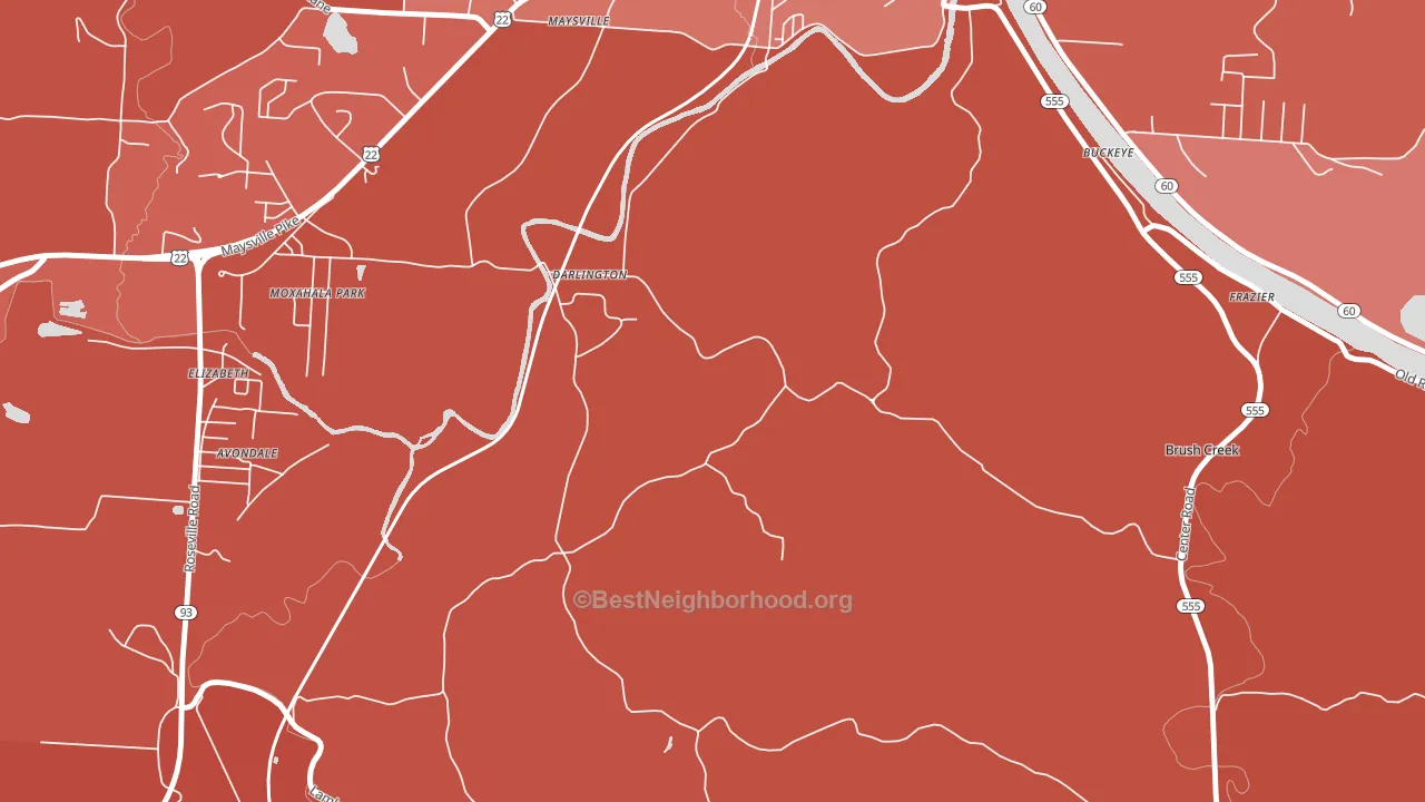
Darlington is a Republican stronghold. About 20% of voters here vote Democratic and 80% Republican.
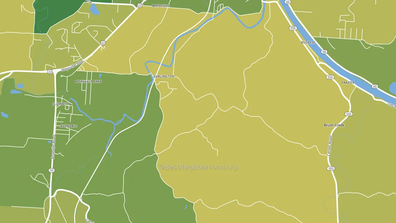
About 62% of adults in Darlington typically vote, near the U.S. average of about 62%. Among adults in Darlington, ~12% vote Democratic, ~49% Republican, and ~39% don't vote. The map below shows estimated turnout by block group.
How Darlington compares
Among cities within 25 miles, Darlington leans more Republican than 58 of 105 neighbors.
Darlington runs about 49 points more Republican than Ohio as a whole.
Why Darlington leans the way it does
This analysis examined 14,881 data points per city to find what predicts political lean and turnout. The items below are a few correlations that stood out for Darlington, not a ranked or complete list of what matters most.
Car-dependent areas vote Republican. About 90% of residents in Darlington drive to work alone, about 16 points above the U.S. average of 74%. Low college attainment predicts Republican voting, and Darlington sits in the bottom quarter (about 10%, below 92% of cities).
Never-married share, developed land, and voter turnout
Places that combine a never-married-heavy adult population and a heavily developed built environment tend to turn out at a lower rate, as Darlington, OH does.
Why turnout in Darlington looks the way it does
Crowded housing lines up with lower turnout. About 13% of homes in Darlington have more than one occupant per room, above 98% of cities. Renters vote less often than owners, and about 30% of households in Darlington rent, above 84% of cities. Low high-school completion lines up with lower turnout, and about 83% of adults in Darlington have completed high school, below 86% of cities. Learn more about the findings and methodology on the political spectrum map.
Nearby Cities
- South Zanesville, OH R+43
- Stovertown, OH R+59
- White Cottage, OH R+59
- Roseville, OH R+57
- East Fultonham, OH R+60
- Philo, OH R+59
- Zanesville, OH R+30
- Duncan Falls, OH R+60
- Cannelville, OH R+61
- Pleasant Grove, OH R+55
Cities with Similar Populations
- Cundiyo, NM D+30
- Curran, WI R+46
- Marshland, WI R+26
- Granville, VT D+16
- Odell, IN R+49
- Kohatk, AZ D+38
- Strandburg, SD R+53
- Mapleville, NC D+19
- Paden, MS R+81
- Buena Vista, IL R+45
Sources and methodology
Precinct-level voting records used to fit the model come from Ohio Secretary of State, Elections, distributed by the Voting and Election Science Team. Demographic inputs come from the U.S. Census Bureau (ACS 5-year estimates and the 2020 Decennial Census). Health and environmental inputs come from the CDC (PLACES and the Environmental Justice Index). Land cover comes from the USGS and EPA. Election-day and lead-up weather come from PRISM 4km daily grids and the NOAA Global Historical Climatology Network. Mail-voting and election-administration patterns come from the MIT Election Lab's Survey of the Performance of American Elections. Block-group crime detail comes from CrimeGrade. Internet data and modeling support provided by ISPreports.org.
Modeling and analysis by the BestNeighborhood data science team. Full methodology and findings: political spectrum map.
Methodology reviewed by the BestNeighborhood data team. Last updated May 2026.