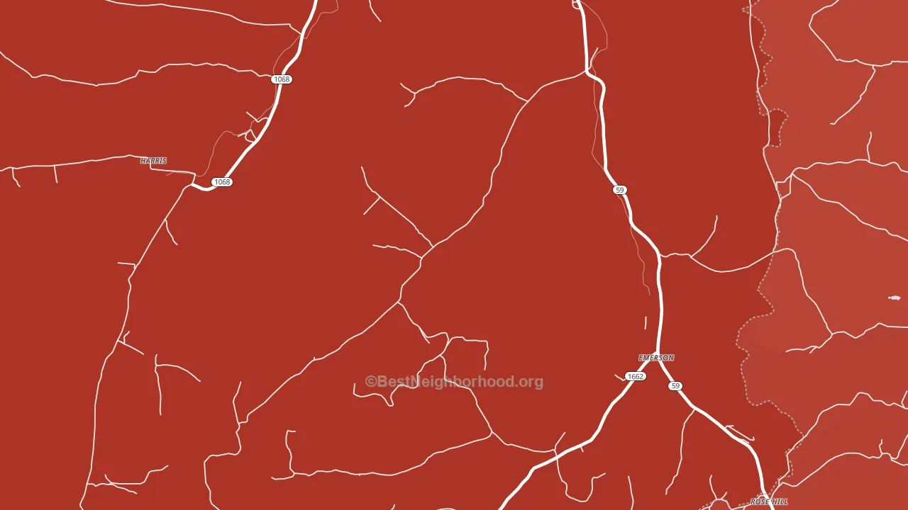
Emerson is a Republican stronghold. About 15% of voters here vote Democratic and 85% Republican.
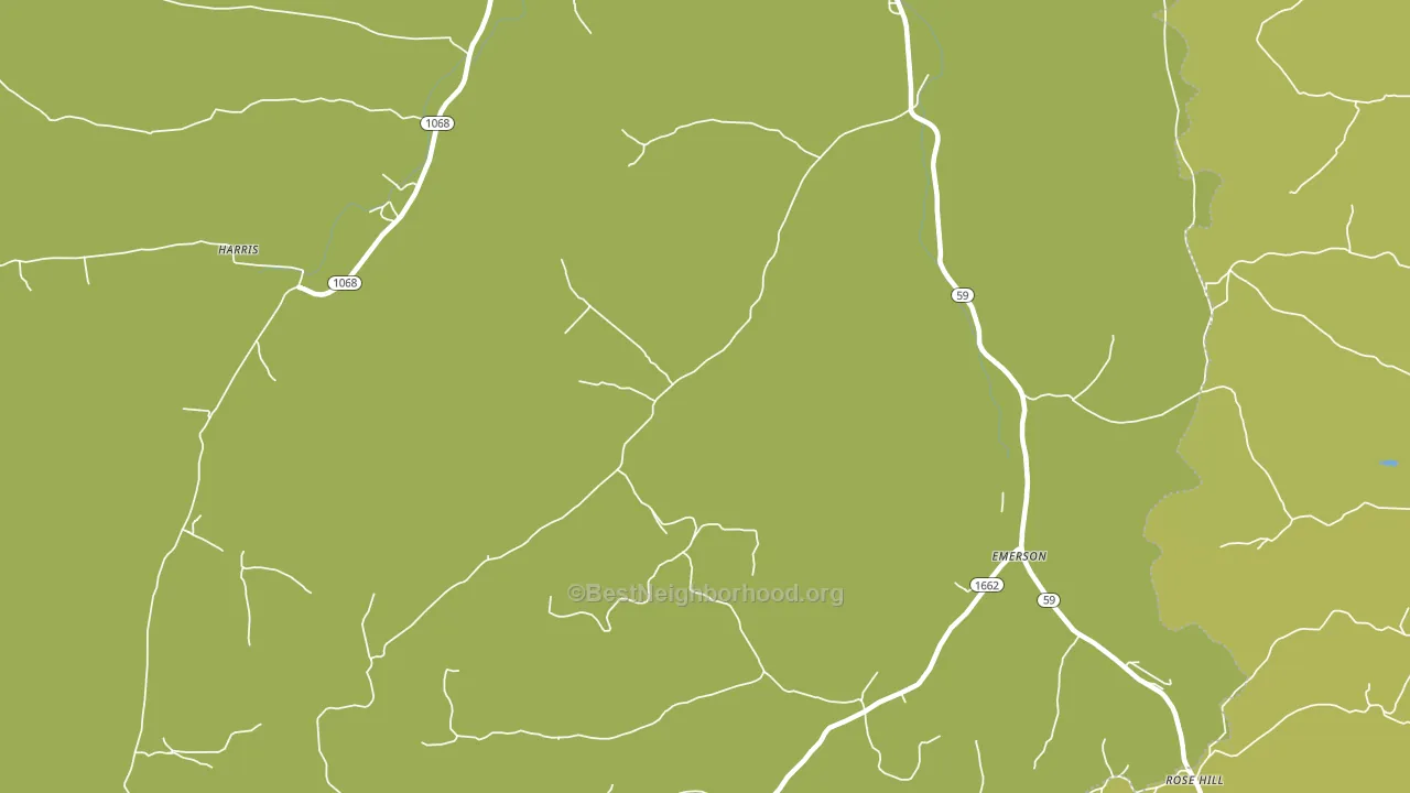
About 65% of adults in Emerson typically vote, near the U.S. average of about 62%. Among adults in Emerson, ~10% vote Democratic, ~55% Republican, and ~35% don't vote. The map below shows estimated turnout by block group.
How Emerson compares
Among cities within 25 miles, Emerson leans more Republican than 81 of 82 neighbors.
Emerson runs about 40 points more Republican than Kentucky as a whole.
Why Emerson leans the way it does
This analysis examined 14,881 data points per city to find what predicts political lean and turnout. The items below are a few correlations that stood out for Emerson, not a ranked or complete list of what matters most.
Rural areas vote Republican. About 4% of residents in Emerson live in densely developed areas, about 14 points below the Kentucky average of 18%. Low college attainment predicts Republican voting, and Emerson sits in the bottom quarter (about 10%, below 92% of cities). A high family-household share predicts Republican voting, and about 76% of households in Emerson are family households, above 78% of cities.
Walkability and Republican lean
Places with a low walkability score tend to lean Republican; Emerson, KY sits in the bottom tenth nationally on this measure. A walkable street grid does not change how people vote; it mostly reflects how urban a place is.
Why turnout in Emerson looks the way it does
Areas with limited routine healthcare access turn out at lower rates. Emerson is in the bottom quarter nationally for routine-care measures such as insurance coverage, preventive screenings, and dental visits. The dental-visit rate here is about 45%, about 9 points below the Kentucky average of 54%. Learn more about the findings and methodology on the political spectrum map.
Nearby Cities
- Wesleyville, KY R+67
- Smoky Valley, KY R+64
- Fitch, KY R+60
- Harris, KY R+69
- Olive Hill, KY R+63
- Prater, KY R+62
- Stricklett, KY R+69
- Smiths Creek, KY R+68
- Waltz, KY R+58
- Counts Crossroads, KY R+61
Cities with Similar Populations
- Mount Wilson, PA R+35
- Mountain Glen, IL R+50
- Idlewild, NC R+54
- Pitcherville, MA R+12
- Thornburg, PA D+18
- Hunter, ND R+44
- Boyd, MT R+60
- Pine Hill, NY D+8
- Ocosta, WA R+30
- Villa Ridge, IL R+39
Sources and methodology
Precinct-level voting records used to fit the model come from Kentucky State Board of Elections, distributed by the Voting and Election Science Team. Demographic inputs come from the U.S. Census Bureau (ACS 5-year estimates and the 2020 Decennial Census). Health and environmental inputs come from the CDC (PLACES and the Environmental Justice Index). Land cover comes from the USGS and EPA. Election-day and lead-up weather come from PRISM 4km daily grids and the NOAA Global Historical Climatology Network. Mail-voting and election-administration patterns come from the MIT Election Lab's Survey of the Performance of American Elections. Block-group crime detail comes from CrimeGrade. Internet data and modeling support provided by ISPreports.org.
Modeling and analysis by the BestNeighborhood data science team. Full methodology and findings: political spectrum map.
Methodology reviewed by the BestNeighborhood data team. Last updated May 2026.