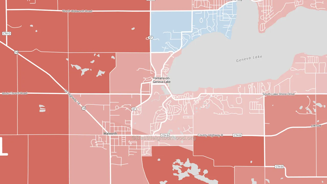
Fontana-on-Geneva Lake is a true toss-up. About 49% of voters here vote Democratic and 51% Republican.
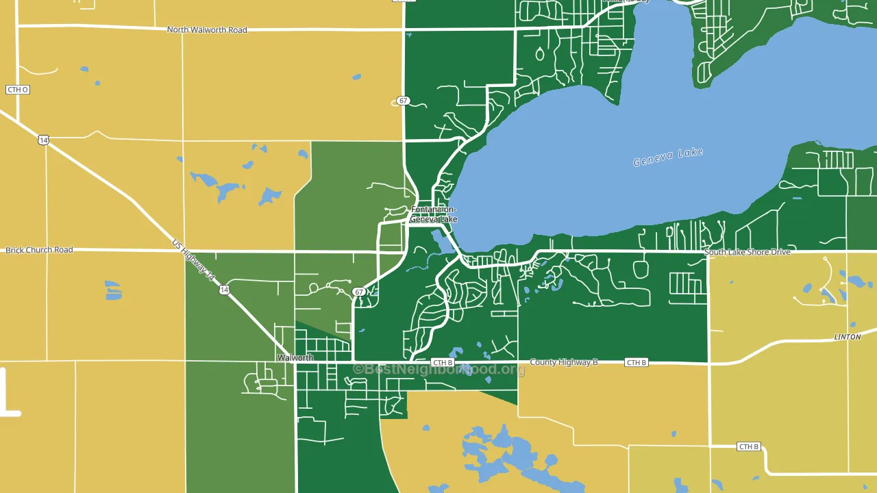
About more than 99% of adults in Fontana-on-Geneva Lake typically vote, above the U.S. average of about 62%. Among adults in Fontana-on-Geneva Lake, ~55% vote Democratic, ~58% Republican, and ~-13% don't vote. The map below shows estimated turnout by block group.
How Fontana-on-Geneva Lake compares
Among cities within 25 miles, Fontana-on-Geneva Lake sits roughly in the middle of the political spectrum, with 4 neighbors leaning further in the place's direction and 90 leaning the other way.
Politically, Fontana-on-Geneva Lake sits close to the rest of Wisconsin.
Politics vary noticeably by neighborhood within Fontana-on-Geneva Lake. The north side runs the most Democratic (D+4) and the northwest side runs the most Republican (R+17), a spread of about 21 points.
Why Fontana-on-Geneva Lake leans the way it does
Density, race composition, education, and family structure all sit close to their national averages in Fontana-on-Geneva Lake. The lean here lands roughly where demographic data alone would predict.
Preventive-care access and voter turnout
Places with strong routine preventive-care access tend to turn out at a higher rate; Fontana-on-Geneva Lake, WI sits in the top tenth nationally on this measure. Dental visits do not drive turnout; the rate reflects income, insurance, and healthcare access, which line up with who votes.
Why turnout in Fontana-on-Geneva Lake looks the way it does
Areas with strong routine healthcare access turn out at higher rates. Fontana-on-Geneva Lake is in the top quarter nationally for routine-care measures such as insurance coverage, preventive screenings, and dental visits. The dental-visit rate here is about 71%, about 11 points above the U.S. average of 60%. Learn more about the findings and methodology on the political spectrum map.
Nearby Cities
- Walworth, WI R+18
- Fontana, WI R+6
- Williams Bay, WI R+11
- Linton, WI R+37
- Delavan Lake, WI R+22
- Lawrence, IL R+15
- Como, WI R+16
- Inlet, WI R+29
- Zenda, WI R+35
- Delavan, WI R+13
Cities with Similar Populations
- Kingsbury, TX R+52
- Borrego Springs, CA R+13
- Onawa, IA R+41
- Edgewood, PA D+69
- Oak Ridge North, TX R+37
- Cornwall On Hudson, NY D+7
- Pequot Lakes, MN R+33
- Montpelier, ID R+69
- Winfield, PA R+42
- Collinsville, TX R+66
Sources and methodology
Precinct-level voting records used to fit the model come from Wisconsin Elections Commission, distributed by the Voting and Election Science Team. Demographic inputs come from the U.S. Census Bureau (ACS 5-year estimates and the 2020 Decennial Census). Health and environmental inputs come from the CDC (PLACES and the Environmental Justice Index). Land cover comes from the USGS and EPA. Election-day and lead-up weather come from PRISM 4km daily grids and the NOAA Global Historical Climatology Network. Mail-voting and election-administration patterns come from the MIT Election Lab's Survey of the Performance of American Elections. Block-group crime detail comes from CrimeGrade. Internet data and modeling support provided by ISPreports.org.
Modeling and analysis by the BestNeighborhood data science team. Full methodology and findings: political spectrum map.
Methodology reviewed by the BestNeighborhood data team. Last updated May 2026.