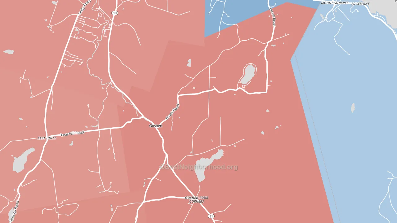
Goshen leans Republican by roughly 28 points: about 36% of voters vote Democratic and 64% Republican. These figures are model estimates: New Hampshire did not have precinct-level voting records available for training, so the numbers above come from demographic and health features rather than local ground truth.
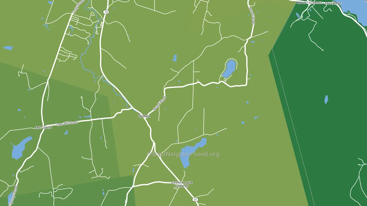
About 81% of adults in Goshen typically vote, above the U.S. average of about 62%. Among adults in Goshen, ~29% vote Democratic, ~52% Republican, and ~19% don't vote. The map below shows estimated turnout by block group.
How Goshen compares
Among cities within 25 miles, Goshen leans more Republican than 102 of 109 neighbors.
Goshen runs about 31 points more Republican than New Hampshire as a whole. New Hampshire is roughly evenly split, and Goshen sits clearly on the Republican side.
Why Goshen leans the way it does
This analysis examined 14,881 data points per city to find what predicts political lean and turnout. The items below are a few correlations that stood out for Goshen, not a ranked or complete list of what matters most.
Areas with many family households vote Republican. About 80% of households in Goshen are family households, about 14 points above the U.S. average of 67%. Goshen runs against the grain of New Hampshire, a Republican-leaning outlier in a roughly evenly split state.
Homeownership and voter turnout
Places with homeowner-heavy households tend to turn out at a higher rate; Goshen, NH sits in the top quarter nationally on this measure.
Why turnout in Goshen looks the way it does
Homeowners vote more often than renters. About 92% of households in Goshen own their home, about 11 points above the New Hampshire average of 82%. Learn more about the findings and methodology on the political spectrum map.
Nearby Cities
- Mount Sunapee, NH R+6
- East Unity, NH R+30
- Newport, NH R+16
- Guild, NH R+10
- Sunapee, NH D+9
- Lempster, NH R+25
- Newbury, NH D+8
- Wendell, NH D+4
- North Newport, NH R+27
- Bradford Center, NH Even
Cities with Similar Populations
- Pettysville, MI R+24
- Sultana, CA R+17
- Midland, TN R+58
- Darling, MN R+52
- Pineview, TX R+75
- Whiteman Air Force Base, MO R+51
- Cynthiana, IN R+51
- Riverside, SC R+26
- Guysie, GA R+78
- Ottokee, OH R+55
Sources and methodology
Precinct-level voting records used to fit the model come from New Hampshire Secretary of State, Elections Division, distributed by the Voting and Election Science Team. Demographic inputs come from the U.S. Census Bureau (ACS 5-year estimates and the 2020 Decennial Census). Health and environmental inputs come from the CDC (PLACES and the Environmental Justice Index). Land cover comes from the USGS and EPA. Election-day and lead-up weather come from PRISM 4km daily grids and the NOAA Global Historical Climatology Network. Mail-voting and election-administration patterns come from the MIT Election Lab's Survey of the Performance of American Elections. Block-group crime detail comes from CrimeGrade. Internet data and modeling support provided by ISPreports.org.
Modeling and analysis by the BestNeighborhood data science team. NH did not have precinct-level voting records available for training, so the figures here come from extrapolation across demographic, health, and land-use features rather than local ground truth. Full methodology and findings: political spectrum map.
Methodology reviewed by the BestNeighborhood data team. Last updated May 2026.