Hampden County leans slightly Democratic by roughly 14 points: about 57% of voters vote Democratic and 43% Republican.
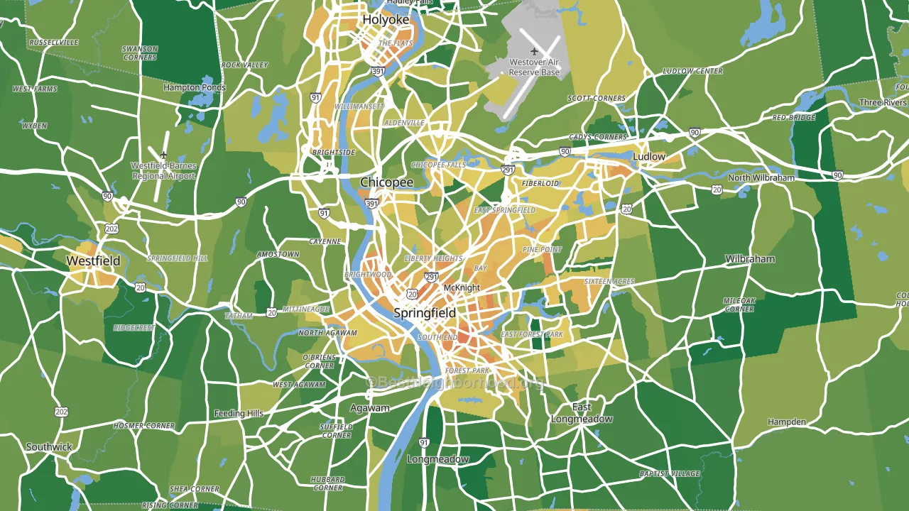
About 66% of adults in Hampden County typically vote, near the U.S. average of about 62%. Among adults in Hampden County, ~38% vote Democratic, ~28% Republican, and ~34% don't vote. The map below shows estimated turnout by block group.
How Hampden County compares
Among counties within 50 miles, Hampden County leans more Democratic than 1 of 4 neighbors.
Hampden County runs about 11 points more Republican than Massachusetts as a whole.
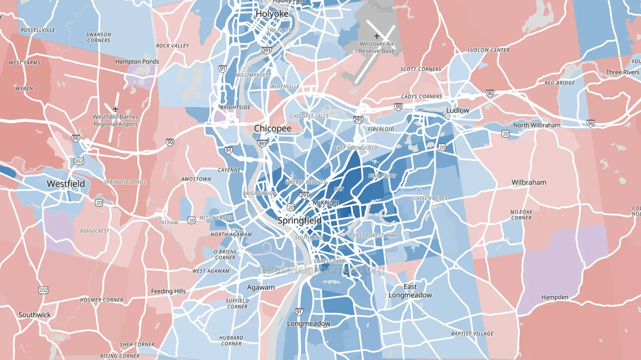
Politics vary noticeably by city within Hampden County. The south side runs the most Democratic (D+32) and the southwest side runs the most Republican (R+6), a spread of about 38 points.
Why Hampden County leans the way it does
This analysis examined 14,881 data points per county to find what predicts political lean and turnout. The items below are a few correlations that stood out for Hampden County, not a ranked or complete list of what matters most.
Dense areas vote Democratic. About 74% of residents in Hampden County live in densely developed areas, about 38 points above the U.S. average of 36%. A high never-married share predicts Democratic voting, and about 42% of adults in Hampden County have never been married, above 95% of counties.
Walkability and Democratic lean
Places with a highly walkable street grid tend to lean Democratic; Hampden County, MA sits in the top tenth nationally on this measure. A walkable street grid does not change how people vote; it mostly reflects how urban a place is.
Why turnout in Hampden County looks the way it does
Turnout in Hampden County sits close to the national pattern. Routine healthcare access, homeownership, education, and food security all land near their national averages here. Learn more about the findings and methodology on the political spectrum map.
Nearby Counties
- Hampshire County, MA D+45
- Franklin County, MA D+22
- Berkshire County, MA D+27
- Worcester County, MA D+12
- Cheshire County, NH Even
- Windham County, VT D+28
- Columbia County, NY D+12
- Providence County, RI D+20
- Kent County, RI D+5
- Bennington County, VT D+17
Counties with Similar Populations
- Burlington County, NJ D+16
- Seminole County, FL R+5
- Virginia Beach City, VA D+9
- Tulare County, CA R+12
- East Baton Rouge Parish, LA D+23
- York County, PA R+21
- Onondaga County, NY D+21
- Solano County, CA D+21
- Knox County, TN R+13
- Prince William County, VA D+21
Sources and methodology
Precinct-level voting records used to fit the model come from Massachusetts Secretary of the Commonwealth, Elections, distributed by the Voting and Election Science Team. Demographic inputs come from the U.S. Census Bureau (ACS 5-year estimates and the 2020 Decennial Census). Health and environmental inputs come from the CDC (PLACES and the Environmental Justice Index). Land cover comes from the USGS and EPA. Election-day and lead-up weather come from PRISM 4km daily grids and the NOAA Global Historical Climatology Network. Mail-voting and election-administration patterns come from the MIT Election Lab's Survey of the Performance of American Elections. Block-group crime detail comes from CrimeGrade. Internet data and modeling support provided by ISPreports.org.
Modeling and analysis by the BestNeighborhood data science team. Full methodology and findings: political spectrum map.
Methodology reviewed by the BestNeighborhood data team. Last updated May 2026.