Heron Walk leans heavily Democratic by roughly 34 points: about 67% of voters vote Democratic and 33% Republican.
[sc name="abovemapcta"]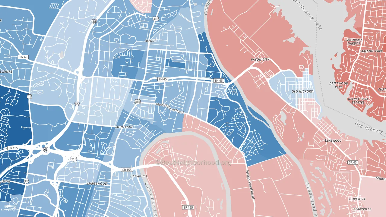 [bestneighborhood_map_controls]
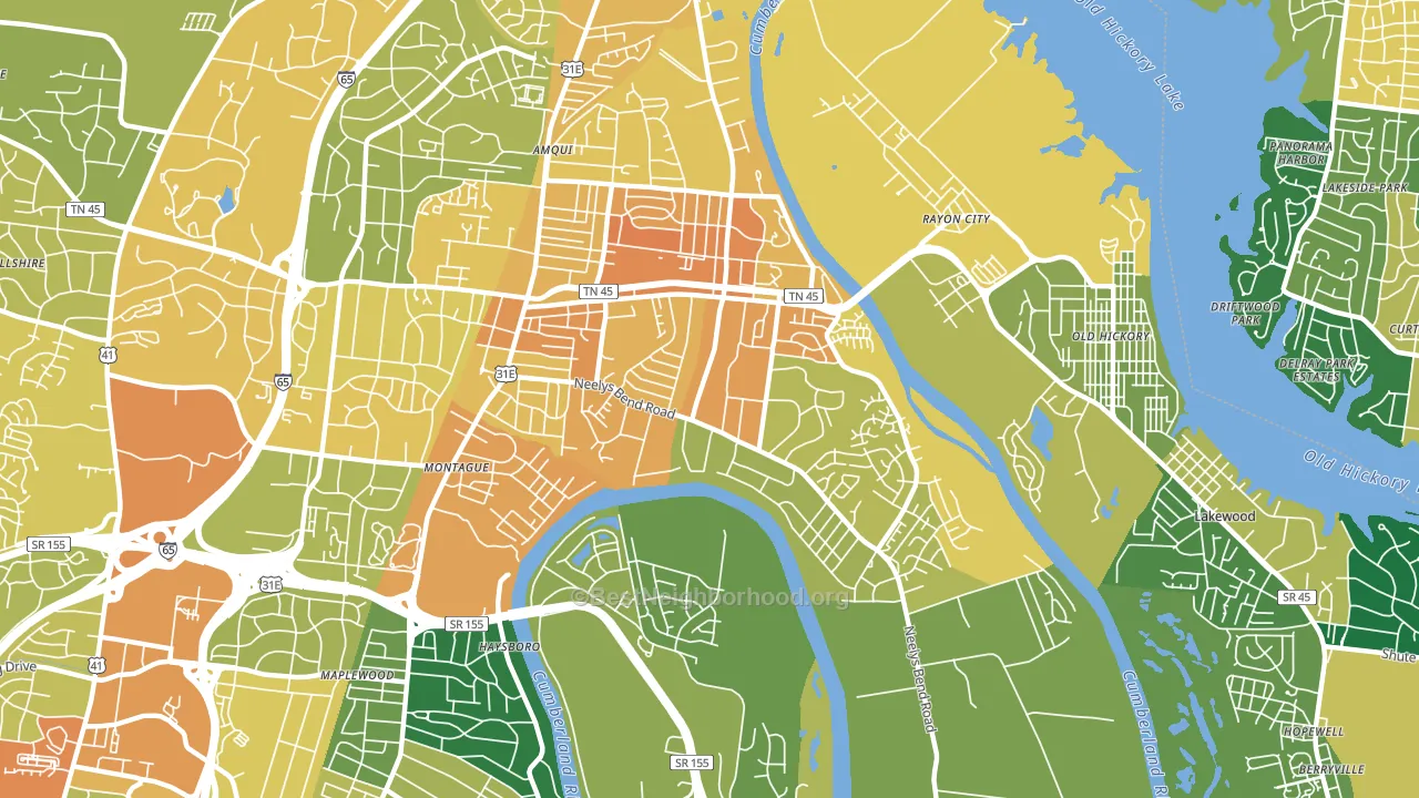
About 43% of adults in Heron Walk typically vote, below the U.S. average of about 62%. Among adults in Heron Walk, ~29% vote Democratic, ~14% Republican, and ~57% don't vote. The map below shows estimated turnout by block group.
 [bestneighborhood_map_controls]
How Heron Walk compares
Among neighborhoods within 5 miles, Heron Walk leans more Democratic than 2 of 5 neighbors.
Heron Walk runs about 63 points more Democratic than Tennessee as a whole. Tennessee leans Republican overall, while Heron Walk is one of the few Democratic-leaning pockets.
Politics vary noticeably by block within Heron Walk. The east side is the most Democratic-leaning (D+49) and the south side is the least Democratic-leaning (D+15), a spread of about 33 points.
Why Heron Walk leans the way it does
This analysis examined 14,881 data points per neighborhood to find what predicts political lean and turnout. The items below are a few correlations that stood out for Heron Walk, not a ranked or complete list of what matters most.
Heron Walk votes against the grain of Tennessee. Tennessee leans Republican overall, while Heron Walk runs about 63 points more Democratic.
High-school completion, uninsured rate, and voter turnout
Places that combine low high-school-completion share and a high uninsured rate tend to turn out at a lower rate, as Heron Walk, Madison, TN does.
Why turnout in Heron Walk looks the way it does
Areas with limited routine healthcare access turn out at lower rates. Heron Walk is in the bottom quarter nationally for routine-care measures such as insurance coverage, preventive screenings, and dental visits. Learn more about the findings and methodology on the political spectrum map.
[one_half]Nearby Neighborhoods
- Inglewood-Riverwood, Nashville, TN D+24
- CCSI-South Inglewood, Nashville, TN D+57
- Rosebank, Nashville, TN D+20
- Capitol View, Nashville, TN D+65
- Brick Church Bellshire, Nashville, TN D+71
- Donelson, Nashville, TN D+5
- Talbot's Corner, Nashville, TN D+59
- Lockeland Springs, Nashville, TN D+54
- Merry Oaks, Nashville, TN D+5
- McFerrin Park, Nashville, TN D+71
Neighborhoods with Similar Populations
- South Broadway, Cleveland, OH D+53
- Old Aurora, New Orleans, LA D+56
- Dupont Circle, Washington, DC D+78
- Woodlawn, Bronx, NY D+26
- Fairmount, Philadelphia, PA D+75
- Mountain View, Bend, OR D+14
- Lincoln Heights, Spokane, WA D+21
- Highland Creek, Charlotte, NC D+38
- St Marys Park, San Francisco, CA D+53
- West Akron, Akron, OH D+76
Sources and methodology
Precinct-level voting records used to fit the model come from Tennessee Secretary of State, Division of Elections, distributed by the Voting and Election Science Team. Demographic inputs come from the U.S. Census Bureau (ACS 5-year estimates and the 2020 Decennial Census). Health and environmental inputs come from the CDC (PLACES and the Environmental Justice Index). Land cover comes from the USGS and EPA. Election-day and lead-up weather come from PRISM 4km daily grids and the NOAA Global Historical Climatology Network. Mail-voting and election-administration patterns come from the MIT Election Lab's Survey of the Performance of American Elections. Block-group crime detail comes from CrimeGrade. Internet data and modeling support provided by ISPreports.org.
Modeling and analysis by the BestNeighborhood data science team. Full methodology and findings: political spectrum map.
Methodology reviewed by the BestNeighborhood data team. Last updated May 2026.