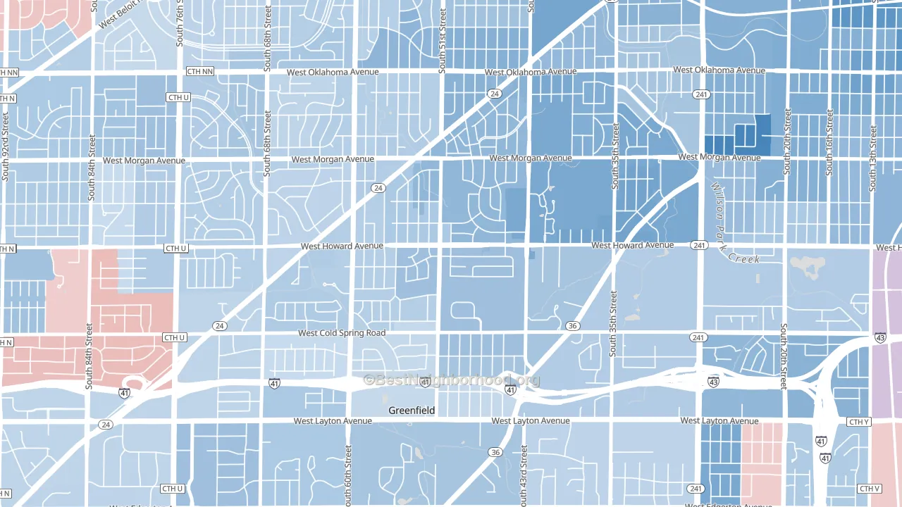
Honey Creek Manor leans slightly Democratic by roughly 8 points: about 54% of voters vote Democratic and 46% Republican.
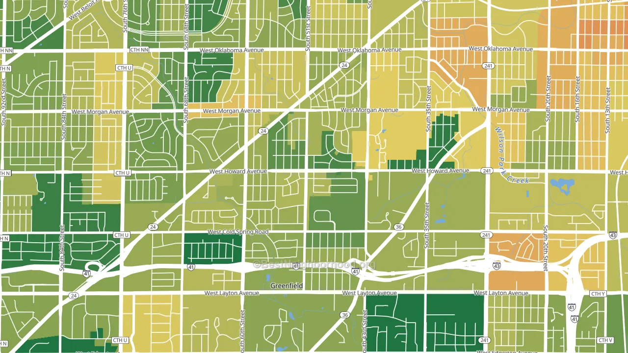
About 76% of adults in Honey Creek Manor typically vote, above the U.S. average of about 62%. Among adults in Honey Creek Manor, ~41% vote Democratic, ~35% Republican, and ~24% don't vote. The map below shows estimated turnout by block group.
How Honey Creek Manor compares
Among neighborhoods within 5 miles, Honey Creek Manor leans more Democratic than 1 of 23 neighbors.
Honey Creek Manor runs about 10 points more Democratic than Wisconsin as a whole.
Politics vary noticeably by block within Honey Creek Manor. The northeast side is the most Democratic-leaning (D+16) and the southwest side is the least Democratic-leaning (D+3), a spread of about 13 points.
Why Honey Creek Manor leans the way it does
Density, race composition, education, and family structure all sit close to their national averages in Honey Creek Manor. The lean here lands roughly where demographic data alone would predict.
Population density and Democratic lean
Places with high population density tend to lean Democratic; Honey Creek Manor, Milwaukee, WI sits above the national average on this measure.
Why turnout in Honey Creek Manor looks the way it does
Areas with strong routine healthcare access turn out at higher rates. Honey Creek Manor is in the top quarter nationally for routine-care measures such as insurance coverage, preventive screenings, and dental visits. The dental-visit rate here is about 68%, about 8 points above the U.S. average of 60%. Learn more about the findings and methodology on the political spectrum map.
Nearby Neighborhoods
- Jackson Park, Milwaukee, WI D+24
- Southpoint, Milwaukee, WI D+19
- Fairview, Milwaukee, WI D+6
- Castle Manor, Milwaukee, WI D+15
- Wilson Park, Milwaukee, WI D+17
- Layton Park, Milwaukee, WI D+31
- Morgandale, Milwaukee, WI D+25
- Mitchell West, Milwaukee, WI D+9
- Polonia, Milwaukee, WI D+32
- Forest Home Hills, Milwaukee, WI D+40
Neighborhoods with Similar Populations
- Delaware-West Ferry, Buffalo, NY D+67
- Downtown Fayetteville, Fayetteville, NC D+63
- Rodgers Forge, Towson, MD D+47
- University Park-Gainsville, Gainesville, FL D+41
- Penrose, Arlington, VA D+58
- Abram-Perezville, Mission, TX R+6
- Northgate Sacramento, Sacramento, CA D+32
- Jefferson-Woodlawn Lake, San Antonio, TX D+36
- Downtown, St. Louis, MO D+67
- Dayton-Campbell Historic District, Hamilton, OH R+11
Sources and methodology
Precinct-level voting records used to fit the model come from Wisconsin Elections Commission, distributed by the Voting and Election Science Team. Demographic inputs come from the U.S. Census Bureau (ACS 5-year estimates and the 2020 Decennial Census). Health and environmental inputs come from the CDC (PLACES and the Environmental Justice Index). Land cover comes from the USGS and EPA. Election-day and lead-up weather come from PRISM 4km daily grids and the NOAA Global Historical Climatology Network. Mail-voting and election-administration patterns come from the MIT Election Lab's Survey of the Performance of American Elections. Block-group crime detail comes from CrimeGrade. Internet data and modeling support provided by ISPreports.org.
Modeling and analysis by the BestNeighborhood data science team. Full methodology and findings: political spectrum map.
Methodology reviewed by the BestNeighborhood data team. Last updated May 2026.