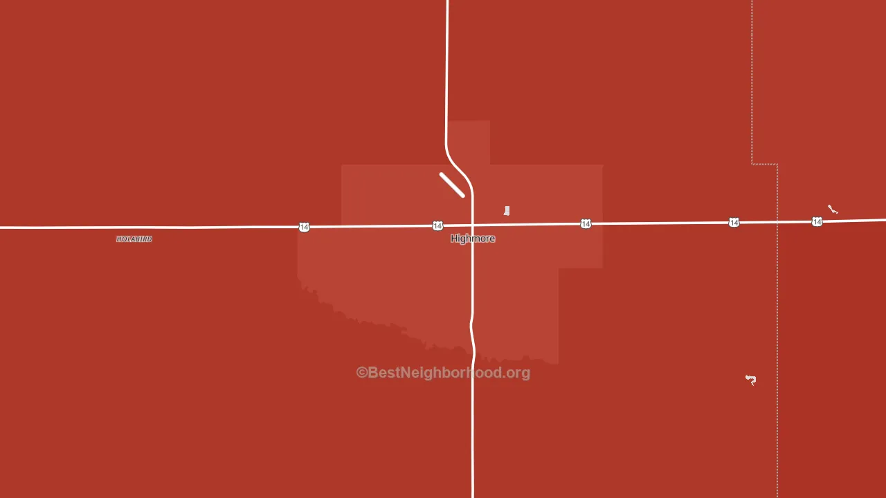
Hyde County is a Republican stronghold. About 20% of voters here vote Democratic and 80% Republican.
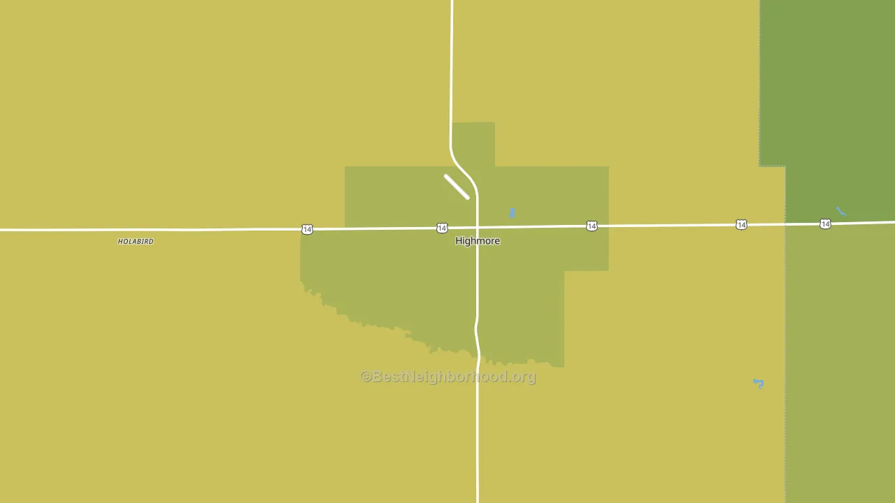
About 65% of adults in Hyde County typically vote, near the U.S. average of about 62%. Among adults in Hyde County, ~13% vote Democratic, ~52% Republican, and ~35% don't vote. The map below shows estimated turnout by block group.
How Hyde County compares
Among counties within 50 miles, Hyde County leans more Republican than 3 of 7 neighbors.
Hyde County runs about 31 points more Republican than South Dakota as a whole.
Why Hyde County leans the way it does
This analysis examined 14,881 data points per county to find what predicts political lean and turnout. The items below are a few correlations that stood out for Hyde County, not a ranked or complete list of what matters most.
Rural areas vote Republican. About 6% of residents in Hyde County live in densely developed areas, about 31 points below the U.S. average of 36%.
Paved land cover and Republican lean
Places with little paved surface tend to lean Republican; Hyde County, SD sits in the bottom quarter nationally on this measure. Paved ground does not change how people vote; it mostly reflects how urban and built-up a place is.
Why turnout in Hyde County looks the way it does
Areas with strong routine healthcare access turn out at higher rates. Hyde County is in the top quarter nationally for routine-care measures such as insurance coverage, preventive screenings, and dental visits. The dental-visit rate here is about 69%, about 9 points above the U.S. average of 60%. Homeowners vote more often than renters, and about 84% of households in Hyde County own their home, above 95% of counties. Learn more about the findings and methodology on the political spectrum map.
Nearby Counties
- Hand County, SD R+62
- Buffalo County, SD D+24
- Sully County, SD R+62
- Lyman County, SD R+5
- Faulk County, SD R+66
- Hughes County, SD R+34
- Potter County, SD R+62
- Stanley County, SD R+49
- Brule County, SD R+52
- Jerauld County, SD R+48
Counties with Similar Populations
- Rock County, NE R+74
- Sheridan County, ND R+69
- Stonewall County, TX R+68
- Greeley County, KS R+68
- Skagway Municipality, AK R+23
- Harding County, SD R+88
- Alpine County, CA D+36
- Issaquena County, MS R+11
- Garfield County, MT R+87
- Sterling County, TX R+80
Sources and methodology
Precinct-level voting records used to fit the model come from South Dakota Secretary of State, Elections, distributed by the Voting and Election Science Team. Demographic inputs come from the U.S. Census Bureau (ACS 5-year estimates and the 2020 Decennial Census). Health and environmental inputs come from the CDC (PLACES and the Environmental Justice Index). Land cover comes from the USGS and EPA. Election-day and lead-up weather come from PRISM 4km daily grids and the NOAA Global Historical Climatology Network. Mail-voting and election-administration patterns come from the MIT Election Lab's Survey of the Performance of American Elections. Block-group crime detail comes from CrimeGrade. Internet data and modeling support provided by ISPreports.org.
Modeling and analysis by the BestNeighborhood data science team. Full methodology and findings: political spectrum map.
Methodology reviewed by the BestNeighborhood data team. Last updated May 2026.