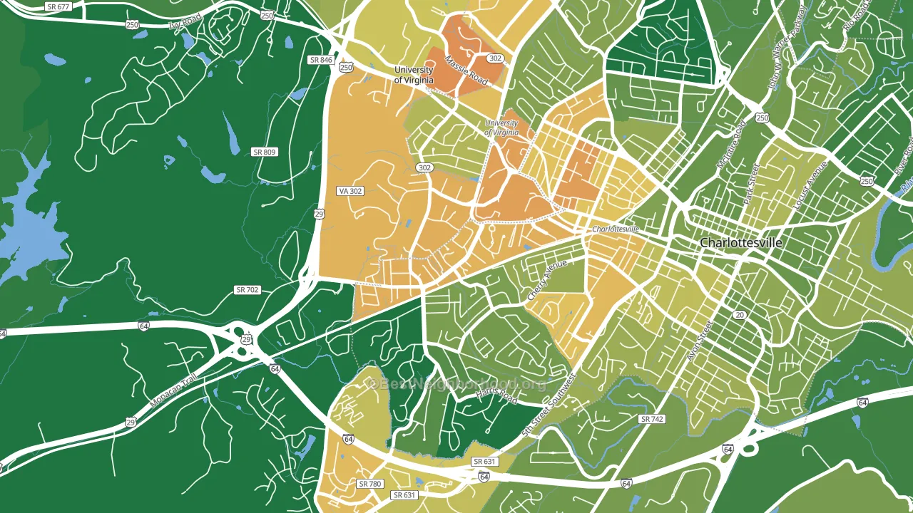
Jefferson Park is a Democratic stronghold. About 81% of voters here vote Democratic and 19% Republican.
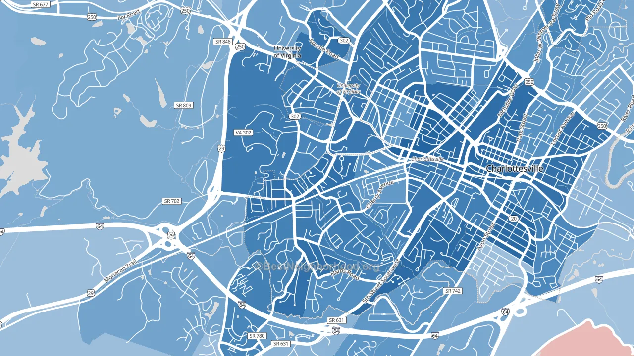
About 43% of adults in Jefferson Park typically vote, below the U.S. average of about 62%. Among adults in Jefferson Park, ~35% vote Democratic, ~8% Republican, and ~57% don't vote. The map below shows estimated turnout by block group.
How Jefferson Park compares
Among neighborhoods within 5 miles, Jefferson Park leans more Democratic than 2 of 3 neighbors.
Jefferson Park runs about 57 points more Democratic than Virginia as a whole.
Why Jefferson Park leans the way it does
This analysis examined 14,881 data points per neighborhood to find what predicts political lean and turnout. The items below are a few correlations that stood out for Jefferson Park, not a ranked or complete list of what matters most.
Areas with high college attainment vote Democratic. About 72% of adults in Jefferson Park hold a bachelor's degree, about 43 points above the U.S. average of 28%. A high never-married share predicts Democratic voting, and about 85% of adults in Jefferson Park have never been married, in the top fraction of neighborhoods.
Preventive-care access and voter turnout
Places with limited routine preventive-care access tend to turn out at a lower rate; Jefferson Park, Charlottesville, VA sits in the bottom quarter nationally on this measure. Dental visits do not drive turnout; the rate reflects income, insurance, and healthcare access, which line up with who votes.
Why turnout in Jefferson Park looks the way it does
Renters vote less often than owners. About 90% of households in Jefferson Park rent, about 65 points above the U.S. average of 25%. Learn more about the findings and methodology on the political spectrum map.
Nearby Neighborhoods
- Fry Springs, Charlottesville, VA D+68
- Venable, Charlottesville, VA D+59
- Belmont-Charlottesville, Charlottesville, VA D+61
- Bedford Hills, Lynchburg, VA R+3
- Miller Park, Lynchburg, VA D+37
- Grayson Hill, Tuckahoe, VA D+20
- Huguenot, Richmond, VA D+21
- Three Chopt, Richmond, VA D+23
- Stratford Hills, Richmond, VA D+38
- Jahnke, Richmond, VA D+74
Neighborhoods with Similar Populations
- Wenonah, Minneapolis, MN D+61
- New Center, Detroit, MI D+80
- Briarfield, Newport News, VA D+55
- Columbia Heights West, Arlington, VA D+40
- Prospect-Shields, Fort Collins, CO D+45
- Ravenswood Gardens, Chicago, IL D+78
- Aberdeen, Pueblo, CO D+13
- Woodmoor, Lochearn, MD D+86
- Hanscom Park, Omaha, NE D+24
- Lone Star, San Antonio, TX D+36
Sources and methodology
Precinct-level voting records used to fit the model come from Virginia Department of Elections, distributed by the Voting and Election Science Team. Demographic inputs come from the U.S. Census Bureau (ACS 5-year estimates and the 2020 Decennial Census). Health and environmental inputs come from the CDC (PLACES and the Environmental Justice Index). Land cover comes from the USGS and EPA. Election-day and lead-up weather come from PRISM 4km daily grids and the NOAA Global Historical Climatology Network. Mail-voting and election-administration patterns come from the MIT Election Lab's Survey of the Performance of American Elections. Block-group crime detail comes from CrimeGrade. Internet data and modeling support provided by ISPreports.org.
Modeling and analysis by the BestNeighborhood data science team. Full methodology and findings: political spectrum map.
Methodology reviewed by the BestNeighborhood data team. Last updated May 2026.