Lafayette County leans heavily Republican by roughly 30 points: about 35% of voters vote Democratic and 65% Republican.
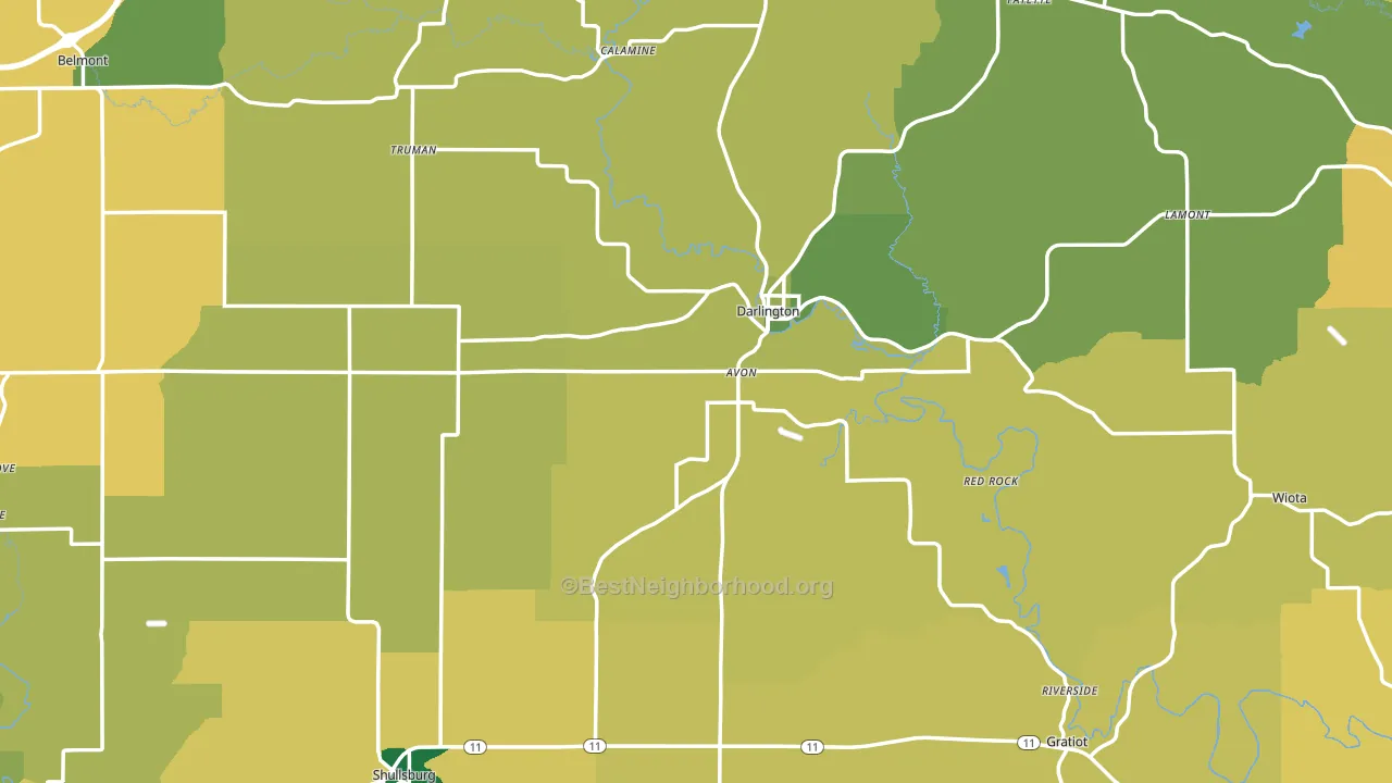
About 66% of adults in Lafayette County typically vote, near the U.S. average of about 62%. Among adults in Lafayette County, ~23% vote Democratic, ~43% Republican, and ~34% don't vote. The map below shows estimated turnout by block group.
How Lafayette County compares
Among counties within 50 miles, Lafayette County leans more Republican than 8 of 10 neighbors.
Lafayette County runs about 30 points more Republican than Wisconsin as a whole.
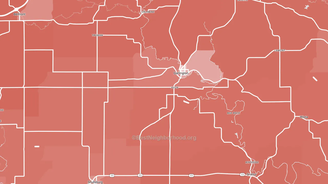
Politics vary noticeably by city within Lafayette County. The southeast side is the most Republican-leaning (R+42) and the northeast side is the least Republican-leaning (R+20), a spread of about 22 points.
Why Lafayette County leans the way it does
Density, race composition, education, and family structure all sit close to their national averages in Lafayette County. The lean here lands roughly where demographic data alone would predict.
Developed land, local retail density, and voter turnout
Places that combine a rural land-use pattern and dense local retail within a mile tend to turn out at a higher rate, as Lafayette County, WI does.
Why turnout in Lafayette County looks the way it does
Turnout in Lafayette County sits close to the national pattern. Routine healthcare access, homeownership, education, and food security all land near their national averages here. Learn more about the findings and methodology on the political spectrum map.
Nearby Counties
- Jo Daviess County, IL R+18
- Iowa County, WI R+11
- Grant County, WI R+23
- Green County, WI R+11
- Dubuque County, IA R+12
- Stephenson County, IL R+14
- Carroll County, IL R+34
- Jackson County, IA R+35
- Dane County, WI D+48
- Richland County, WI R+19
Counties with Similar Populations
- Washburn County, WI R+31
- Socorro County, NM Even
- Phillips County, AR D+20
- Iowa County, IA R+38
- La Paz County, AZ R+28
- Baker County, OR R+41
- Piatt County, IL R+35
- Madison County, IA R+41
- Idaho County, ID R+64
- Lee County, SC D+20
Sources and methodology
Precinct-level voting records used to fit the model come from Wisconsin Elections Commission, distributed by the Voting and Election Science Team. Demographic inputs come from the U.S. Census Bureau (ACS 5-year estimates and the 2020 Decennial Census). Health and environmental inputs come from the CDC (PLACES and the Environmental Justice Index). Land cover comes from the USGS and EPA. Election-day and lead-up weather come from PRISM 4km daily grids and the NOAA Global Historical Climatology Network. Mail-voting and election-administration patterns come from the MIT Election Lab's Survey of the Performance of American Elections. Block-group crime detail comes from CrimeGrade. Internet data and modeling support provided by ISPreports.org.
Modeling and analysis by the BestNeighborhood data science team. Full methodology and findings: political spectrum map.
Methodology reviewed by the BestNeighborhood data team. Last updated May 2026.