Manderfield is a Republican stronghold. About 11% of voters here vote Democratic and 89% Republican.
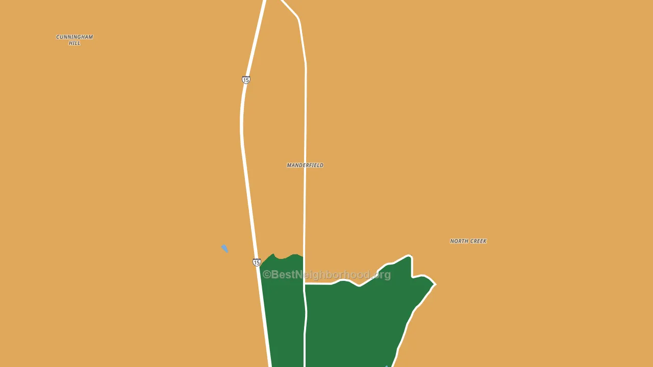
About 45% of adults in Manderfield typically vote, below the U.S. average of about 62%. Among adults in Manderfield, ~5% vote Democratic, ~40% Republican, and ~55% don't vote. The map below shows estimated turnout by block group.
How Manderfield compares
Among cities within 25 miles, Manderfield leans more Republican than 7 of 10 neighbors.
Manderfield runs about 56 points more Republican than Utah as a whole.
Why Manderfield leans the way it does
This analysis examined 14,881 data points per city to find what predicts political lean and turnout. The items below are a few correlations that stood out for Manderfield, not a ranked or complete list of what matters most.
Rural areas vote Republican. About 4% of residents in Manderfield live in densely developed areas, about 28 points below the Utah average of 32%. A high family-household share predicts Republican voting, and about 84% of households in Manderfield are family households, above 96% of cities.
Developed land and Republican lean
Places with a rural land-use pattern tend to lean Republican; Manderfield, UT sits in the bottom quarter nationally on this measure. Developed land does not change how people vote; it mostly reflects how urban a place is.
Why turnout in Manderfield looks the way it does
Crowded housing lines up with lower turnout. About 22% of homes in Manderfield have more than one occupant per room, in the top fraction of cities. Strong routine healthcare access lines up with higher turnout, and Manderfield sits in the top quarter on routine-care measures. Learn more about the findings and methodology on the political spectrum map.
Nearby Cities
- Beaver, UT R+72
- North Creek, UT R+78
- Greenville, UT R+75
- Minersville, UT R+65
- Milford, UT R+59
- Thompsonville, UT R+77
- Marysvale, UT R+76
- Sevier, UT R+75
- Circleville, UT R+79
- Junction, UT R+79
Cities with Similar Populations
- Felty, KY R+76
- Sarton, WV R+56
- Keysburg, KY R+63
- Harrell, AL D+51
- Montpelier Station, VA R+23
- Sweeton Hill, TN R+66
- Kadesh, LA R+63
- West Pelham, MA D+58
- Los Fuertes, CO D+33
- Bodcaw, AR R+62
Sources and methodology
Precinct-level voting records used to fit the model come from Utah Lieutenant Governor's Office, Elections, distributed by the Voting and Election Science Team. Demographic inputs come from the U.S. Census Bureau (ACS 5-year estimates and the 2020 Decennial Census). Health and environmental inputs come from the CDC (PLACES and the Environmental Justice Index). Land cover comes from the USGS and EPA. Election-day and lead-up weather come from PRISM 4km daily grids and the NOAA Global Historical Climatology Network. Mail-voting and election-administration patterns come from the MIT Election Lab's Survey of the Performance of American Elections. Block-group crime detail comes from CrimeGrade. Internet data and modeling support provided by ISPreports.org.
Modeling and analysis by the BestNeighborhood data science team. Full methodology and findings: political spectrum map.
Methodology reviewed by the BestNeighborhood data team. Last updated May 2026.