Manns Harbor is a Republican stronghold. About 22% of voters here vote Democratic and 78% Republican.
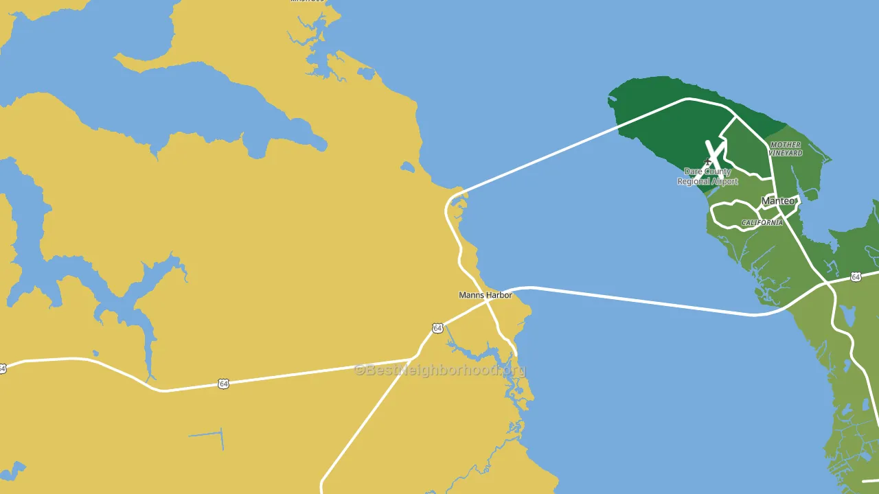
About 53% of adults in Manns Harbor typically vote, below the U.S. average of about 62%. Among adults in Manns Harbor, ~12% vote Democratic, ~41% Republican, and ~47% don't vote. The map below shows estimated turnout by block group.
How Manns Harbor compares
Among cities within 25 miles, Manns Harbor leans more Republican than 13 of 15 neighbors.
Manns Harbor runs about 54 points more Republican than North Carolina as a whole.
Why Manns Harbor leans the way it does
This analysis examined 14,881 data points per city to find what predicts political lean and turnout. The items below are a few correlations that stood out for Manns Harbor, not a ranked or complete list of what matters most.
Rural areas vote Republican. About 2% of residents in Manns Harbor live in densely developed areas, about 25 points below the North Carolina average of 27%.
Population density and Republican lean
Places with low population density tend to lean Republican; Manns Harbor, NC sits in the bottom tenth nationally on this measure.
Why turnout in Manns Harbor looks the way it does
Areas with limited routine healthcare access turn out at lower rates. Manns Harbor is in the bottom quarter nationally for routine-care measures such as insurance coverage, preventive screenings, and dental visits. Renters vote less often than owners, and about 28% of households in Manns Harbor rent, above 81% of cities. High food insecurity lines up with lower turnout, and about 21% of adults in Manns Harbor report food insecurity, above 83% of cities. Learn more about the findings and methodology on the political spectrum map.
Nearby Cities
- Manteo, NC R+27
- Wanchese, NC R+56
- Nags Head, NC R+22
- Buffalo City, NC R+57
- Kill Devil Hills, NC R+21
- Kitty Hawk, NC R+27
- Stumpy Point, NC R+57
- Harbinger, NC R+48
- Southern Shores, NC R+11
- Powells Point, NC R+41
Cities with Similar Populations
- Yosemite, KY R+76
- Copeland, ID R+65
- Stonefort, IL R+66
- Arlington, IN R+60
- Ellenburg Depot, NY R+35
- Moran, KS R+58
- Riverview, OR R+28
- Helm, MO R+69
- Point Hope, AK D+21
- Waterville, WI R+32
Sources and methodology
Precinct-level voting records used to fit the model come from North Carolina State Board of Elections, distributed by the Voting and Election Science Team. Demographic inputs come from the U.S. Census Bureau (ACS 5-year estimates and the 2020 Decennial Census). Health and environmental inputs come from the CDC (PLACES and the Environmental Justice Index). Land cover comes from the USGS and EPA. Election-day and lead-up weather come from PRISM 4km daily grids and the NOAA Global Historical Climatology Network. Mail-voting and election-administration patterns come from the MIT Election Lab's Survey of the Performance of American Elections. Block-group crime detail comes from CrimeGrade. Internet data and modeling support provided by ISPreports.org.
Modeling and analysis by the BestNeighborhood data science team. Full methodology and findings: political spectrum map.
Methodology reviewed by the BestNeighborhood data team. Last updated May 2026.