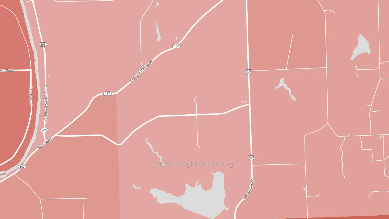
Maple Grove leans Republican by roughly 30 points: about 35% of voters vote Democratic and 65% Republican. These figures are model estimates: Maine did not have precinct-level voting records available for training, so the numbers above come from demographic and health features rather than local ground truth.
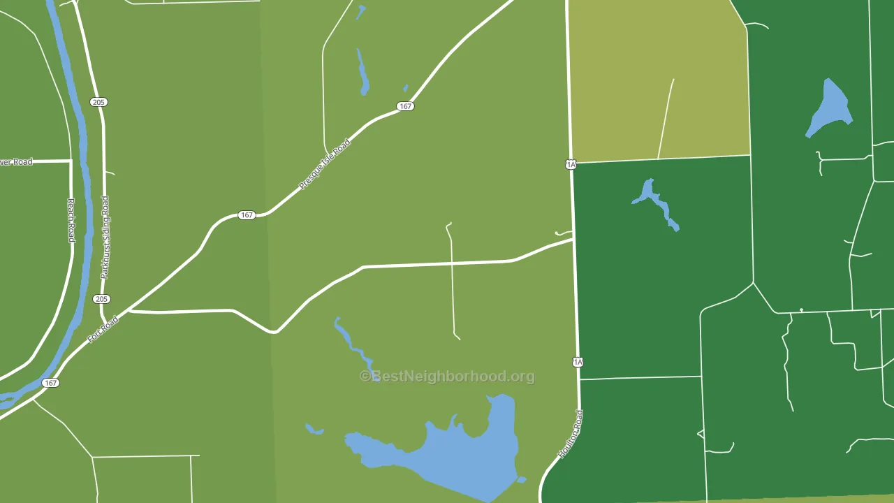
About 72% of adults in Maple Grove typically vote, above the U.S. average of about 62%. Among adults in Maple Grove, ~25% vote Democratic, ~47% Republican, and ~28% don't vote. The map below shows estimated turnout by block group.
How Maple Grove compares
Among cities within 25 miles, Maple Grove leans more Republican than 6 of 26 neighbors.
Maple Grove runs about 36 points more Republican than Maine as a whole. Maine leans Democratic overall, while Maple Grove is one of the few Republican-leaning pockets.
Why Maple Grove leans the way it does
This analysis examined 14,881 data points per city to find what predicts political lean and turnout. The items below are a few correlations that stood out for Maple Grove, not a ranked or complete list of what matters most.
Areas with many family households vote Republican. About 86% of households in Maple Grove are family households, about 19 points above the U.S. average of 67%. Maple Grove runs against the grain of Maine, a Republican-leaning pocket in a Democratic-leaning state.
Walkability and Republican lean
Places with a low walkability score tend to lean Republican; Maple Grove, ME sits below the national average on this measure. A walkable street grid does not change how people vote; it mostly reflects how urban a place is.
Why turnout in Maple Grove looks the way it does
Turnout in Maple Grove sits close to the national pattern. Routine healthcare access, homeownership, education, and food security all land near their national averages here. Learn more about the findings and methodology on the political spectrum map.
Nearby Cities
- Fort Fairfield, ME R+28
- Easton Center, ME R+37
- Easton, ME R+37
- Presque Isle, ME R+17
- Goodrich, ME R+32
- Mars Hill-Blaine, ME R+41
- Westfield, ME R+40
- Morris Corner, ME R+25
- Spragueville, ME R+32
- Caribou, ME R+21
Cities with Similar Populations
- Fritchton, IN R+61
- Wende, AL D+35
- London, MN R+41
- Wendell, NH D+4
- Lockhart, MN R+38
- Oakton, KY R+52
- Ridgeville, TN R+69
- Rasselas, PA R+50
- Randolph, IN R+63
- LeRoy, WI R+47
Sources and methodology
Precinct-level voting records used to fit the model come from Maine Secretary of State, Bureau of Corporations Elections and Commissions, distributed by the Voting and Election Science Team. Demographic inputs come from the U.S. Census Bureau (ACS 5-year estimates and the 2020 Decennial Census). Health and environmental inputs come from the CDC (PLACES and the Environmental Justice Index). Land cover comes from the USGS and EPA. Election-day and lead-up weather come from PRISM 4km daily grids and the NOAA Global Historical Climatology Network. Mail-voting and election-administration patterns come from the MIT Election Lab's Survey of the Performance of American Elections. Block-group crime detail comes from CrimeGrade. Internet data and modeling support provided by ISPreports.org.
Modeling and analysis by the BestNeighborhood data science team. ME did not have precinct-level voting records available for training, so the figures here come from extrapolation across demographic, health, and land-use features rather than local ground truth. Full methodology and findings: political spectrum map.
Methodology reviewed by the BestNeighborhood data team. Last updated May 2026.