McGovern Park is a Democratic stronghold. About 91% of voters here vote Democratic and 9% Republican.
[sc name="abovemapcta"] [bestneighborhood_map_controls]
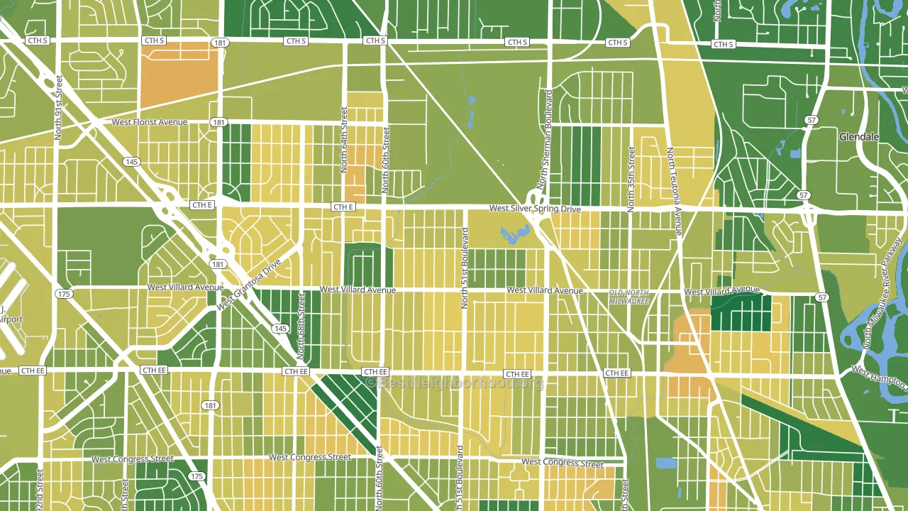
About 65% of adults in McGovern Park typically vote, near the U.S. average of about 62%. Among adults in McGovern Park, ~60% vote Democratic, ~6% Republican, and ~34% don't vote. The map below shows estimated turnout by block group.
 [bestneighborhood_map_controls]
How McGovern Park compares
Among neighborhoods within 5 miles, McGovern Park leans more Democratic than 27 of 39 neighbors.
McGovern Park runs about 83 points more Democratic than Wisconsin as a whole. Wisconsin is roughly evenly split, and McGovern Park sits clearly on the Democratic side.
Why McGovern Park leans the way it does
This analysis examined 14,881 data points per neighborhood to find what predicts political lean and turnout. The items below are a few correlations that stood out for McGovern Park, not a ranked or complete list of what matters most.
McGovern Park votes against the grain of Wisconsin. Wisconsin is roughly evenly split, while McGovern Park runs about 83 points more Democratic. A high never-married share predicts Democratic voting, and about 60% of adults in McGovern Park have never been married, above 93% of neighborhoods.
Preventive-care access and voter turnout
Places with limited routine preventive-care access tend to turn out at a lower rate; McGovern Park, Milwaukee, WI sits in the bottom tenth nationally on this measure. Dental visits do not drive turnout; the rate reflects income, insurance, and healthcare access, which line up with who votes.
Why turnout in McGovern Park looks the way it does
Turnout in McGovern Park sits close to the national pattern. Routine healthcare access, homeownership, education, and food security all land near their national averages here. Learn more about the findings and methodology on the political spectrum map.
[one_half]Nearby Neighborhoods
- Hampton Heights, Milwaukee, WI D+82
- Silver Spring, Milwaukee, WI D+74
- Old North Milwaukee, Milwaukee, WI D+85
- Thurston Woods, Milwaukee, WI D+79
- Lincoln Creek, Milwaukee, WI D+84
- Long View, Milwaukee, WI D+69
- Capitol Heights, Milwaukee, WI D+81
- Columbus Park, Milwaukee, WI D+74
- Menomonee River Hills East, Milwaukee, WI D+63
- Lincoln Park, Milwaukee, WI D+83
Neighborhoods with Similar Populations
- New Auburn, Auburn, ME R+2
- Highlands-Kirkland, Kirkland, WA D+45
- Downtown Wyandotte, Wyandotte, MI Even
- Tri-Court, Lincoln, NE D+5
- Mount Healthy Heights, Cincinnati, OH D+26
- Brookwood, Mobile, AL D+35
- Cobbs Hill, Rochester, NY D+59
- Palmer Heights, Easton, PA R+6
- Clapp Park, Lubbock, TX D+6
- Mercer Heights, Mercer Island, WA D+48
Sources and methodology
Precinct-level voting records used to fit the model come from Wisconsin Elections Commission, distributed by the Voting and Election Science Team. Demographic inputs come from the U.S. Census Bureau (ACS 5-year estimates and the 2020 Decennial Census). Health and environmental inputs come from the CDC (PLACES and the Environmental Justice Index). Land cover comes from the USGS and EPA. Election-day and lead-up weather come from PRISM 4km daily grids and the NOAA Global Historical Climatology Network. Mail-voting and election-administration patterns come from the MIT Election Lab's Survey of the Performance of American Elections. Block-group crime detail comes from CrimeGrade. Internet data and modeling support provided by ISPreports.org.
Modeling and analysis by the BestNeighborhood data science team. Full methodology and findings: political spectrum map.
Methodology reviewed by the BestNeighborhood data team. Last updated May 2026.