Murray leans Republican by roughly 28 points: about 36% of voters vote Democratic and 64% Republican.
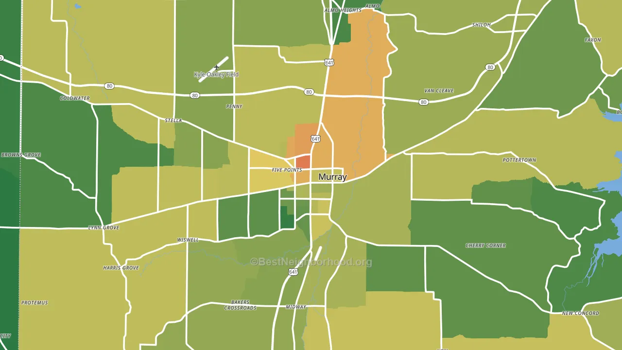
About 61% of adults in Murray typically vote, near the U.S. average of about 62%. Among adults in Murray, ~22% vote Democratic, ~39% Republican, and ~39% don't vote. The map below shows estimated turnout by block group.
How Murray compares
Among cities within 25 miles, Murray is the least Republican-leaning.
Politically, Murray sits close to the rest of Kentucky.
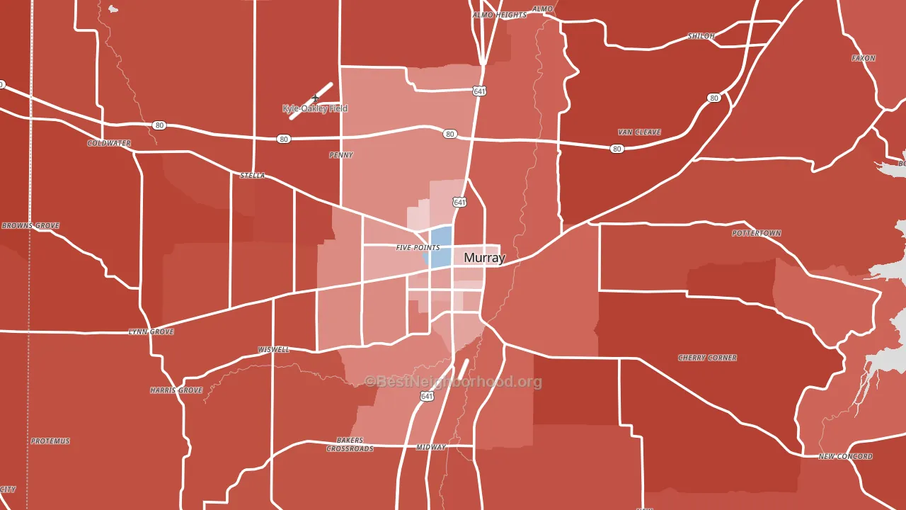
Politics vary noticeably by neighborhood within Murray. The northeast side is the most Republican-leaning (R+58) and the north side is the least Republican-leaning (R+22), a spread of about 37 points.
Why Murray leans the way it does
This analysis examined 14,881 data points per city to find what predicts political lean and turnout. The items below are a few correlations that stood out for Murray, not a ranked or complete list of what matters most.
Murray votes Republican even though it is densely developed (about 51%, far above the Kentucky average of 18%). State and regional patterns outweigh the Democratic lean that density usually predicts here.
Homeownership and voter turnout
Places with renter-heavy households tend to turn out at a lower rate; Murray, KY sits in the bottom tenth nationally on this measure.
Why turnout in Murray looks the way it does
Renters vote less often than owners. About 45% of households in Murray rent, about 20 points above the U.S. average of 25%. Learn more about the findings and methodology on the political spectrum map.
Nearby Cities
- Wiswell, KY R+55
- Almo, KY R+54
- Hazel, KY R+58
- New Providence, KY R+62
- Pleasant Hill, KY R+58
- Lynn Grove, KY R+58
- Coldwater, KY R+60
- Dexter, KY R+60
- Faxon, KY R+58
Cities with Similar Populations
- Lapeer, MI R+30
- Kihei, HI D+20
- West Springfield, VA D+34
- Kahului, HI D+18
- Green, OH R+16
- Tujunga, CA D+4
- Lakeside, FL R+28
- Cave Spring, VA R+13
- Bergenfield, NJ D+8
- Burlington, MA D+19
Sources and methodology
Precinct-level voting records used to fit the model come from Kentucky State Board of Elections, distributed by the Voting and Election Science Team. Demographic inputs come from the U.S. Census Bureau (ACS 5-year estimates and the 2020 Decennial Census). Health and environmental inputs come from the CDC (PLACES and the Environmental Justice Index). Land cover comes from the USGS and EPA. Election-day and lead-up weather come from PRISM 4km daily grids and the NOAA Global Historical Climatology Network. Mail-voting and election-administration patterns come from the MIT Election Lab's Survey of the Performance of American Elections. Block-group crime detail comes from CrimeGrade. Internet data and modeling support provided by ISPreports.org.
Modeling and analysis by the BestNeighborhood data science team. Full methodology and findings: political spectrum map.
Methodology reviewed by the BestNeighborhood data team. Last updated May 2026.