Ophir is a true toss-up. About 50% of voters here vote Democratic and 50% Republican.
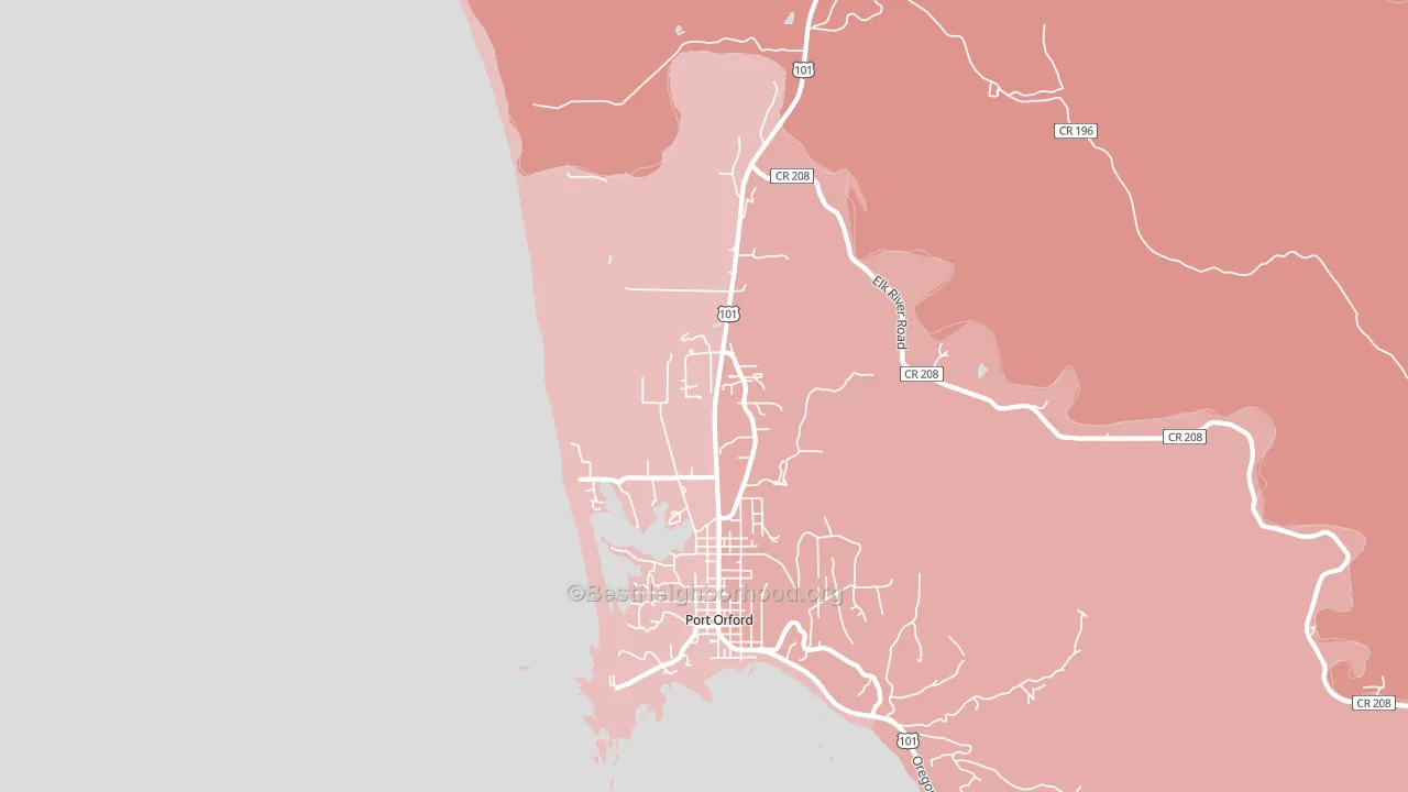
About 87% of adults in Ophir typically vote, above the U.S. average of about 62%. Among adults in Ophir, ~43% vote Democratic, ~44% Republican, and ~13% don't vote. The map below shows estimated turnout by block group.
How Ophir compares
Among cities within 25 miles, Ophir sits roughly in the middle of the political spectrum, with 12 neighbors leaning further in the place's direction and 1 leaning the other way.
Ophir runs about 14 points more Republican than Oregon as a whole.
Why Ophir leans the way it does
Density, race composition, education, and family structure all sit close to their national averages in Ophir. The lean here lands roughly where demographic data alone would predict.
Park access and Democratic lean
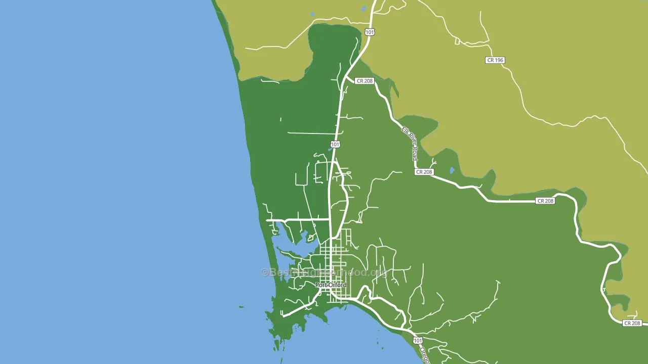
Places with heavy park coverage tend to lean Democratic; Ophir, OR sits in the top quarter nationally on this measure. Park access does not change how people vote; it tends to track denser, higher-income areas.
Why turnout in Ophir looks the way it does
Turnout in Ophir sits close to the national pattern. Routine healthcare access, homeownership, education, and food security all land near their national averages here. Learn more about the findings and methodology on the political spectrum map.
Nearby Cities
- Port Orford, OR Even
- Sixes, OR R+6
- Langlois, OR R+7
- Wedderburn, OR R+16
- Laurel Grove, OR R+9
- Nesika Beach, OR R+17
- Dew Valley, OR R+9
- Twomile, OR R+9
- Powers, OR R+29
- Broadbent, OR R+31
Cities with Similar Populations
- Kniveton, KS R+48
- Lincolnville, OH R+69
- North Paynesville, MI R+24
- Ware, IL R+56
- Littlefield, AZ R+59
- Brookfield Center, VT D+18
- Dolph, AR R+67
- Jamesville, VA R+21
- Waterson, PA R+55
- West Middletown, PA R+48
Sources and methodology
Precinct-level voting records used to fit the model come from Oregon Secretary of State, Elections Division, distributed by the Voting and Election Science Team. Demographic inputs come from the U.S. Census Bureau (ACS 5-year estimates and the 2020 Decennial Census). Health and environmental inputs come from the CDC (PLACES and the Environmental Justice Index). Land cover comes from the USGS and EPA. Election-day and lead-up weather come from PRISM 4km daily grids and the NOAA Global Historical Climatology Network. Mail-voting and election-administration patterns come from the MIT Election Lab's Survey of the Performance of American Elections. Block-group crime detail comes from CrimeGrade. Internet data and modeling support provided by ISPreports.org.
Modeling and analysis by the BestNeighborhood data science team. Full methodology and findings: political spectrum map.
Methodology reviewed by the BestNeighborhood data team. Last updated May 2026.