Philo leans heavily Democratic by roughly 46 points: about 73% of voters vote Democratic and 27% Republican.
About 58% of adults in Philo typically vote, near the U.S. average of about 62%. Among adults in Philo, ~42% vote Democratic, ~16% Republican, and ~42% don't vote. The map below shows estimated turnout by block group.
How Philo compares
Among cities within 25 miles, Philo leans more Democratic than 13 of 21 neighbors.
Philo runs about 26 points more Democratic than California as a whole.
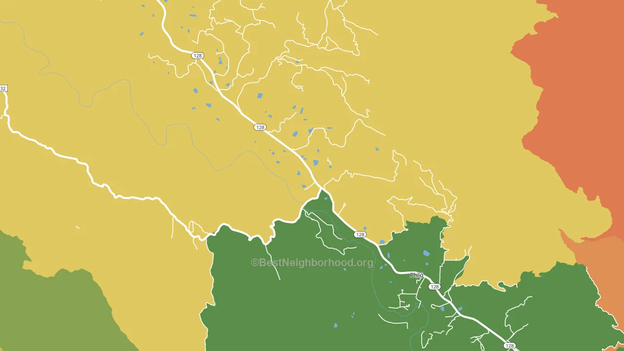
Politics vary noticeably by neighborhood within Philo. The north side is the most Democratic-leaning (D+48) and the southeast side is the least Democratic-leaning (D+32), a spread of about 17 points.
Why Philo leans the way it does
This analysis examined 14,881 data points per city to find what predicts political lean and turnout. The items below are a few correlations that stood out for Philo, not a ranked or complete list of what matters most.
Areas with high college attainment vote Democratic. About 47% of adults in Philo hold a bachelor's degree, about 18 points above the U.S. average of 28%.
Walkability and Democratic lean
Places with a highly walkable street grid tend to lean Democratic; Philo, CA sits in the top quarter nationally on this measure. A walkable street grid does not change how people vote; it mostly reflects how urban a place is.
Why turnout in Philo looks the way it does
Renters vote less often than owners. About 36% of households in Philo rent, about 11 points above the U.S. average of 25%. Crowded housing lines up with lower turnout, and about 5% of homes in Philo have more than one occupant per room, above 89% of cities. Learn more about the findings and methodology on the political spectrum map.
Nearby Cities
- Boonville, CA D+35
- Navarro, CA D+42
- Elk, CA D+50
- Calpella, CA D+17
- Comptche, CA D+45
- Manchester, CA D+51
- Yorkville, CA D+30
- Ukiah, CA D+18
- Albion, CA D+62
- Point Arena, CA D+57
Cities with Similar Populations
- Willshire, OH R+67
- Newbury, VT Even
- Powderly, KY R+57
- Hamburg, IA R+46
- Link, TN R+55
- Bolton, NC D+3
- Sentinel, OK R+79
- Bronte, TX R+78
- Middleville, NY R+49
- Doon, IA R+72
Sources and methodology
Precinct-level voting records used to fit the model come from California Secretary of State, Elections, distributed by the Voting and Election Science Team. Demographic inputs come from the U.S. Census Bureau (ACS 5-year estimates and the 2020 Decennial Census). Health and environmental inputs come from the CDC (PLACES and the Environmental Justice Index). Land cover comes from the USGS and EPA. Election-day and lead-up weather come from PRISM 4km daily grids and the NOAA Global Historical Climatology Network. Mail-voting and election-administration patterns come from the MIT Election Lab's Survey of the Performance of American Elections. Block-group crime detail comes from CrimeGrade. Internet data and modeling support provided by ISPreports.org.
Modeling and analysis by the BestNeighborhood data science team. Full methodology and findings: political spectrum map.
Methodology reviewed by the BestNeighborhood data team. Last updated May 2026.