Piercy leans heavily Democratic by roughly 48 points: about 74% of voters vote Democratic and 26% Republican.
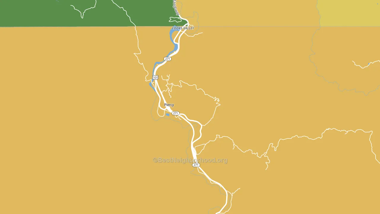
About 50% of adults in Piercy typically vote, below the U.S. average of about 62%. Among adults in Piercy, ~37% vote Democratic, ~13% Republican, and ~50% don't vote. The map below shows estimated turnout by block group.
How Piercy compares
Among cities within 25 miles, Piercy leans more Democratic than 19 of 21 neighbors.
Piercy runs about 28 points more Democratic than California as a whole.
Politics vary noticeably by neighborhood within Piercy. The east side is the most Democratic-leaning (D+53) and the north side is the least Democratic-leaning (D+41), a spread of about 12 points.
Why Piercy leans the way it does
This analysis examined 14,881 data points per city to find what predicts political lean and turnout. The items below are a few correlations that stood out for Piercy, not a ranked or complete list of what matters most.
Areas with high college attainment vote Democratic. About 32% of adults in Piercy hold a bachelor's degree, above 78% of cities.
Preventive-care access and voter turnout
Places with limited routine preventive-care access tend to turn out at a lower rate; Piercy, CA sits below the national average on this measure. Dental visits do not drive turnout; the rate reflects income, insurance, and healthcare access, which line up with who votes.
Why turnout in Piercy looks the way it does
Renters vote less often than owners. About 33% of households in Piercy rent, about 8 points above the U.S. average of 25%. High food insecurity lines up with lower turnout, and about 22% of adults in Piercy report food insecurity, above 86% of cities. Learn more about the findings and methodology on the political spectrum map.
Nearby Cities
- Benbow, CA D+21
- Garberville, CA D+24
- Leggett, CA D+50
- Harris, CA D+32
- Redway, CA D+22
- Briceland, CA D+19
- Whitethorn, CA D+17
- Cummings, CA D+35
- Phillipsville, CA D+19
- Alderpoint, CA D+23
Cities with Similar Populations
- Zinnia, WV R+71
- Giles, AL R+77
- Gayle Mill, SC R+31
- Tillicum, WA R+12
- Nutall Rise, FL R+80
- Pleasant View, PA R+64
- Matthews Crossroads, NC R+2
- West Wellington, AL R+76
- Brewersville, AL D+50
- Greenwood, AL R+86
Sources and methodology
Precinct-level voting records used to fit the model come from California Secretary of State, Elections, distributed by the Voting and Election Science Team. Demographic inputs come from the U.S. Census Bureau (ACS 5-year estimates and the 2020 Decennial Census). Health and environmental inputs come from the CDC (PLACES and the Environmental Justice Index). Land cover comes from the USGS and EPA. Election-day and lead-up weather come from PRISM 4km daily grids and the NOAA Global Historical Climatology Network. Mail-voting and election-administration patterns come from the MIT Election Lab's Survey of the Performance of American Elections. Block-group crime detail comes from CrimeGrade. Internet data and modeling support provided by ISPreports.org.
Modeling and analysis by the BestNeighborhood data science team. Full methodology and findings: political spectrum map.
Methodology reviewed by the BestNeighborhood data team. Last updated May 2026.