Puncheon Camp is a Republican stronghold. About 14% of voters here vote Democratic and 86% Republican.
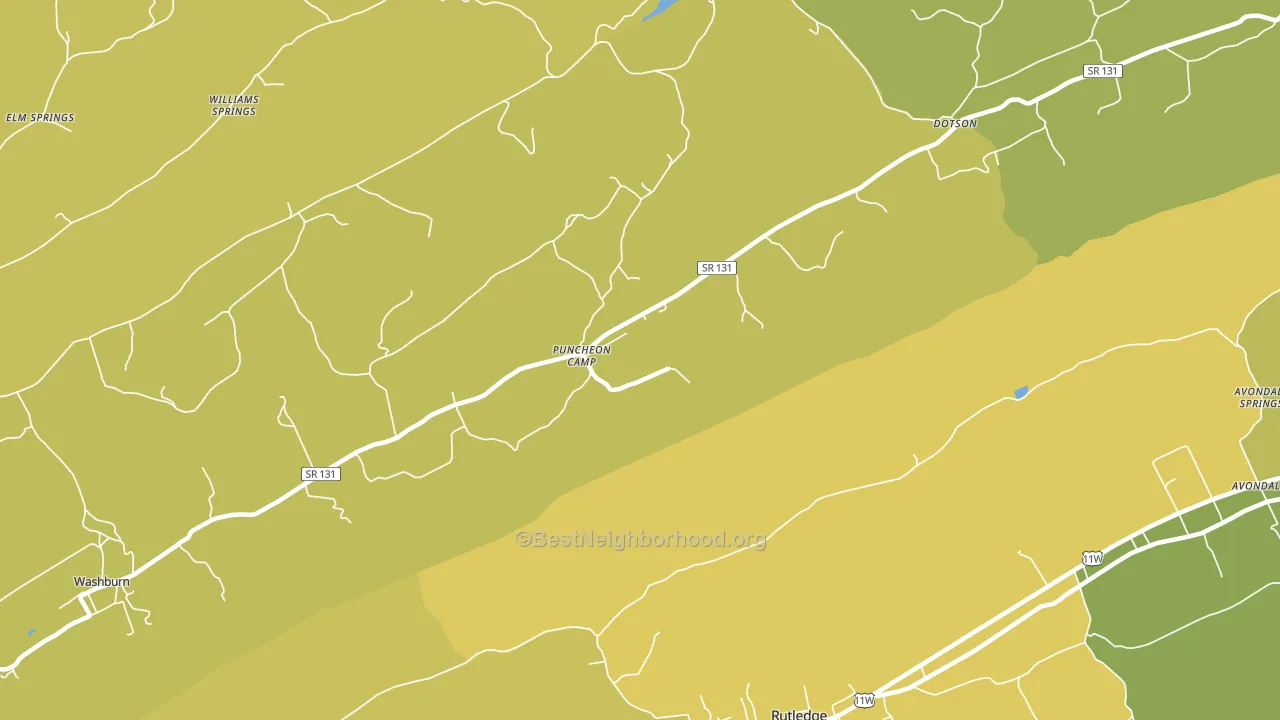
About 58% of adults in Puncheon Camp typically vote, near the U.S. average of about 62%. Among adults in Puncheon Camp, ~8% vote Democratic, ~50% Republican, and ~42% don't vote. The map below shows estimated turnout by block group.
How Puncheon Camp compares
Among cities within 25 miles, Puncheon Camp leans more Republican than 42 of 73 neighbors.
Puncheon Camp runs about 42 points more Republican than Tennessee as a whole.
Why Puncheon Camp leans the way it does
Density, race composition, education, and family structure all sit close to their national averages in Puncheon Camp. The lean here lands roughly where demographic data alone would predict.
Walkability and Republican lean
Places with a low walkability score tend to lean Republican; Puncheon Camp, TN sits in the bottom quarter nationally on this measure. A walkable street grid does not change how people vote; it mostly reflects how urban a place is.
Why turnout in Puncheon Camp looks the way it does
Areas with limited routine healthcare access turn out at lower rates. Puncheon Camp is in the bottom quarter nationally for routine-care measures such as insurance coverage, preventive screenings, and dental visits. The dental-visit rate here is about 48%, about 8 points below the Tennessee average of 56%. Renters vote less often than owners, and about 40% of households in Puncheon Camp rent, compared to around 21% in nearby cities. Low high-school completion lines up with lower turnout, and about 83% of adults in Puncheon Camp have completed high school, below 86% of cities. Learn more about the findings and methodology on the political spectrum map.
Nearby Cities
- Williams Springs, TN R+74
- Washburn, TN R+73
- Rutledge, TN R+71
- Elm Springs, TN R+76
- Wa-Ni Village, TN R+66
- Chittum, TN R+71
- Springdale, TN R+70
- Helton, TN R+70
- Pennington Chapel, TN R+74
- Powder Springs, TN R+74
Cities with Similar Populations
- Oil Valley, KY R+75
- Oakton, MO R+74
- Uniontown, MD R+49
- Direct, TX R+80
- Highland Center, IA R+53
- North Sherburne, VT D+17
- Benson, PA R+53
- Hyco, VA R+32
- Caney City, TX R+64
- Old Frame, PA R+56
Sources and methodology
Precinct-level voting records used to fit the model come from Tennessee Secretary of State, Division of Elections, distributed by the Voting and Election Science Team. Demographic inputs come from the U.S. Census Bureau (ACS 5-year estimates and the 2020 Decennial Census). Health and environmental inputs come from the CDC (PLACES and the Environmental Justice Index). Land cover comes from the USGS and EPA. Election-day and lead-up weather come from PRISM 4km daily grids and the NOAA Global Historical Climatology Network. Mail-voting and election-administration patterns come from the MIT Election Lab's Survey of the Performance of American Elections. Block-group crime detail comes from CrimeGrade. Internet data and modeling support provided by ISPreports.org.
Modeling and analysis by the BestNeighborhood data science team. Full methodology and findings: political spectrum map.
Methodology reviewed by the BestNeighborhood data team. Last updated May 2026.