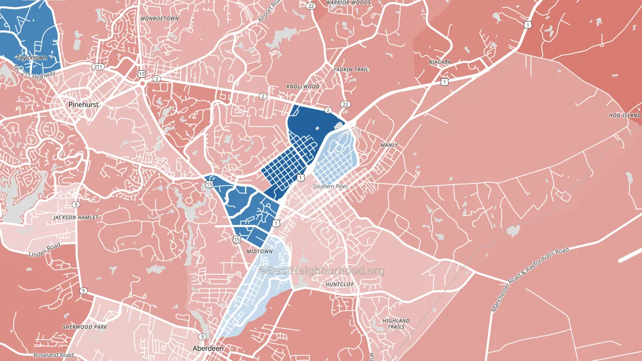
Southern Pines leans slightly Democratic by roughly 6 points: about 53% of voters vote Democratic and 47% Republican.
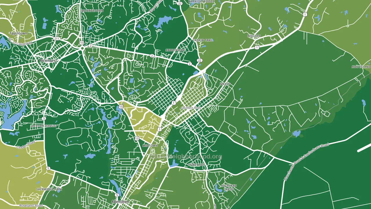
About 91% of adults in Southern Pines typically vote, above the U.S. average of about 62%. Among adults in Southern Pines, ~48% vote Democratic, ~43% Republican, and ~9% don't vote. The map below shows estimated turnout by block group.
How Southern Pines compares
Among cities within 25 miles, Southern Pines leans more Democratic than 43 of 49 neighbors.
Southern Pines runs about 9 points more Democratic than North Carolina as a whole.
Politics vary noticeably by neighborhood within Southern Pines. The southwest side runs the most Democratic (D+49) and the southeast side runs the most Republican (R+11), a spread of about 59 points.
Why Southern Pines leans the way it does
This analysis examined 14,881 data points per city to find what predicts political lean and turnout. The items below are a few correlations that stood out for Southern Pines, not a ranked or complete list of what matters most.
Areas with high college attainment vote Democratic. About 48% of adults in Southern Pines hold a bachelor's degree, about 19 points above the U.S. average of 28%. Dense areas vote Democratic, and Southern Pines sits in the top fifth on density (about 61%, above 90% of cities).
Population density and Democratic lean
Places with high population density tend to lean Democratic; Southern Pines, NC sits in the top quarter nationally on this measure.
Why turnout in Southern Pines looks the way it does
Areas with strong routine healthcare access turn out at higher rates. Southern Pines is in the top quarter nationally for routine-care measures such as insurance coverage, preventive screenings, and dental visits. The dental-visit rate here is about 70%, about 10 points above the U.S. average of 60%. Learn more about the findings and methodology on the political spectrum map.
Nearby Cities
- Aberdeen, NC R+16
- Pinehurst, NC R+18
- Addor, NC R+29
- Whispering Pines, NC R+26
- Lakeview, NC R+43
- Taylortown, NC D+21
- Pinebluff, NC R+17
- Ashley Heights, NC R+43
- Silver Spring, NC R+11
- West End, NC R+32
Cities with Similar Populations
- Pearl River, NY R+24
- Seven Corners, VA D+37
- Otsego, MN R+24
- Sturgeon Bay, WI R+3
- Burlington, WA Even
- Port Royal, SC R+6
- North New Hyde Park, NY R+12
- Mastic Beach, NY R+12
- Ashland City, TN R+55
- Teays Valley, WV R+32
Sources and methodology
Precinct-level voting records used to fit the model come from North Carolina State Board of Elections, distributed by the Voting and Election Science Team. Demographic inputs come from the U.S. Census Bureau (ACS 5-year estimates and the 2020 Decennial Census). Health and environmental inputs come from the CDC (PLACES and the Environmental Justice Index). Land cover comes from the USGS and EPA. Election-day and lead-up weather come from PRISM 4km daily grids and the NOAA Global Historical Climatology Network. Mail-voting and election-administration patterns come from the MIT Election Lab's Survey of the Performance of American Elections. Block-group crime detail comes from CrimeGrade. Internet data and modeling support provided by ISPreports.org.
Modeling and analysis by the BestNeighborhood data science team. Full methodology and findings: political spectrum map.
Methodology reviewed by the BestNeighborhood data team. Last updated May 2026.