Trona leans Republican by roughly 28 points: about 36% of voters vote Democratic and 64% Republican.
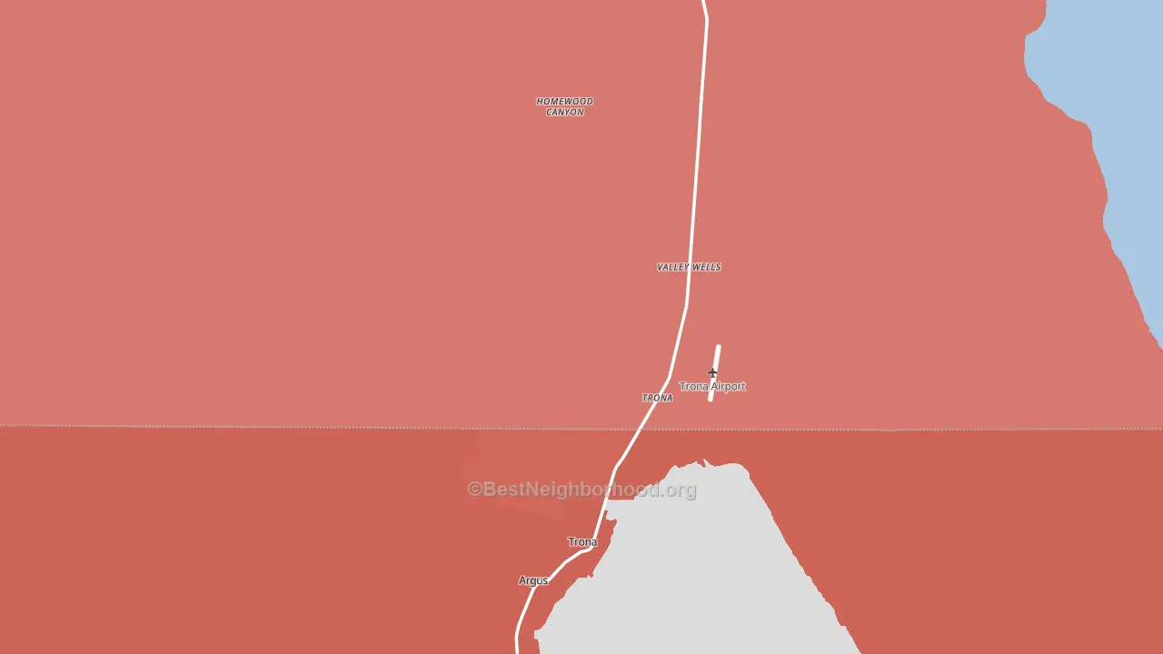
About 42% of adults in Trona typically vote, below the U.S. average of about 62%. Among adults in Trona, ~15% vote Democratic, ~27% Republican, and ~58% don't vote. The map below shows estimated turnout by block group.
How Trona compares
Among cities within 25 miles, Trona leans more Republican than 1 of 3 neighbors.
Trona runs about 48 points more Republican than California as a whole. California leans Democratic overall, while Trona is one of the few Republican-leaning pockets.
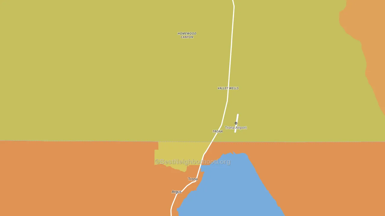
Politics vary noticeably by neighborhood within Trona. The southwest side is the most split-leaning (R+47) and the north side is the least split-leaning (Even), a spread of about 45 points.
Why Trona leans the way it does
This analysis examined 14,881 data points per city to find what predicts political lean and turnout. The items below are a few correlations that stood out for Trona, not a ranked or complete list of what matters most.
Trona votes against the grain of California. California leans Democratic overall, while Trona runs about 48 points more Republican. Rural areas vote Republican, and Trona sits in the bottom quarter on density (fewer than 1%, in the bottom fraction of cities). Low college attainment predicts Republican voting, and Trona sits in the bottom quarter (about 9%, below 94% of cities).
Population density, never-married share, and Republican lean
Places that combine low population density and a never-married-heavy adult population tend to lean Republican, as Trona, CA does.
Why turnout in Trona looks the way it does
Renters vote less often than owners. About 32% of households in Trona rent, about 8 points above the U.S. average of 25%. Learn more about the findings and methodology on the political spectrum map.
Nearby Cities
- Searles Valley, CA R+46
- Ridgecrest, CA R+25
- China Lake Acres, CA R+39
- Inyokern, CA R+40
- Randsburg, CA R+36
- Pearsonville, CA R+33
- Darwin, CA R+11
- Johannesburg, CA R+36
Cities with Similar Populations
- Yancopin, AR R+40
- Yatesville, IL R+52
- Gunsight, TX R+77
- Melrose, AR R+69
- Model, CO R+52
- Crescent, ID R+62
- Melbourne, MO R+73
Sources and methodology
Precinct-level voting records used to fit the model come from California Secretary of State, Elections, distributed by the Voting and Election Science Team. Demographic inputs come from the U.S. Census Bureau (ACS 5-year estimates and the 2020 Decennial Census). Health and environmental inputs come from the CDC (PLACES and the Environmental Justice Index). Land cover comes from the USGS and EPA. Election-day and lead-up weather come from PRISM 4km daily grids and the NOAA Global Historical Climatology Network. Mail-voting and election-administration patterns come from the MIT Election Lab's Survey of the Performance of American Elections. Block-group crime detail comes from CrimeGrade. Internet data and modeling support provided by ISPreports.org.
Modeling and analysis by the BestNeighborhood data science team. Full methodology and findings: political spectrum map.
Methodology reviewed by the BestNeighborhood data team. Last updated May 2026.