Tuscaloosa County leans slightly Republican by roughly 8 points: about 46% of voters vote Democratic and 54% Republican.
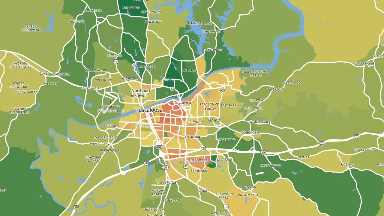
About 62% of adults in Tuscaloosa County typically vote, near the U.S. average of about 62%. Among adults in Tuscaloosa County, ~29% vote Democratic, ~34% Republican, and ~37% don't vote. The map below shows estimated turnout by block group.
How Tuscaloosa County compares
Among counties within 50 miles, Tuscaloosa County leans more Republican than 4 of 9 neighbors.
Tuscaloosa County runs about 22 points more Democratic than Alabama as a whole.
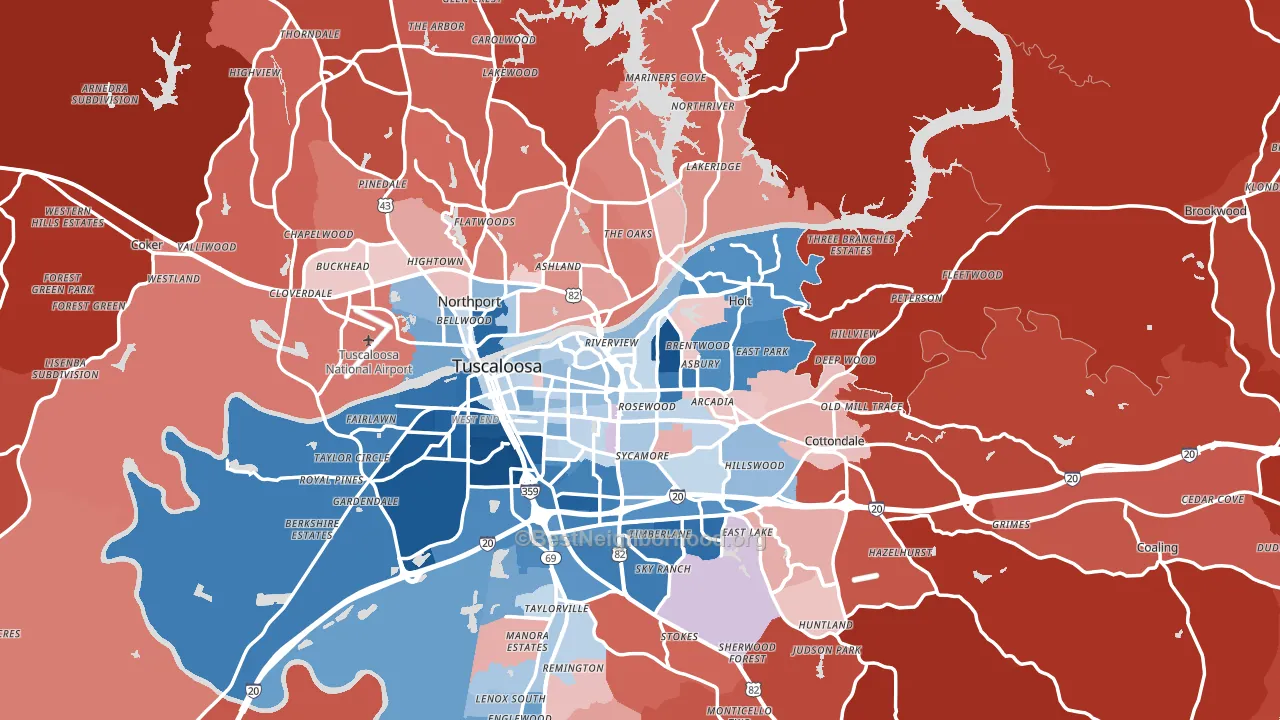
Politics vary noticeably by city within Tuscaloosa County. The south side runs the most Democratic (D+30) and the northeast side runs the most Republican (R+60), a spread of about 89 points.
Why Tuscaloosa County leans the way it does
This analysis examined 14,881 data points per county to find what predicts political lean and turnout. The items below are a few correlations that stood out for Tuscaloosa County, not a ranked or complete list of what matters most.
Tuscaloosa County votes Republican even though it is densely developed (about 56%, far above the Alabama average of 19%). State and regional patterns outweigh the Democratic lean that density usually predicts here.
Cancer-screening access and voter turnout
Places with high colon-cancer-screening access tend to turn out at a higher rate; Tuscaloosa County, AL sits above the national average on this measure. Cancer screening does not drive turnout; it reflects income, insurance, and healthcare access.
Why turnout in Tuscaloosa County looks the way it does
Turnout in Tuscaloosa County sits close to the national pattern. Routine healthcare access, homeownership, education, and food security all land near their national averages here. Learn more about the findings and methodology on the political spectrum map.
Nearby Counties
- Bibb County, AL R+57
- Hale County, AL D+13
- Pickens County, AL R+21
- Greene County, AL D+53
- Fayette County, AL R+68
- Perry County, AL D+41
- Shelby County, AL R+36
- Walker County, AL R+72
- Jefferson County, AL D+20
- Lamar County, AL R+77
Counties with Similar Populations
- Whatcom County, WA D+23
- Jefferson County, MO R+39
- Richmond City, VA D+65
- Hinds County, MS D+52
- Gaston County, NC R+18
- Cabarrus County, NC R+7
- New Hanover County, NC D+5
- Mahoning County, OH Even
- Montgomery County, AL D+38
- Barnstable County, MA D+20
Sources and methodology
Precinct-level voting records used to fit the model come from Alabama Secretary of State, Elections, distributed by the Voting and Election Science Team. Demographic inputs come from the U.S. Census Bureau (ACS 5-year estimates and the 2020 Decennial Census). Health and environmental inputs come from the CDC (PLACES and the Environmental Justice Index). Land cover comes from the USGS and EPA. Election-day and lead-up weather come from PRISM 4km daily grids and the NOAA Global Historical Climatology Network. Mail-voting and election-administration patterns come from the MIT Election Lab's Survey of the Performance of American Elections. Block-group crime detail comes from CrimeGrade. Internet data and modeling support provided by ISPreports.org.
Modeling and analysis by the BestNeighborhood data science team. Full methodology and findings: political spectrum map.
Methodology reviewed by the BestNeighborhood data team. Last updated May 2026.