Warren leans heavily Republican by roughly 38 points: about 31% of voters vote Democratic and 69% Republican.
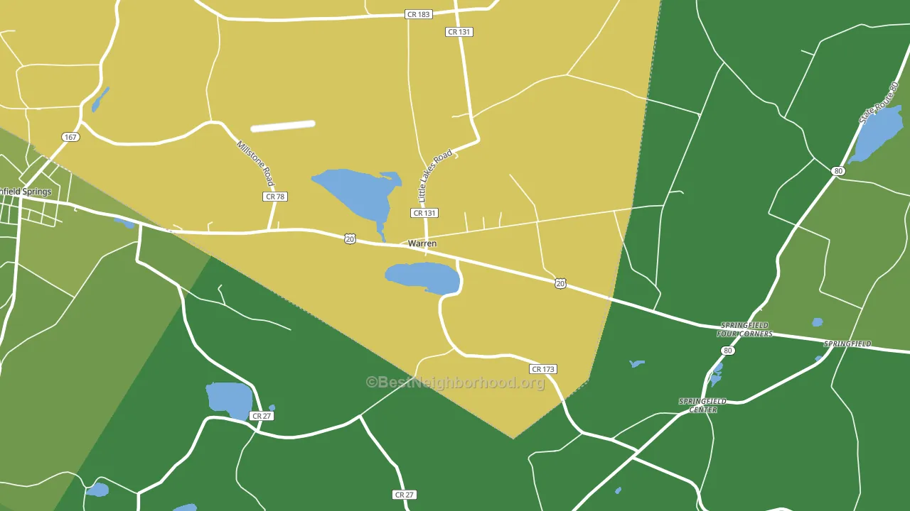
About 66% of adults in Warren typically vote, near the U.S. average of about 62%. Among adults in Warren, ~20% vote Democratic, ~46% Republican, and ~34% don't vote. The map below shows estimated turnout by block group.
How Warren compares
Among cities within 25 miles, Warren leans more Republican than 64 of 130 neighbors.
Warren runs about 51 points more Republican than New York as a whole. New York leans Democratic overall, while Warren is one of the few Republican-leaning pockets.
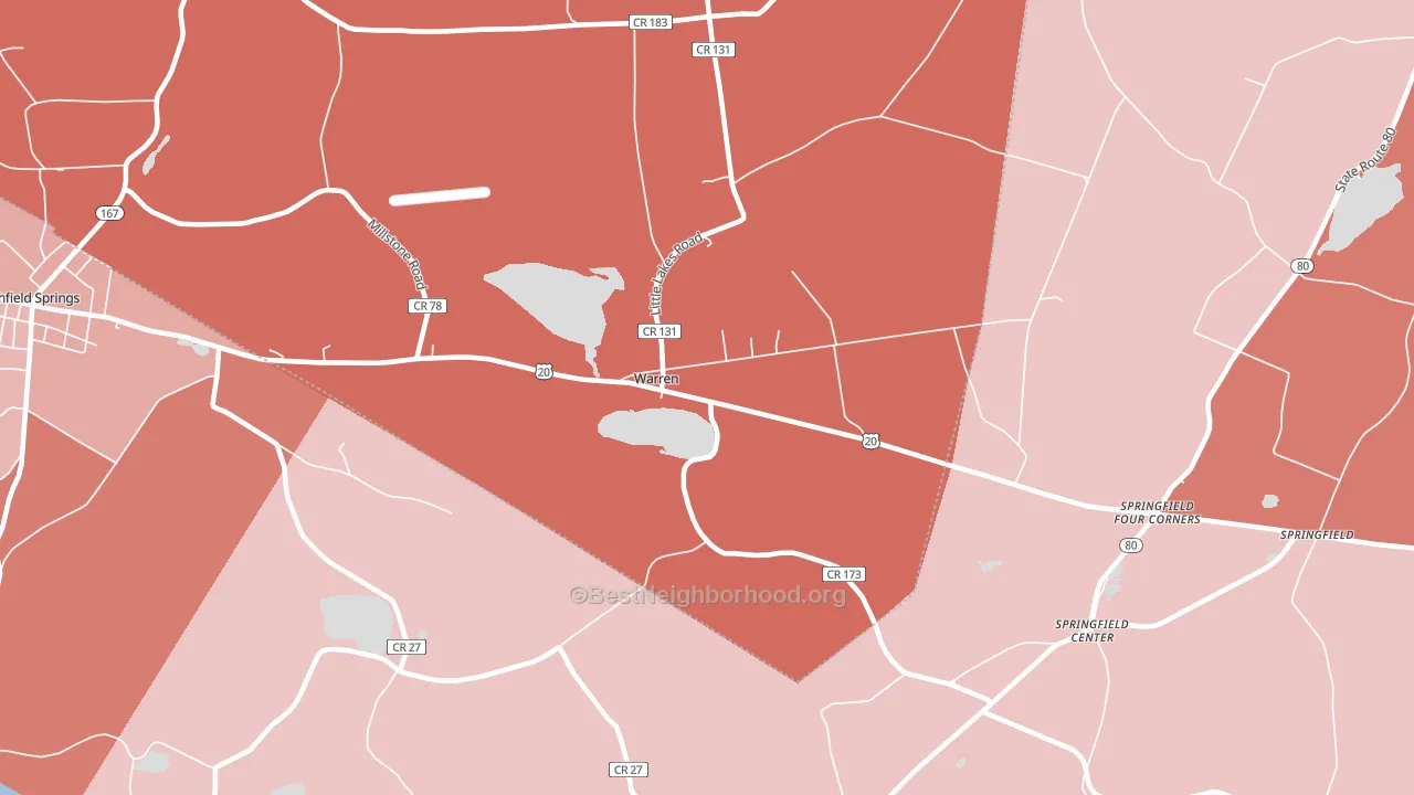
Politics vary noticeably by neighborhood within Warren. The northwest side is the most Republican-leaning (R+48) and the south side is the least Republican-leaning (R+9), a spread of about 39 points.
Why Warren leans the way it does
This analysis examined 14,881 data points per city to find what predicts political lean and turnout. The items below are a few correlations that stood out for Warren, not a ranked or complete list of what matters most.
Warren votes against the grain of New York. New York leans Democratic overall, while Warren runs about 51 points more Republican. A high family-household share predicts Republican voting, and about 76% of households in Warren are family households, above 78% of cities.
Cancer-screening access and voter turnout
Places with high colon-cancer-screening access tend to turn out at a higher rate; Warren, NY sits in the top quarter nationally on this measure. Cancer screening does not drive turnout; it reflects income, insurance, and healthcare access.
Why turnout in Warren looks the way it does
Turnout in Warren sits close to the national pattern. Routine healthcare access, homeownership, education, and food security all land near their national averages here. Learn more about the findings and methodology on the political spectrum map.
Nearby Cities
- Springfield Center, NY R+13
- Richfield Springs, NY R+26
- Jordanville, NY R+47
- Van Hornesville, NY R+35
- South Columbia, NY R+48
- East Springfield, NY R+23
- Pierstown, NY D+28
- Deck, NY R+47
- Richfield, NY R+36
Cities with Similar Populations
- Charleston, KY R+73
- Recluse, WY R+80
- Queen Shoals, WV R+63
- Furman, AL D+34
- Galchutt, ND R+47
- Ralston, WA R+63
- Mystic, MO R+70
- Igerna, NY R+27
- Mountain Park, NM R+31
- Jonestown, IN R+56
Sources and methodology
Precinct-level voting records used to fit the model come from New York State Board of Elections, distributed by the Voting and Election Science Team. Demographic inputs come from the U.S. Census Bureau (ACS 5-year estimates and the 2020 Decennial Census). Health and environmental inputs come from the CDC (PLACES and the Environmental Justice Index). Land cover comes from the USGS and EPA. Election-day and lead-up weather come from PRISM 4km daily grids and the NOAA Global Historical Climatology Network. Mail-voting and election-administration patterns come from the MIT Election Lab's Survey of the Performance of American Elections. Block-group crime detail comes from CrimeGrade. Internet data and modeling support provided by ISPreports.org.
Modeling and analysis by the BestNeighborhood data science team. Full methodology and findings: political spectrum map.
Methodology reviewed by the BestNeighborhood data team. Last updated May 2026.