Williamsburg is a Republican stronghold. About 17% of voters here vote Democratic and 83% Republican.
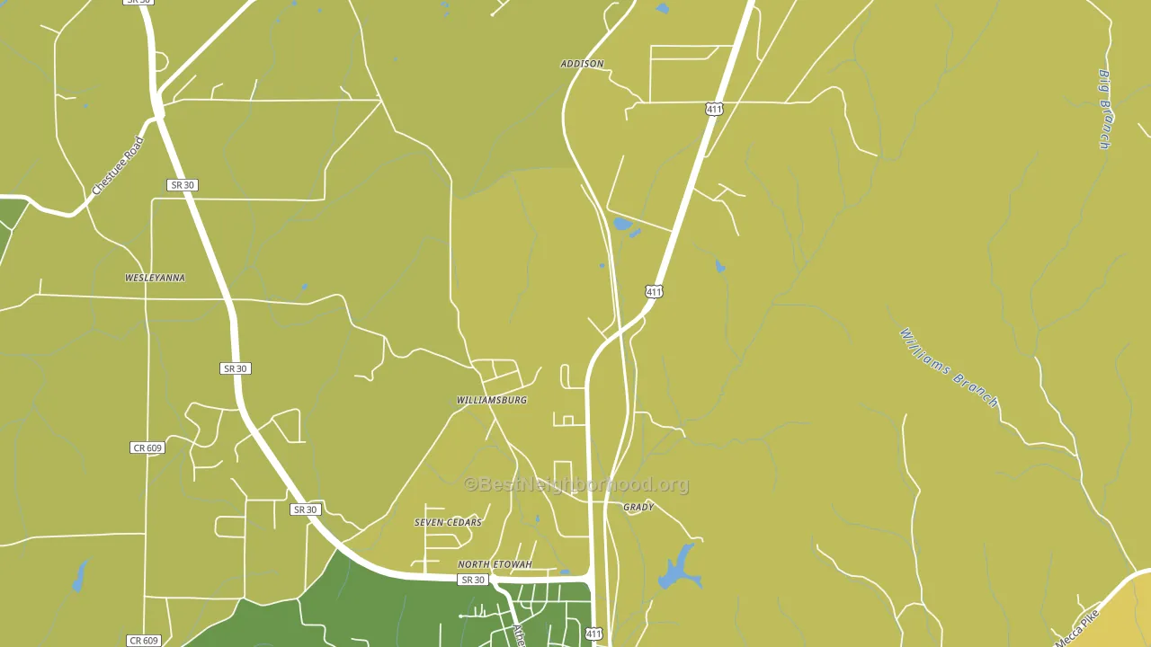
About 61% of adults in Williamsburg typically vote, near the U.S. average of about 62%. Among adults in Williamsburg, ~10% vote Democratic, ~51% Republican, and ~39% don't vote. The map below shows estimated turnout by block group.
How Williamsburg compares
Among cities within 25 miles, Williamsburg leans more Republican than 17 of 66 neighbors.
Williamsburg runs about 37 points more Republican than Tennessee as a whole.
Why Williamsburg leans the way it does
This analysis examined 14,881 data points per city to find what predicts political lean and turnout. The items below are a few correlations that stood out for Williamsburg, not a ranked or complete list of what matters most.
Car-dependent areas vote Republican. About 90% of residents in Williamsburg drive to work alone, about 16 points above the U.S. average of 74%.
Housing overcrowding and voter turnout
Places with heavy housing overcrowding tend to turn out at a lower rate; Williamsburg, TN sits in the top tenth nationally on this measure.
Why turnout in Williamsburg looks the way it does
Areas with low high-school completion turn out at lower rates. About 86% of adults in Williamsburg have completed high school, below 76% of cities. Learn more about the findings and methodology on the political spectrum map.
Nearby Cities
- Etowah, TN R+60
- Englewood, TN R+68
- East Etowah, TN R+65
- Nonaburg, TN R+71
- New Bethel, TN R+64
- Bullet Creek, TN R+71
- Athens, TN R+53
- Delano, TN R+70
- South Liberty, TN R+70
Cities with Similar Populations
- North Sherburne, VT D+17
- Wakenda, MO R+68
- Brinsmade, ND R+47
- Getchell, WA R+30
- Benson, PA R+53
- Merritt, MO R+75
- Coulters, PA R+37
- Kents Corners, NY R+41
- Cherryville, PA R+33
- Johnstown, NE R+74
Sources and methodology
Precinct-level voting records used to fit the model come from Tennessee Secretary of State, Division of Elections, distributed by the Voting and Election Science Team. Demographic inputs come from the U.S. Census Bureau (ACS 5-year estimates and the 2020 Decennial Census). Health and environmental inputs come from the CDC (PLACES and the Environmental Justice Index). Land cover comes from the USGS and EPA. Election-day and lead-up weather come from PRISM 4km daily grids and the NOAA Global Historical Climatology Network. Mail-voting and election-administration patterns come from the MIT Election Lab's Survey of the Performance of American Elections. Block-group crime detail comes from CrimeGrade. Internet data and modeling support provided by ISPreports.org.
Modeling and analysis by the BestNeighborhood data science team. Full methodology and findings: political spectrum map.
Methodology reviewed by the BestNeighborhood data team. Last updated May 2026.