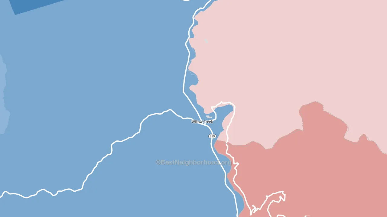
Willow Creek leans slightly Democratic by roughly 10 points: about 55% of voters vote Democratic and 45% Republican.
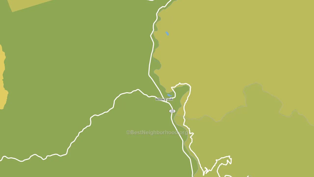
About 59% of adults in Willow Creek typically vote, near the U.S. average of about 62%. Among adults in Willow Creek, ~32% vote Democratic, ~27% Republican, and ~41% don't vote. The map below shows estimated turnout by block group.
How Willow Creek compares
Among cities within 25 miles, Willow Creek leans more Democratic than 5 of 18 neighbors.
Willow Creek runs about 10 points more Republican than California as a whole.
Politics vary noticeably by neighborhood within Willow Creek. The west side is the most Democratic-leaning (D+15) and the northeast side is the least Democratic-leaning (D+4), a spread of about 12 points.
Why Willow Creek leans the way it does
This analysis examined 14,881 data points per city to find what predicts political lean and turnout. The items below are a few correlations that stood out for Willow Creek, not a ranked or complete list of what matters most.
Areas with high college attainment vote Democratic. About 35% of adults in Willow Creek hold a bachelor's degree, about 7 points above the U.S. average of 28%. A high never-married share predicts Democratic voting, and about 38% of adults in Willow Creek have never been married, above 91% of cities.
Population density and Republican lean
Places with low population density tend to lean Republican; Willow Creek, CA sits in the bottom tenth nationally on this measure.
Why turnout in Willow Creek looks the way it does
Renters vote less often than owners. About 40% of households in Willow Creek rent, about 15 points above the U.S. average of 25%. Learn more about the findings and methodology on the political spectrum map.
Nearby Cities
- Salyer, CA R+9
- Hoopa, CA D+46
- Burnt Ranch, CA R+11
- Korbel, CA D+36
- Weitchpec, CA D+38
- Blue Lake, CA D+34
- Fieldbrook, CA D+40
Cities with Similar Populations
- Port Sanilac, MI R+39
- Dunlap, IA R+45
- Turtletown, TN R+74
- Stanford, IN R+45
- Pahala, HI D+23
- Dove, MO R+69
- Cadwell, GA R+74
- Sugar Valley, GA R+74
- Flat Lick, KY R+72
- Mountain City, GA R+56
Sources and methodology
Precinct-level voting records used to fit the model come from California Secretary of State, Elections, distributed by the Voting and Election Science Team. Demographic inputs come from the U.S. Census Bureau (ACS 5-year estimates and the 2020 Decennial Census). Health and environmental inputs come from the CDC (PLACES and the Environmental Justice Index). Land cover comes from the USGS and EPA. Election-day and lead-up weather come from PRISM 4km daily grids and the NOAA Global Historical Climatology Network. Mail-voting and election-administration patterns come from the MIT Election Lab's Survey of the Performance of American Elections. Block-group crime detail comes from CrimeGrade. Internet data and modeling support provided by ISPreports.org.
Modeling and analysis by the BestNeighborhood data science team. Full methodology and findings: political spectrum map.
Methodology reviewed by the BestNeighborhood data team. Last updated May 2026.