Willow is a Democratic stronghold. About 87% of voters here vote Democratic and 13% Republican.
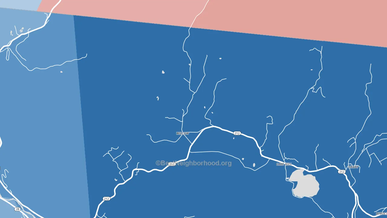
About 83% of adults in Willow typically vote, above the U.S. average of about 62%. Among adults in Willow, ~72% vote Democratic, ~11% Republican, and ~17% don't vote. The map below shows estimated turnout by block group.
How Willow compares
Among cities within 25 miles, Willow leans more Democratic than 112 of 114 neighbors.
Willow runs about 62 points more Democratic than New York as a whole.
Why Willow leans the way it does
This analysis examined 14,881 data points per city to find what predicts political lean and turnout. The items below are a few correlations that stood out for Willow, not a ranked or complete list of what matters most.
Areas with high college attainment vote Democratic. About 69% of adults in Willow hold a bachelor's degree, about 40 points above the U.S. average of 28%.
Park access and Democratic lean
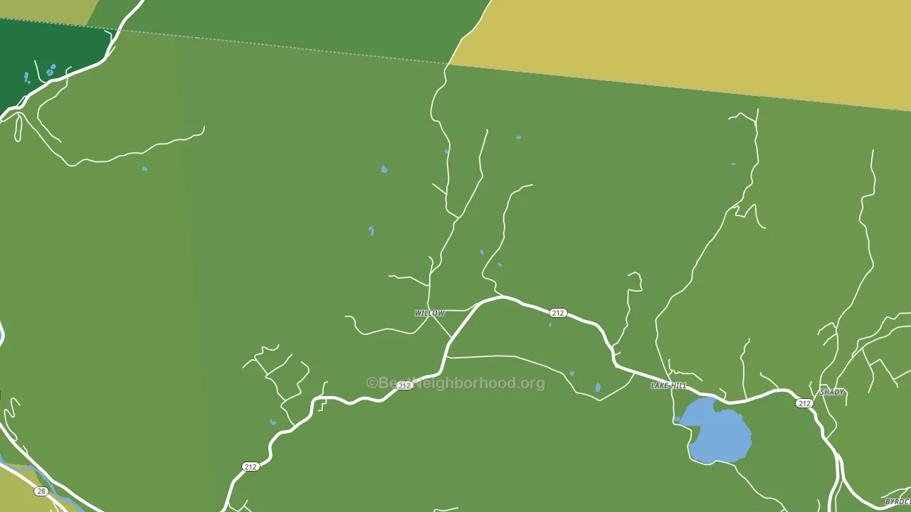
Places with heavy park coverage tend to lean Democratic; Willow, NY sits in the top tenth nationally on this measure. Park access does not change how people vote; it tends to track denser, higher-income areas.
Why turnout in Willow looks the way it does
Areas with strong routine healthcare access turn out at higher rates. Willow is in the top quarter nationally for routine-care measures such as insurance coverage, preventive screenings, and dental visits. The dental-visit rate here is about 74%, about 14 points above the U.S. average of 60%. Homeowners vote more often than renters, and about 92% of households in Willow own their home, about 17 points above the U.S. average of 75%. High high-school completion lines up with higher turnout, and about 99% of adults in Willow have completed high school, above 98% of cities. Learn more about the findings and methodology on the political spectrum map.
Nearby Cities
- Lake Hill, NY D+75
- Mount Tremper, NY D+52
- Chichester, NY D+39
- Bearsville, NY D+76
- Lanesville, NY R+14
- Boiceville, NY D+29
- Phoenicia, NY D+37
- Glenford, NY D+42
- Woodstock, NY D+61
- Shokan, NY D+24
Cities with Similar Populations
- Melvin, KY R+60
- Mellott, IN R+67
- Jameson, MN R+26
- Maplehurst, NY R+43
- Lynchburg, MO R+73
- Whiting, ME R+28
- Harmony Grove, TN R+69
- Glendon, PA R+15
- Hutchinson, PA R+43
- McKinnon, FL R+68
Sources and methodology
Precinct-level voting records used to fit the model come from New York State Board of Elections, distributed by the Voting and Election Science Team. Demographic inputs come from the U.S. Census Bureau (ACS 5-year estimates and the 2020 Decennial Census). Health and environmental inputs come from the CDC (PLACES and the Environmental Justice Index). Land cover comes from the USGS and EPA. Election-day and lead-up weather come from PRISM 4km daily grids and the NOAA Global Historical Climatology Network. Mail-voting and election-administration patterns come from the MIT Election Lab's Survey of the Performance of American Elections. Block-group crime detail comes from CrimeGrade. Internet data and modeling support provided by ISPreports.org.
Modeling and analysis by the BestNeighborhood data science team. Full methodology and findings: political spectrum map.
Methodology reviewed by the BestNeighborhood data team. Last updated May 2026.