
Enter your city or zip code below to see how conservative or liberal each neighborhood in the area is likely to lean.
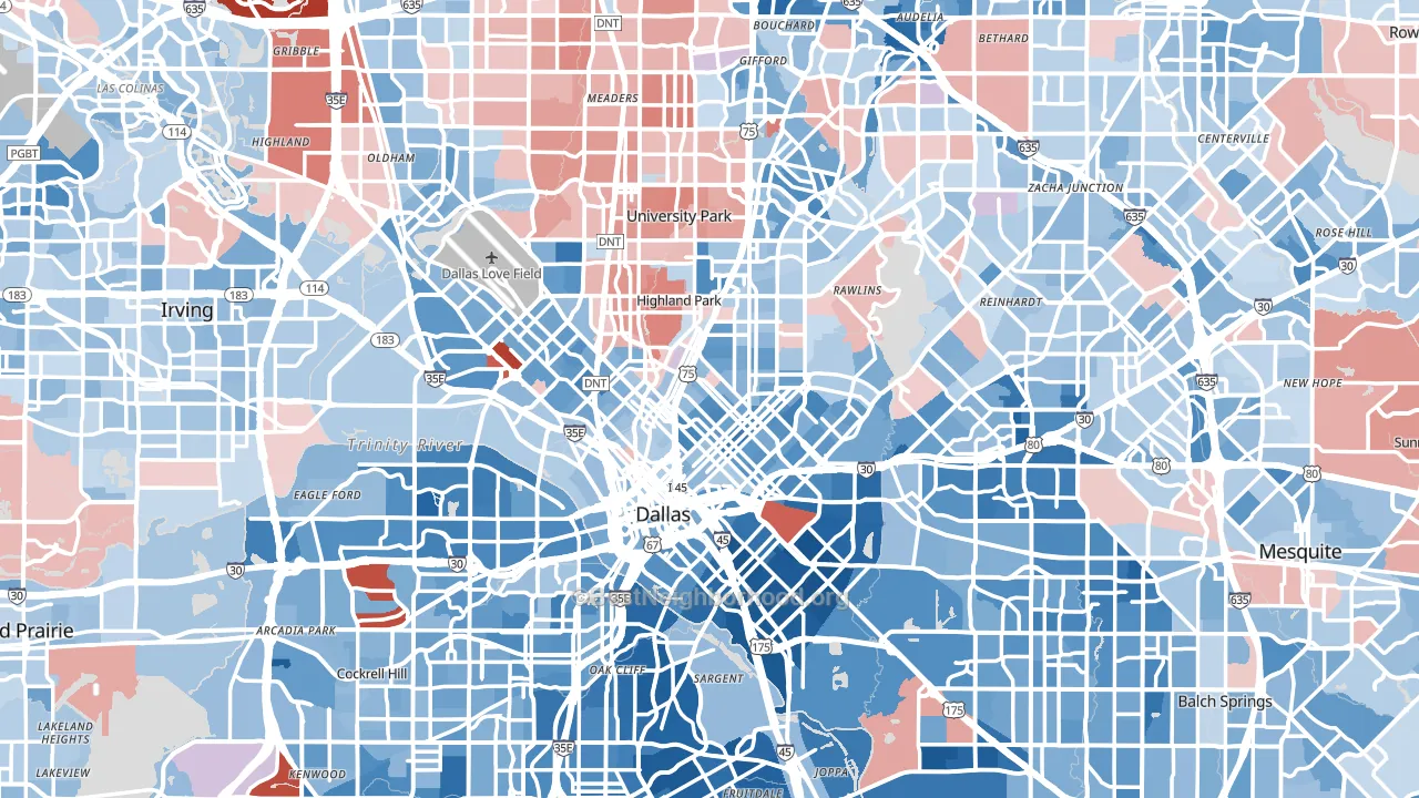
An example political map of Dallas, TX
Why Do People Vote Democrat or Republican? Why Do They Vote at All?
This map shows the predicted partisan political lean of every census block in all 50 states plus the District of Columbia. The predictions come from a model trained on actual election results in hundreds of thousands of voting precincts across 45 states, then projected to the block-group level using public demographic, health, environmental, and land-use data that exists for the whole country. It is shockingly accurate and more detailed than the most-detailed precinct data you could find.
The goal is to estimate where conservative-leaning and liberal-leaning residents likely live. Predicting who will win a future election is a different problem. That depends on candidates, mobilization, weather, and ballot composition. And while our model is good enough to be predictive, this isn’t the problem we’re trying to solve. Our focus is on helping you determine the best place for you to live and work.
Across the 45 states (plus DC) where 2024 precinct results were published and used in training, the model captures about 92% of the variation in precinct-level partisan lean on precincts it never saw during training. That is what you are looking at across most of the map. As a stricter stress test of the model’s underlying skill, when entire states are held out of training so the model has to reconstruct a state’s partisanship from features alone, it still captures about 87% of the variation. The “How Accurate Is It” section below puts both numbers in context.
Why this is a bigger deal than you might think: We don’t have the resources of a large political think tank or new site, but we do have a better map. Most political maps stop at the county level, which can hide the actual political character of a neighborhood. Our former map took local elections into account, but was not detailed enough. A liberal college town inside a conservative county looks identical to its rural neighbors on a county map. A conservative suburb inside a liberal metro looks identical to the downtown.
Block-level estimates show those internal contrasts. The US Census does an excellent job drawing lines around neighborhoods that look similar. People moving to a new area often want to know what kind of neighbors they will have politically. People who already live somewhere often want to know how their block compares to the rest of the city. Other people will be curious about the geography of partisan sorting more generally.
This page is neutral on the merits of either lean. The model describes what is there, not what should be.
Key Findings
The model was built up iteratively, adding one new data source or testing one refinement at a time. Several patterns surfaced that are worth highlighting, including a few that contradict common assumptions about how American neighborhoods sort politically. If the urban-rural divide doesn’t surprise you… well, keep reading.
The urban-form factor
The top features for predicting partisan lean look like five separate variables: population density, walkability, the share of impervious surface, park access, and developed land cover. They are not five separate factors. They are five measurements of one underlying thing, namely how urban and walkable a place is.
Together these features account for about 29% of the model’s explanatory power for partisan lean. The pattern is stark. The most rural quartile of census blocks averages roughly 45 lean-points to the Republican side. The densest and most walkable quartile averages 30 to 32 lean-points to the Democratic side. A spread of about 75 lean-points separates one end of the urban-form spectrum from the other.
The lesson is that “urban vs rural” remains the single biggest geographic predictor of how a neighborhood votes in 2024. Several modern measurements (the EPA’s National Walkability Index, satellite-derived imperviousness, park access, and road-network density) all read off the same underlying axis.
The insurance and turnout story
A cluster of health-access measurements (insurance coverage, food insecurity, preventive dental visits, cholesterol screening, social-support availability, food-stamp uptake) together explains roughly 20% of the variation in voter turnout across U.S. precincts. Among these, the share of adults without health insurance is the most policy-actionable single measurement. The basic relationship: in the well-insured quartile of precincts, voter turnout averages 74% of voting-age adults. In the poorly-insured quartile, turnout averages 46%. That is a 28-percentage-point gap, and it remains roughly the same after controlling for race, income, education, age, and dozens of other features.
The asymmetric piece of this story is the surprising one. In below-median-college precincts inside blue states, going from well-insured to poorly-insured drops the Republican vote rate per adult by 18 percentage points, from 39.3% to 21.2%. The Democratic vote rate in the same precincts rises slightly, from 22.9% to 24.2%. The same pattern appears in red-state below-median-college precincts: Republican vote rate falls roughly 14 percentage points, Democratic vote rate barely moves.
Insurance loss in working-class areas appears to suppress Republican voter participation more than Democratic participation. That said, turnout is higher among age 65+ Americans, the same age they become eligible for Medicare, and older Americans are more likely to vote conservative.
One might think that insurance status is a proxy for low income, and lack of access to healthcare is is indeed correlated with low income. However, our analysis of the cross-sections of education, income, race, and the other top variables found that the healthcare access metric remained strong independent of (and in combination with) any of the top variables. Whether someone can access healthcare does appear to legitimately impact voter turnout, which we believe warrants further study.
The asymmetric diploma divide
College attainment is the single biggest demographic predictor of the Democratic vote rate per adult in a neighborhood. Its importance for the Democratic side is roughly four times the next-strongest demographic feature.
For the Republican vote rate, the same feature does not appear in the top ten predictors.
This is the asymmetric diploma divide. Education does not drive partisan sorting by pulling Republican voters down at the same rate it pulls Democratic voters up. It primarily lifts the Democratic share, while the Republican share is held up by different factors such as homeownership, family structure, and lower-density geography. A standard “partisan lean” model could not show this. Separating turnout into Republican-vote-per-adult and Democratic-vote-per-adult was what made it visible.
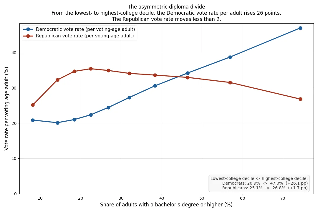
Sort every neighborhood in America into ten groups, from the least college-educated on the left to the most college-educated on the right. Out of every 100 adults living there, how many vote for each party? In the least-educated places, it’s about 21 Democrats and 25 Republicans. Pretty close. As education rises, the Democratic count more than doubles, ending near 47 per 100. Republicans climb to a peak of about 35 in moderately-educated areas, then fall back to about 27 in the most-educated places. So the “diploma divide” isn’t just Democrats gaining in educated areas. Republicans also lose voters once education rises past a working-to-middle-class peak. This shape is invisible to a standard partisan-lean model; it only appears when each party’s vote rate is modeled separately.
Patterns that run against the stereotype
Several smaller findings push against common assumptions.
Heavily Catholic precincts lean slightly Democratic. The most-Catholic quartile averages a lean of about 9 points on the Democratic side of the 200-point lean scale. The “conservative Catholic” stereotype lags the demographic reality, which now includes large Latino-Catholic concentrations in liberal cities and a steady secular drift among non-Hispanic Catholics.
Heavily Mormon (LDS) precincts predict partisan lean only slightly once other variables are controlled. The spread from least-Mormon to most-Mormon quartiles is only about 1.4 lean-points. Mormon concentration looks predictive in raw correlations, but most of that signal is already captured by other features in the model.
Areas with high reported rape-rate percentiles from CrimeGrade‘s blockgroup-level dataset (zip-level data would have been nonsense here) skew Democratic and have lower turnout. This is a geographic artifact: violent-crime rates concentrate in dense urban areas, which also lean Democratic and turn out at lower per-adult rates. The pattern reflects geography, not any causal claim about either party.
Census tracts where adults more often report having someone for emotional support, a CDC measure of social connectedness, show lower voter turnout. The direction is counterintuitive. It serves as a useful reminder that single health-related measurements can carry confounded signals; the same measurement can serve as a marker for low-stress communities (which often turn out well) or for low-income communities (which often turn out poorly), depending on which population dominates the average.
Neighborhoods with high foreign-born shares vote at lower rates than the national average. The reasons are well-documented in academic work, including slower naturalization timelines and lower integration into political networks. They rarely make it into popular political maps.
Pre-1940 housing stock and bicycle commuting both correlate with a Democratic lean. So does a high share of never-married single residents. These directions are familiar in American political geography. The size of each effect is larger than common discourse suggests.
A note on the prison-town measurement: census blocks that contain large correctional facilities show high “turnout per voting-age adult” in the raw data. This is a measurement artifact. Incarcerated residents are counted in the voting-age population but cannot vote, so the small voting community around a prison has its per-adult turnout overstated. The model accounts for this in its lean estimates, but the artifact still warrants a flag for anyone interpreting the underlying numbers.
Our Methodology
The point of this analysis is to estimate where people who lean conservative and liberal live. Future elections depend on candidates, mobilization, weather, and ballot composition that no demographic model can know in advance.
The model uses public data from federal agencies plus one commercial crime-data source. Every input is traceable to its original publisher.
- American Community Survey (ACS) 5-year estimates, U.S. Census Bureau. The backbone of the demographic features. Provides block-group-level estimates of age, race, education, income, household composition, language, commute mode, housing type, and many other variables.
- 2020 Decennial Census Demographic and Housing Characteristics (DHC), U.S. Census Bureau. Used specifically to separate the group-quarters population into prisons, juvenile facilities, nursing homes, college dorms, and military quarters. Without this split, a college-dominated block looks identical to a prison-dominated block in standard ACS data.
- CDC PLACES, U.S. Centers for Disease Control and Prevention. Census-tract-level prevalence estimates for 40 health and social-determinant measurements, including diabetes, hypertension, smoking, mental health, health insurance coverage, food insecurity, and preventive screening rates.
- CDC Environmental Justice Index 2022, U.S. Centers for Disease Control and Prevention. Census-tract-level measurements of environmental exposures (air quality, water quality, proximity to industrial sites) plus walkability and park-access scores.
- National Land Cover Database (NLCD), U.S. Geological Survey and the Multi-Resolution Land Characteristics Consortium. Satellite-derived 30-meter measurements of impervious surface, developed land, tree canopy, and land-cover type.
- EPA National Walkability Index, U.S. Environmental Protection Agency. A direct measurement of walkable infrastructure built from intersection density, transit access, and mixed land use. Distributed through the CDC EJI dataset and used as a separate feature.
- CrimeGrade. Block-group-level percentile rankings for violent crime, property crime, and several specific offense categories. One of two non-governmental sources in the model.
- PRISM Climate Group (Oregon State University) and NOAA Global Historical Climatology Network. Daily 4 km gridded temperature and precipitation for the days leading up to and including election day, plus nearest-station snow depth and wind speed. Added to test whether election-day weather explains additional variation in voter turnout and partisan lean.
- MIT Election Lab Survey of the Performance of American Elections (SPAE) 2024. State-level voter-reported voting modes (mail, early in-person, election day) weighted from 10,200 post-election survey responses. Combined with the National Conference of State Legislatures‘ classification of all-mail and no-excuse absentee states. Added to give the model state-level information about how voters cast their ballots. Released by MIT under the CC0 public-domain dedication.
Additional county-level data on local community composition was also used as model input.
Training data. The model was trained on all voting precincts where the presidential election results were published officially. Precincts are the smallest geography for which ballot counts are routinely available. Each precinct’s lean and turnout numbers were paired with the demographic, health, and land-use features of the block groups it overlaps geographically. Some states and counties were not available for some elections.
Why census blocks. Block groups are the finest U.S. Census geography where rich demographic data is reported. Our model can predict down to the census block, but our findings are that the block group data looks nearly identical. This is a testament to the fine data scientists working at the Census Bureau.
What the model predicts. Each block gets three predictions: overall partisan lean (the D-vs-R margin in percentage points), total turnout per voting-age adult, and the implied nonvoter rate. The D-vs-R split shown on the page is derived from the lean prediction.
Model class. The predictions come from an ensemble of decision trees, a machine-learning method well suited to messy real-world data with many overlapping inputs. The model was built up in stages, adding one data source at a time. The earliest stages covered demographics and crime. Later ones added religion variables, group-quarters detail, health and social-determinant measurements, environmental exposures, and finally election-day weather and state-level mail-voting patterns. At its widest the model evaluated 14,881 candidate measurements for every neighborhood. Most of those carried little independent signal once everything else was accounted for, so the final model keeps the 1,368 measurements per neighborhood that actually improve accuracy. The turnout model uses a smaller, hand-curated set of inputs that has held up better than every attempt to widen it. Each data source had to earn its place by improving accuracy on neighborhoods the model had never seen; sources that did not help were dropped, including several engineered composite features that looked reasonable on paper.
Why this beats a feature-by-feature correlation table. A standard “how strongly does X predict partisan lean?” analysis collapses each variable to one number. That misses how variables behave together. Each tree in this model considers up to eight features simultaneously when deciding how to split a neighborhood. The same share of uninsured adults pulls Republican turnout down sharply in a low-education precinct but barely moves it in a college-educated precinct in the same state. The model finds those conditional relationships without being told where to look. Across the whole ensemble, the model effectively asks “given everything we already know about this block, including its density, education mix, religion, age structure, and environment, what does this measurement add?” rather than “what does this measurement predict on its own?” The asymmetric diploma divide and the insurance-and-turnout findings described above are direct outputs of this approach. A pairwise correlation table would not have surfaced either one.
Parallel measurements instead of a composite score. Walkability, population density, impervious surface, park access, and developed-land share are five different measurements of how urban a place is. Each comes from a different agency, has different noise, and is missing in different places. Tree models prefer to see all five raw rather than a pre-summed “urbanness” score. When one source is missing (Hawaii is missing from the EPA walkability source, for example), the others still split correctly. Every engineered composite we tested hurt accuracy, including the CDC’s own pre-summed environmental indices. The model is better at building composites than we are.
The earlier four-way decomposition (now retired). An earlier version of the model trained four separate targets in addition to the overall lean: total turnout per voting-age adult, Republican vote rate per adult, Democratic vote rate per adult, and third-party vote rate per adult. That decomposition is what surfaced the asymmetric diploma divide and the insurance/turnout asymmetry described in the Findings section above. The three per-party turnout targets were later retired once an audit showed they added nothing the final model needed. The asymmetric patterns the decomposition exposed are real and the related discussion in Findings remains accurate; the production model just doesn’t carry the three component fits anymore.
Quality refinement. One of the largest accuracy gains came from auditing the model’s own residuals. Precincts with fewer than 50 voting-age adults in their geographic overlap with block groups are often administrative artifacts such as vote-by-mail aggregations or absentee-ballot bins. The final model downweights or excludes those rows.
State coverage and the precinct-level data sources are listed in the State Election Data Sources block below.
How Accurate Is It
The headline number is R-squared = 0.924 for 2024 partisan lean. R-squared is the share of variance in the outcome that the model explains; 1.0 would be perfect, and 0.0 would be no better than always guessing the average. About 92% of the precinct-to-precinct variation in 2024 partisan lean is captured by the model on precincts that were held out of training, across the 45 states (plus DC) where precinct results were published. That is the right number to read for the predictions you are looking at on most of the map: the model is filling in block groups in states where it has already seen many other precincts during training, and those held-out precincts are what the cross-validation scores against.
As a stricter test of how the model generalizes, we also score it with entire states held out of training, so it has to predict a state it has never seen any precinct from. Under that harder test the R-squared is 0.867, still about 87% of the precinct-to-precinct variation captured, without the model ever memorizing a single thing about the held-out state. That is the right number to read for the six states that were entirely absent from the training set (see Limitations below).
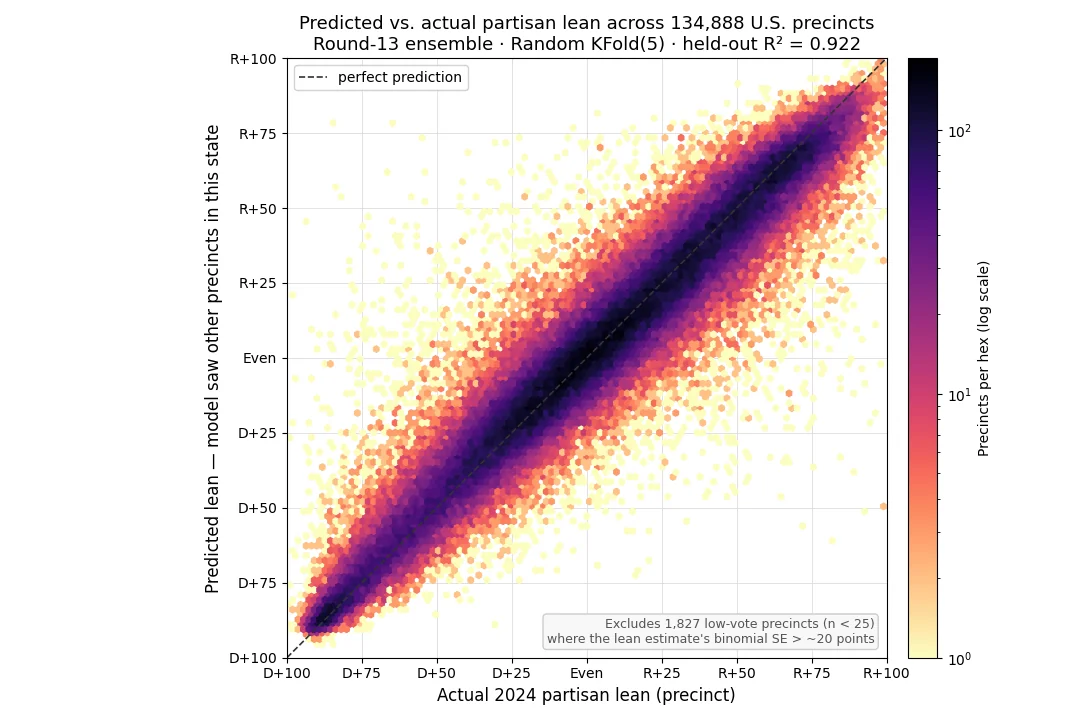
The chart shows how closely the model’s predictions matched actual 2024 partisan lean across the roughly 135,000 precincts in states with published voting data. Each precinct is placed by its actual lean (horizontal) and the model’s predicted lean (vertical), and darker hexes hold more precincts. The tighter the cloud hugs the dashed line, the closer the predictions came to the real results.
For context: in 2013, political scientists Chris Tausanovitch and Christopher Warshaw published a widely-cited paper in the Journal of Politics, “Measuring Constituent Policy Preferences in Congress, State Legislatures, and Cities”. They combined demographics with 275,000 survey responses to estimate the political leanings of every U.S. city above 25,000 people. Their city-level estimates explained about 58% of the variation in actual 2008 presidential vote share (R² ≈ 0.58), and they concluded that “the weak link between demographics and public opinion applies as much in the city context as it does in other contexts.” Our model captures about 92% of the variation at the precinct level, a much finer geography than a whole city. Aggregating those precinct predictions up to the city level only sharpens the picture, since precinct-by-precinct errors largely average out. The demographics-and-politics link is stronger than the standard reading has suggested; it just needed richer features and finer geography to surface.
Total turnout per voting-age adult is harder to predict. R-squared for turnout is 0.39. Turnout depends on candidates, ballot composition, mobilization spending, and on-the-day weather. Even when we fed the model actual election-day weather and state-level mail-voting share, neither moved the headline turnout number. The signal that exists in those sources turns out to be redundant with state-level features the model already had.
Both of the lean numbers above come from genuine held-out cross-validation; the model never scores itself on precincts it was trained on. The difference is only in how the holds-out are constructed: random precincts across the country (0.924) versus entire states at a time (0.867). The gap between the two, about 6 percentage points, is the share of a state’s partisanship that the model would otherwise pick up from the state’s own precincts, and that is the part it has to reconstruct from demographics alone when extrapolating into a state it has never seen.
Limitations
The accuracy numbers may understate the map’s resolution. The model predicts at the census-block and block-group level, a finer geography than the precincts it is scored against. A single precinct often spans several block groups, so its published lean is already a population-weighted blend of them. Where those block groups vote differently, the precinct figure averages away the variation the model is built to find. In those cases the block-level estimate can map the real political geography more precisely than the precinct number it is graded on. Precinct results are the only ground truth available, so the reported R-squared cannot credit the model for detail the precinct data does not carry. True block-level accuracy may run higher than the headline numbers, or in some places lower, and the precinct data cannot settle which.
Six states are not in the training data. Alaska did not have precinct-level 2024 results available. Five states never report precinct-level data, making their city-level reporting all but useless for our model. Predictions for blocks inside these six states are still shown on the map, but they come entirely from the model extrapolating from demographic, health, and land-use features. They were not validated against any local 2024 ground truth. Treat predictions in Alaska, Connecticut, Maine, New Hampshire, Rhode Island, and Vermont as the lowest-confidence parts of the map.
Hawaii has thinner inputs. Hawaii census tracts are missing from the CDC Environmental Justice Index source data. Several walkability and environmental features for Hawaii are imputed from national medians. Hawaii predictions are present on the map but carry lower confidence than the rest of the modeled area.
Oklahoma’s published precinct results are incomplete. The 2024 Oklahoma precinct file used for training appears to be missing roughly 43% of votes cast. This biases the state-level turnout aggregate downward for Oklahoma. Per-precinct lean predictions for Oklahoma look accurate against ground truth despite this, but the state-aggregate feature is wrong.
Lean estimates describe composition, not outcomes. The map estimates where partisan-leaning residents live, based on 2024 voting patterns. Who shows up to vote in a future election depends on candidate identity, issue salience, mobilization spending, ballot questions, and weather. A predicted lean for a given block does not translate directly into a candidate-specific vote prediction.
Neighborhoods change. Partisan composition of a neighborhood shifts slowly but does shift over time, especially in growing metros where in-migration changes the demographic mix. Re-training on each future election cycle will be needed to keep the map current.
Different from county maps and voter files. County-level partisan maps and commercial voter-file products address different questions, often at coarser geographies or at the individual level, and use different inputs and methods. This map is intended as a free, neighborhood-resolution complement.
About This Analysis
Modeling and analysis by the BestNeighborhood data science team. Predictions reflect the 2024 election cycle, the 2020 Decennial Census, the most recent American Community Survey 5-year estimates, the 2025 CDC PLACES release, the 2022 CDC Environmental Justice Index, the 2021 NLCD release, PRISM and NOAA daily weather grids for the days surrounding the November 2024 election, and the MIT Election Lab’s 2024 Survey of the Performance of American Elections.
State Election Data Sources
Precinct-level 2024 election results were collected from each of the 45 states (plus the District of Columbia) that publish precinct-level vote counts. Each link below points to the homepage of that state’s primary elections agency. The 2024 results pages within these sites are where the precinct counts originated.
Alabama Secretary of State, Elections
Arizona Secretary of State, Elections
Arkansas Secretary of State, Elections
California Secretary of State, Elections
Colorado Secretary of State, Elections
Delaware Department of Elections
District of Columbia Board of Elections
Florida Division of Elections
Georgia Elections Division
Hawaii Office of Elections
Idaho Secretary of State, Elections
Illinois State Board of Elections
Indiana Secretary of State, Elections
Iowa Secretary of State, Elections
Kansas Secretary of State, Elections
Kentucky State Board of Elections
Louisiana Secretary of State, Elections
Maryland State Board of Elections
Massachusetts Secretary of the Commonwealth, Elections
Michigan Department of State, Elections
Minnesota Secretary of State, Elections
Mississippi Secretary of State, Elections
Missouri Secretary of State, Elections
Montana Secretary of State, Elections
Nebraska Secretary of State, Elections
Nevada Secretary of State, Elections
New Jersey Division of Elections
New Mexico Secretary of State, Bureau of Elections
New York State Board of Elections
North Carolina State Board of Elections
North Dakota Secretary of State, Elections
Ohio Secretary of State, Elections
Oklahoma State Election Board
Oregon Secretary of State, Elections Division
Pennsylvania Department of State, Bureau of Elections
South Carolina State Election Commission
South Dakota Secretary of State, Elections
Tennessee Secretary of State, Division of Elections
Texas Secretary of State, Elections Division
Utah Lieutenant Governor’s Office, Elections
Virginia Department of Elections
Washington Secretary of State, Elections
West Virginia Secretary of State, Elections
Wisconsin Elections Commission
Wyoming Secretary of State, Elections
Most Liberal and Most Conservative Cities
10 Most Liberal Cities (100k+ population)
10 Most Conservative Cities (100k+ population)