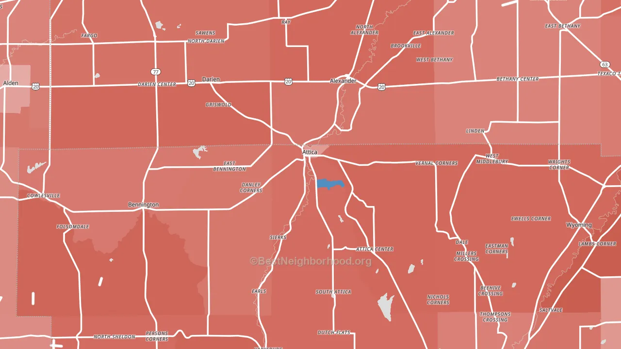
Attica leans Republican by roughly 18 points: about 41% of voters vote Democratic and 59% Republican.
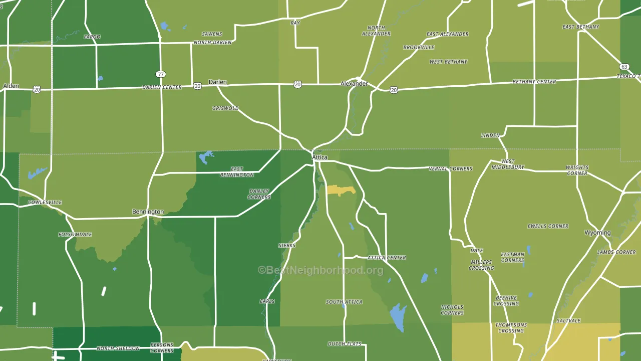
About 61% of adults in Attica typically vote, near the U.S. average of about 62%. Among adults in Attica, ~25% vote Democratic, ~36% Republican, and ~39% don't vote. The map below shows estimated turnout by block group.
How Attica compares
Among cities within 25 miles, Attica leans more Republican than 15 of 120 neighbors.
Attica runs about 30 points more Republican than New York as a whole. New York leans Democratic overall, while Attica is one of the few Republican-leaning pockets.
Politics vary noticeably by neighborhood within Attica. The northwest side is the most Republican-leaning (R+51) and the east side is the least Republican-leaning (R+28), a spread of about 23 points.
Why Attica leans the way it does
This analysis examined 14,881 data points per city to find what predicts political lean and turnout. The items below are a few correlations that stood out for Attica, not a ranked or complete list of what matters most.
Attica votes Republican even though it is densely developed (about 58%, well above the New York average of 36%). State and regional patterns outweigh the Democratic lean that density usually predicts here. Attica runs against the grain of New York, a Republican-leaning pocket in a Democratic-leaning state.
Developed land, local retail density, and voter turnout
Places that combine a heavily developed built environment and sparse local retail within a mile tend to turn out at a lower rate, as Attica, NY does.
Why turnout in Attica looks the way it does
Areas with low high-school completion turn out at lower rates. About 70% of adults in Attica have completed high school, about 20 points below the U.S. average of 90%. Learn more about the findings and methodology on the political spectrum map.
Nearby Cities
- Attica Center, NY R+50
- East Bennington, NY R+52
- Alexander, NY R+52
- South Attica, NY R+51
- Dale, NY R+52
- Darien Center, NY R+54
- Bennington, NY R+50
- Linden, NY R+47
- Varysburg, NY R+52
- West Batavia, NY R+36
Cities with Similar Populations
- Birch Run, MI R+34
- Neshanic Station, NJ R+9
- Ball, LA R+67
- Perkiomenville, PA R+19
- Omro, WI R+29
- New London, NC R+56
- North Oaks, MN D+22
- Hughesville, PA R+52
- Trevor, WI R+23
- East Quogue, NY R+8
Sources and methodology
Precinct-level voting records used to fit the model come from New York State Board of Elections, distributed by the Voting and Election Science Team. Demographic inputs come from the U.S. Census Bureau (ACS 5-year estimates and the 2020 Decennial Census). Health and environmental inputs come from the CDC (PLACES and the Environmental Justice Index). Land cover comes from the USGS and EPA. Election-day and lead-up weather come from PRISM 4km daily grids and the NOAA Global Historical Climatology Network. Mail-voting and election-administration patterns come from the MIT Election Lab's Survey of the Performance of American Elections. Block-group crime detail comes from CrimeGrade. Internet data and modeling support provided by ISPreports.org.
Modeling and analysis by the BestNeighborhood data science team. Full methodology and findings: political spectrum map.
Methodology reviewed by the BestNeighborhood data team. Last updated May 2026.