Belmont County leans heavily Republican by roughly 46 points: about 27% of voters vote Democratic and 73% Republican.
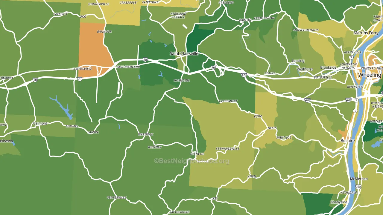
About 72% of adults in Belmont County typically vote, above the U.S. average of about 62%. Among adults in Belmont County, ~19% vote Democratic, ~53% Republican, and ~28% don't vote. The map below shows estimated turnout by block group.
How Belmont County compares
Among counties within 50 miles, Belmont County leans more Republican than 6 of 16 neighbors.
Belmont County runs about 34 points more Republican than Ohio as a whole.
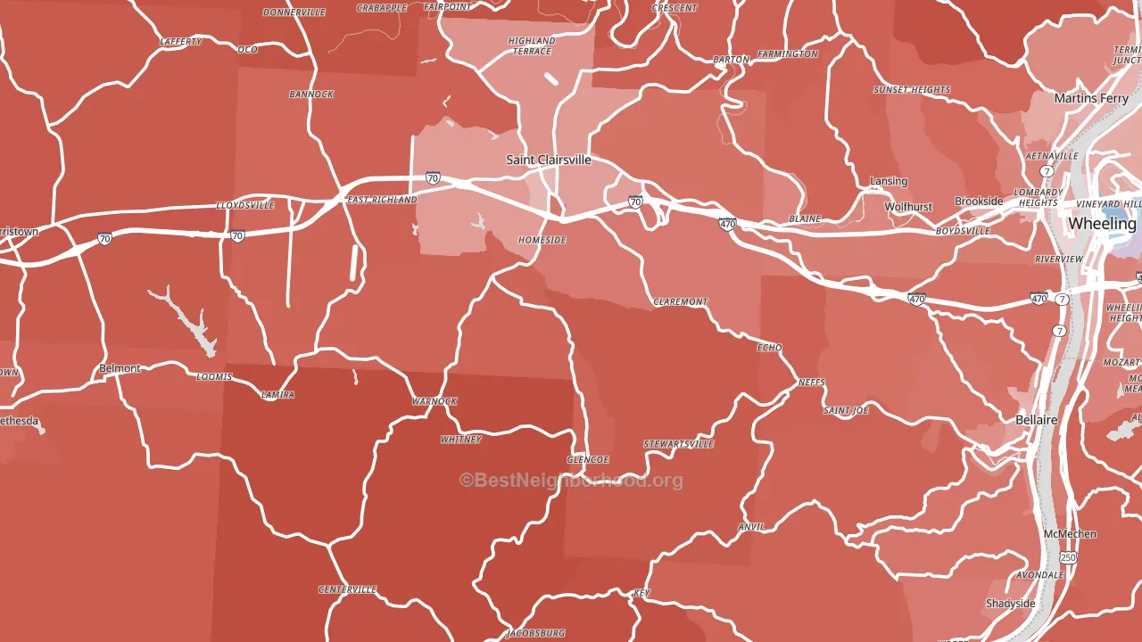
Politics vary noticeably by city within Belmont County. The southwest side is the most Republican-leaning (R+58) and the northeast side is the least Republican-leaning (R+33), a spread of about 25 points.
Why Belmont County leans the way it does
This analysis examined 14,881 data points per county to find what predicts political lean and turnout. The items below are a few correlations that stood out for Belmont County, not a ranked or complete list of what matters most.
Car-dependent areas vote Republican. About 84% of residents in Belmont County drive to work alone, about 10 points above the U.S. average of 74%. A high white share with below-average college attainment predicts Republican voting, and Belmont County fits that profile on both counts.
Walkability and Democratic lean
Places with a highly walkable street grid tend to lean Democratic; Belmont County, OH sits above the national average on this measure. A walkable street grid does not change how people vote; it mostly reflects how urban a place is.
Why turnout in Belmont County looks the way it does
Turnout in Belmont County sits close to the national pattern. Learn more about the findings and methodology on the political spectrum map.
Nearby Counties
- Ohio County, WV R+20
- Marshall County, WV R+50
- Harrison County, OH R+56
- Monroe County, OH R+63
- Brooke County, WV R+42
- Jefferson County, OH R+35
- Wetzel County, WV R+57
- Guernsey County, OH R+50
- Hancock County, WV R+42
- Tyler County, WV R+61
Counties with Similar Populations
- Wayne County, IN R+31
- Montcalm County, MI R+41
- Muskogee County, OK R+29
- Grant County, IN R+34
- Chippewa County, WI R+24
- Ionia County, MI R+30
- Crow Wing County, MN R+29
- St. Francois County, MO R+48
- Apache County, AZ D+30
- Marquette County, MI Even
Sources and methodology
Precinct-level voting records used to fit the model come from Ohio Secretary of State, Elections, distributed by the Voting and Election Science Team. Demographic inputs come from the U.S. Census Bureau (ACS 5-year estimates and the 2020 Decennial Census). Health and environmental inputs come from the CDC (PLACES and the Environmental Justice Index). Land cover comes from the USGS and EPA. Election-day and lead-up weather come from PRISM 4km daily grids and the NOAA Global Historical Climatology Network. Mail-voting and election-administration patterns come from the MIT Election Lab's Survey of the Performance of American Elections. Block-group crime detail comes from CrimeGrade. Internet data and modeling support provided by ISPreports.org.
Modeling and analysis by the BestNeighborhood data science team. Full methodology and findings: political spectrum map.
Methodology reviewed by the BestNeighborhood data team. Last updated May 2026.