Box Elder County is a Republican stronghold. About 22% of voters here vote Democratic and 78% Republican.
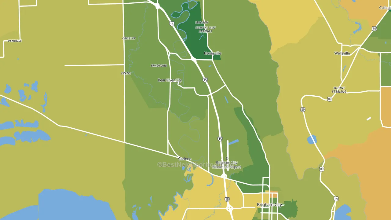
About 73% of adults in Box Elder County typically vote, above the U.S. average of about 62%. Among adults in Box Elder County, ~16% vote Democratic, ~57% Republican, and ~27% don't vote. The map below shows estimated turnout by block group.
How Box Elder County compares
Among counties within 50 miles, Box Elder County leans more Republican than 3 of 7 neighbors.
Box Elder County runs about 34 points more Republican than Utah as a whole.
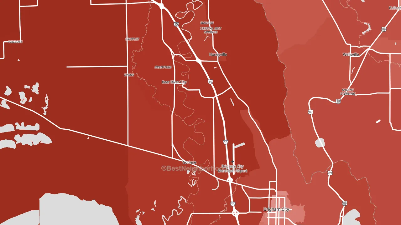
Politics vary noticeably by city within Box Elder County. The southwest side is the most Republican-leaning (R+85) and the southeast side is the least Republican-leaning (R+45), a spread of about 40 points.
Why Box Elder County leans the way it does
This analysis examined 14,881 data points per county to find what predicts political lean and turnout. The items below are a few correlations that stood out for Box Elder County, not a ranked or complete list of what matters most.
Areas with many family households vote Republican. About 78% of households in Box Elder County are family households, about 12 points above the U.S. average of 67%.
Preventive-care access and voter turnout
Places with strong routine preventive-care access tend to turn out at a higher rate; Box Elder County, UT sits in the top tenth nationally on this measure. Dental visits do not drive turnout; the rate reflects income, insurance, and healthcare access, which line up with who votes.
Why turnout in Box Elder County looks the way it does
Areas with strong routine healthcare access turn out at higher rates. Box Elder County is in the top quarter nationally for routine-care measures such as insurance coverage, preventive screenings, and dental visits. The dental-visit rate here is about 68%, about 8 points above the U.S. average of 60%. Learn more about the findings and methodology on the political spectrum map.
Nearby Counties
- Cache County, UT R+32
- Weber County, UT R+21
- Franklin County, ID R+77
- Morgan County, UT R+63
- Davis County, UT R+24
- Oneida County, ID R+76
- Rich County, UT R+66
- Bear Lake County, ID R+71
- Salt Lake County, UT D+10
- Summit County, UT D+10
Counties with Similar Populations
- Jefferson County, WV R+22
- Windsor County, VT D+17
- Acadia Parish, LA R+54
- Oxford County, ME R+25
- Gordon County, GA R+60
- Maverick County, TX R+8
- Coffee County, TN R+55
- Putnam County, WV R+46
- Anderson County, TX R+41
- Vermilion Parish, LA R+55
Sources and methodology
Precinct-level voting records used to fit the model come from Utah Lieutenant Governor's Office, Elections, distributed by the Voting and Election Science Team. Demographic inputs come from the U.S. Census Bureau (ACS 5-year estimates and the 2020 Decennial Census). Health and environmental inputs come from the CDC (PLACES and the Environmental Justice Index). Land cover comes from the USGS and EPA. Election-day and lead-up weather come from PRISM 4km daily grids and the NOAA Global Historical Climatology Network. Mail-voting and election-administration patterns come from the MIT Election Lab's Survey of the Performance of American Elections. Block-group crime detail comes from CrimeGrade. Internet data and modeling support provided by ISPreports.org.
Modeling and analysis by the BestNeighborhood data science team. Full methodology and findings: political spectrum map.
Methodology reviewed by the BestNeighborhood data team. Last updated May 2026.