Buffalo leans Democratic by roughly 18 points: about 59% of voters vote Democratic and 41% Republican.
[sc name="abovemapcta"]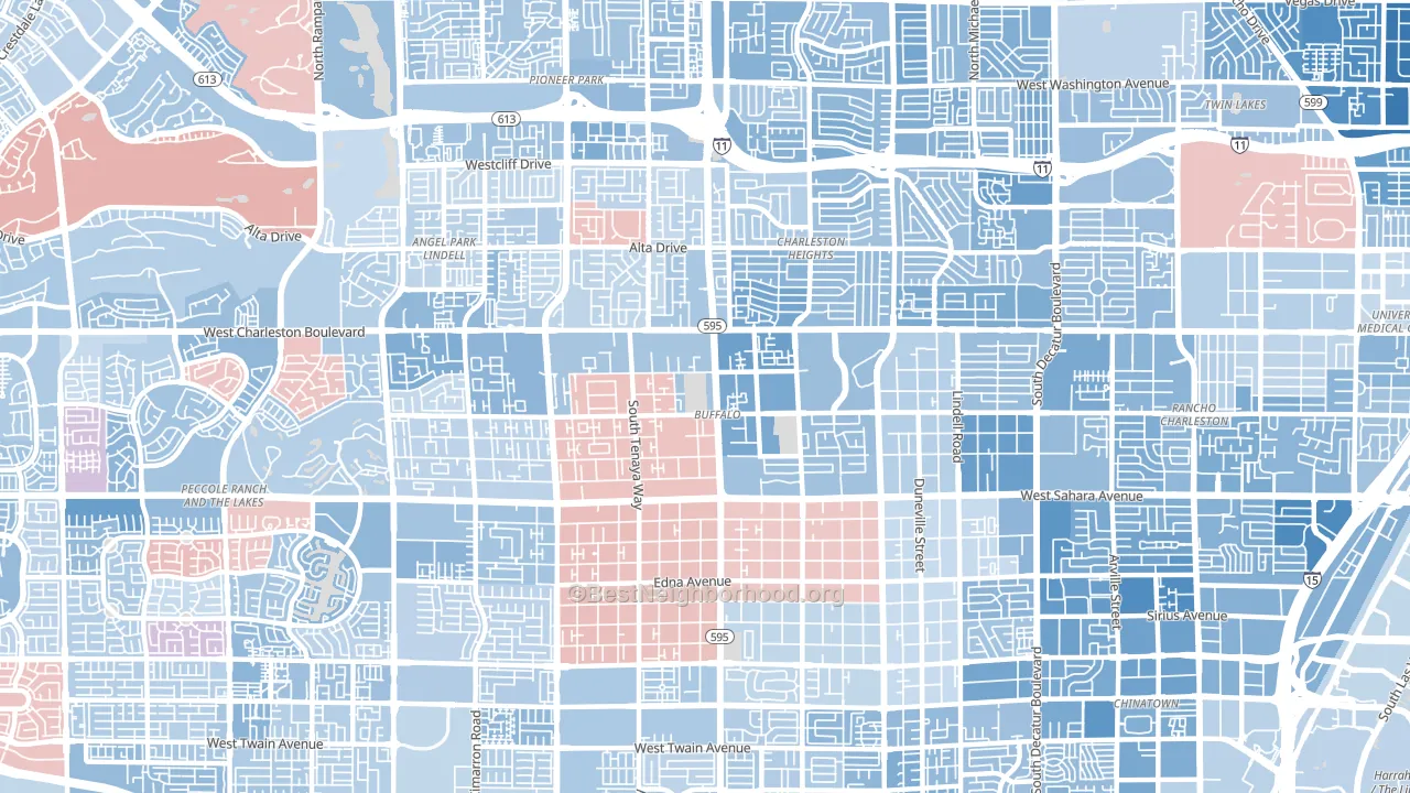 [bestneighborhood_map_controls]
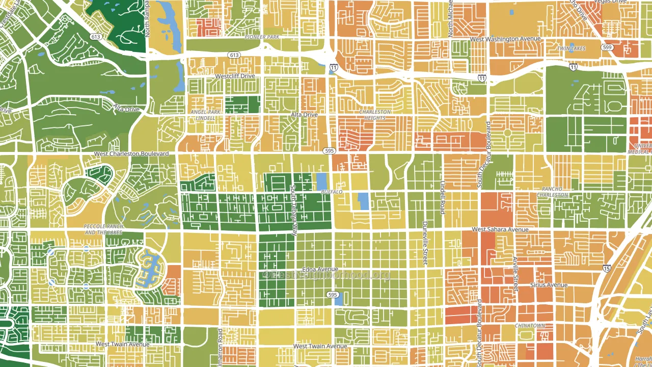
About 55% of adults in Buffalo typically vote, below the U.S. average of about 62%. Among adults in Buffalo, ~33% vote Democratic, ~23% Republican, and ~44% don't vote. The map below shows estimated turnout by block group.
 [bestneighborhood_map_controls]
How Buffalo compares
Among neighborhoods within 5 miles, Buffalo leans more Democratic than 9 of 15 neighbors.
Buffalo runs about 21 points more Democratic than Nevada as a whole. Nevada leans Republican overall, while Buffalo is one of the few Democratic-leaning pockets.
Politics vary noticeably by block within Buffalo. The southeast side is the most Democratic-leaning (D+29) and the southwest side is the least Democratic-leaning (D+7), a spread of about 23 points.
Why Buffalo leans the way it does
This analysis examined 14,881 data points per neighborhood to find what predicts political lean and turnout. The items below are a few correlations that stood out for Buffalo, not a ranked or complete list of what matters most.
Buffalo votes against the grain of Nevada. Nevada leans Republican overall, while Buffalo runs about 21 points more Democratic.
Walkability and Democratic lean
Places with a highly walkable street grid tend to lean Democratic; Buffalo, Las Vegas, NV sits in the top quarter nationally on this measure. A walkable street grid does not change how people vote; it mostly reflects how urban a place is.
Why turnout in Buffalo looks the way it does
Turnout in Buffalo sits close to the national pattern. Routine healthcare access, homeownership, education, and food security all land near their national averages here. Learn more about the findings and methodology on the political spectrum map.
[one_half]Nearby Neighborhoods
- Charleston Heights, Las Vegas, NV D+15
- The Lakes-Country Club, Spring Valley, NV D+11
- Angel Park Lindell, Las Vegas, NV D+11
- Pioneer Park, Las Vegas, NV D+16
- Rancho Charleston, Las Vegas, NV D+23
- The Lakes, Las Vegas, NV D+9
- The Pueblo, Las Vegas, NV D+13
- Michael Way, Las Vegas, NV D+22
- Twin Lakes, Las Vegas, NV D+23
- Desert Shores, Las Vegas, NV D+22
Neighborhoods with Similar Populations
- North Valley San Diego, Oceanside, CA D+10
- Eastside, Riverside, CA D+31
- Calallen, Corpus Christi, TX R+36
- Blueberry Hill-Brigadoon-Stoneybrook, Lexington, KY D+28
- Bagley, Detroit, MI D+89
- Garnsey, Valley Village, CA D+35
- Byberry, Philadelphia, PA R+12
- Cedar Hills-Cedar Mill, Portland, OR D+49
- Kamms Corner, Cleveland, OH D+22
- Lake View, Paterson, NJ D+5
Sources and methodology
Precinct-level voting records used to fit the model come from Nevada Secretary of State, Elections, distributed by the Voting and Election Science Team. Demographic inputs come from the U.S. Census Bureau (ACS 5-year estimates and the 2020 Decennial Census). Health and environmental inputs come from the CDC (PLACES and the Environmental Justice Index). Land cover comes from the USGS and EPA. Election-day and lead-up weather come from PRISM 4km daily grids and the NOAA Global Historical Climatology Network. Mail-voting and election-administration patterns come from the MIT Election Lab's Survey of the Performance of American Elections. Block-group crime detail comes from CrimeGrade. Internet data and modeling support provided by ISPreports.org.
Modeling and analysis by the BestNeighborhood data science team. Full methodology and findings: political spectrum map.
Methodology reviewed by the BestNeighborhood data team. Last updated May 2026.