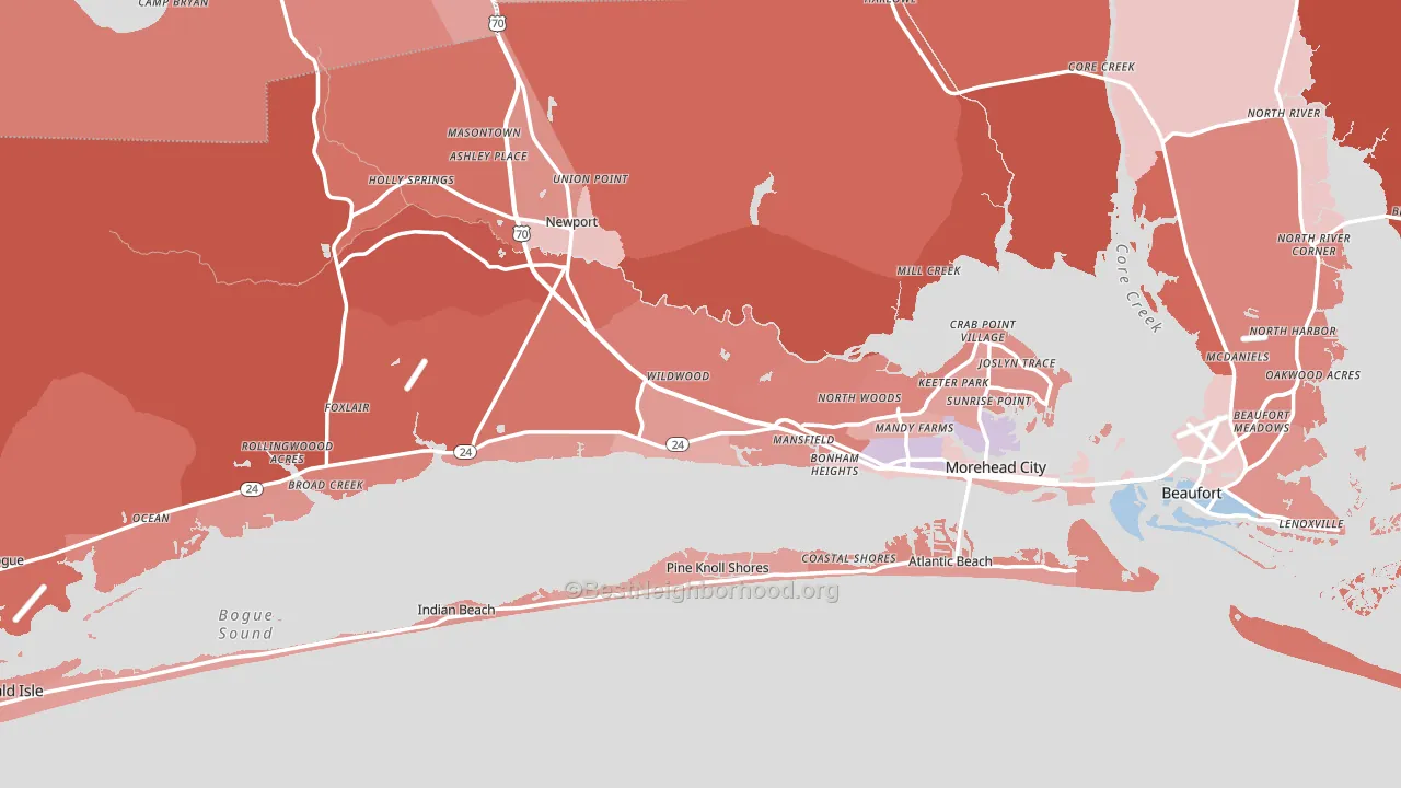
Carteret County leans heavily Republican by roughly 34 points: about 33% of voters vote Democratic and 67% Republican.
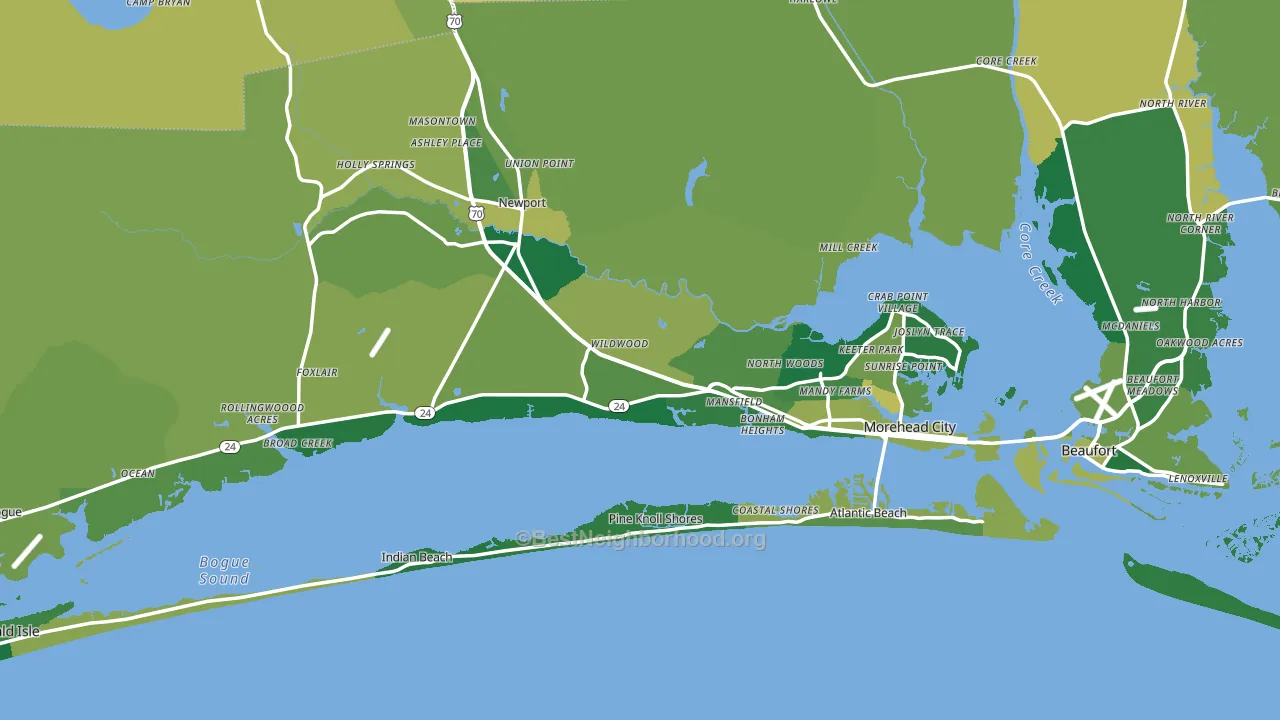
About 86% of adults in Carteret County typically vote, above the U.S. average of about 62%. Among adults in Carteret County, ~28% vote Democratic, ~58% Republican, and ~14% don't vote. The map below shows estimated turnout by block group.
How Carteret County compares
Among counties within 50 miles, Carteret County leans more Republican than 3 of 4 neighbors.
Carteret County runs about 31 points more Republican than North Carolina as a whole.
Politics vary noticeably by city within Carteret County. The northeast side is the most Republican-leaning (R+46) and the southeast side is the least Republican-leaning (R+23), a spread of about 23 points.
Why Carteret County leans the way it does
Density, race composition, education, and family structure all sit close to their national averages in Carteret County. The lean here lands roughly where demographic data alone would predict.
Food insecurity and voter turnout
Places with low food insecurity tend to turn out at a higher rate; Carteret County, NC sits in the bottom quarter nationally on this measure. Food insecurity does not directly drive turnout; it reflects economic hardship, which lines up with lower voting.
Why turnout in Carteret County looks the way it does
Areas with strong routine healthcare access turn out at higher rates. Carteret County is in the top quarter nationally for routine-care measures such as insurance coverage, preventive screenings, and dental visits. The dental-visit rate here is about 68%, about 8 points above the U.S. average of 60%. Learn more about the findings and methodology on the political spectrum map.
Nearby Counties
- Pamlico County, NC R+37
- Craven County, NC R+15
- Onslow County, NC R+23
- Jones County, NC R+24
- Beaufort County, NC R+24
- Lenoir County, NC Even
- Hyde County, NC R+25
- Pender County, NC R+33
- Duplin County, NC R+23
- Pitt County, NC D+17
Counties with Similar Populations
- Walker County, GA R+61
- Oldham County, KY R+23
- Laurens County, SC R+35
- Otero County, NM R+19
- Catoosa County, GA R+54
- McCracken County, KY R+30
- Butler County, KS R+41
- Madison County, NY R+13
- Spalding County, GA R+8
- Shiawassee County, MI R+27
Sources and methodology
Precinct-level voting records used to fit the model come from North Carolina State Board of Elections, distributed by the Voting and Election Science Team. Demographic inputs come from the U.S. Census Bureau (ACS 5-year estimates and the 2020 Decennial Census). Health and environmental inputs come from the CDC (PLACES and the Environmental Justice Index). Land cover comes from the USGS and EPA. Election-day and lead-up weather come from PRISM 4km daily grids and the NOAA Global Historical Climatology Network. Mail-voting and election-administration patterns come from the MIT Election Lab's Survey of the Performance of American Elections. Block-group crime detail comes from CrimeGrade. Internet data and modeling support provided by ISPreports.org.
Modeling and analysis by the BestNeighborhood data science team. Full methodology and findings: political spectrum map.
Methodology reviewed by the BestNeighborhood data team. Last updated May 2026.