Davidson County leans Democratic by roughly 26 points: about 63% of voters vote Democratic and 37% Republican.
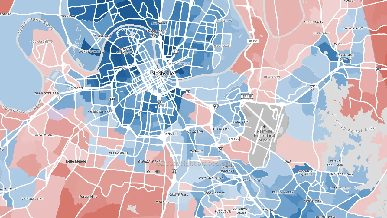
About 59% of adults in Davidson County typically vote, near the U.S. average of about 62%. Among adults in Davidson County, ~37% vote Democratic, ~22% Republican, and ~41% don't vote. The map below shows estimated turnout by block group.
How Davidson County compares
Among counties within 50 miles, Davidson County is the most Democratic-leaning.
Davidson County runs about 56 points more Democratic than Tennessee as a whole. Tennessee leans Republican overall, while Davidson County is one of the few Democratic-leaning pockets.
Politics vary noticeably by city within Davidson County. The north side is the most Democratic-leaning (D+51) and the southwest side is the least Democratic-leaning (D+5), a spread of about 46 points.
Why Davidson County leans the way it does
This analysis examined 14,881 data points per county to find what predicts political lean and turnout. The items below are a few correlations that stood out for Davidson County, not a ranked or complete list of what matters most.
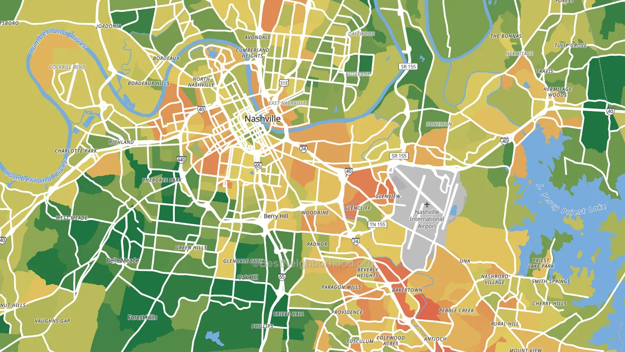
Dense areas vote Democratic. About 83% of residents in Davidson County live in densely developed areas, about 46 points above the U.S. average of 36%. High college attainment predicts Democratic voting, and Davidson County sits in the top quarter (about 47%, above 96% of counties). Davidson County runs against the grain of Tennessee, a Democratic-leaning pocket in a Republican-leaning state.
Population density and Democratic lean
Places with high population density tend to lean Democratic; Davidson County, TN sits in the top tenth nationally on this measure.
Why turnout in Davidson County looks the way it does
Renters vote less often than owners. About 45% of households in Davidson County rent, about 20 points above the U.S. average of 25%. Limited routine healthcare access lines up with lower turnout, and Davidson County sits in the bottom quarter on routine-care measures. Learn more about the findings and methodology on the political spectrum map.
Nearby Counties
- Williamson County, TN R+29
- Wilson County, TN R+39
- Cheatham County, TN R+55
- Sumner County, TN R+40
- Rutherford County, TN R+16
- Robertson County, TN R+46
- Dickson County, TN R+55
- Trousdale County, TN R+59
- Maury County, TN R+39
- Hickman County, TN R+67
Counties with Similar Populations
- Denver County, CO D+53
- Jackson County, MO D+24
- Lake County, IL D+22
- Hudson County, NJ D+27
- Polk County, FL R+18
- Norfolk County, MA D+30
- El Paso County, CO R+7
- Will County, IL D+6
- District of Columbia, DC D+80
- Bernalillo County, NM D+21
Sources and methodology
Precinct-level voting records used to fit the model come from Tennessee Secretary of State, Division of Elections, distributed by the Voting and Election Science Team. Demographic inputs come from the U.S. Census Bureau (ACS 5-year estimates and the 2020 Decennial Census). Health and environmental inputs come from the CDC (PLACES and the Environmental Justice Index). Land cover comes from the USGS and EPA. Election-day and lead-up weather come from PRISM 4km daily grids and the NOAA Global Historical Climatology Network. Mail-voting and election-administration patterns come from the MIT Election Lab's Survey of the Performance of American Elections. Block-group crime detail comes from CrimeGrade. Internet data and modeling support provided by ISPreports.org.
Modeling and analysis by the BestNeighborhood data science team. Full methodology and findings: political spectrum map.
Methodology reviewed by the BestNeighborhood data team. Last updated May 2026.