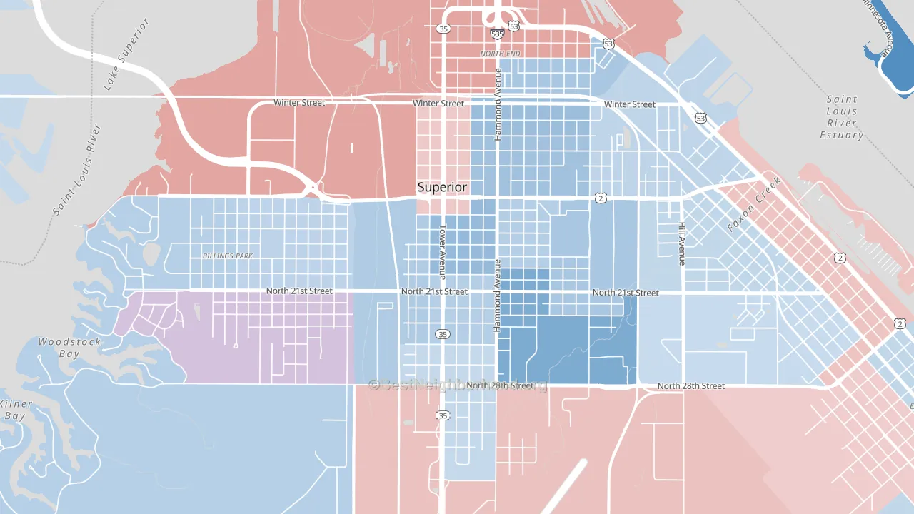
Downtown leans slightly Democratic by roughly 12 points: about 56% of voters vote Democratic and 44% Republican.
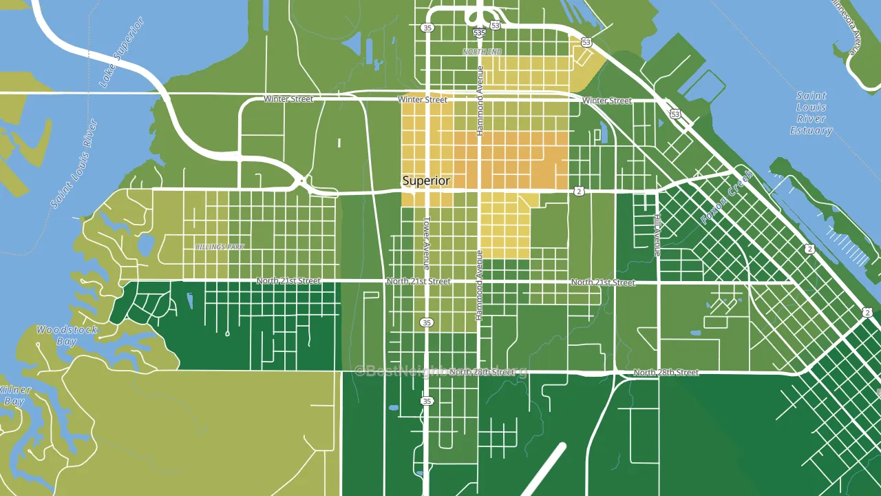
About 67% of adults in Downtown typically vote, near the U.S. average of about 62%. Among adults in Downtown, ~38% vote Democratic, ~29% Republican, and ~33% don't vote. The map below shows estimated turnout by block group.
How Downtown compares
Among neighborhoods within 5 miles, Downtown leans more Democratic than 1 of 4 neighbors.
Downtown runs about 13 points more Democratic than Wisconsin as a whole. Wisconsin is roughly evenly split, and Downtown sits clearly on the Democratic side.
Politics vary noticeably by block within Downtown. The east side runs the most Democratic (D+15) and the north side runs the most Republican (Even), a spread of about 17 points.
Why Downtown leans the way it does
This analysis examined 14,881 data points per neighborhood to find what predicts political lean and turnout. The items below are a few correlations that stood out for Downtown, not a ranked or complete list of what matters most.
Downtown votes against the grain of Wisconsin. Wisconsin is roughly evenly split, while Downtown runs about 13 points more Democratic. A high white share with below-average college attainment predicts Republican voting, and Downtown fits that profile on both counts.
Walkability and Democratic lean
Places with a highly walkable street grid tend to lean Democratic; Downtown, Superior, WI sits in the top tenth nationally on this measure. A walkable street grid does not change how people vote; it mostly reflects how urban a place is.
Why turnout in Downtown looks the way it does
Turnout in Downtown sits close to the national pattern. Learn more about the findings and methodology on the political spectrum map.
Nearby Neighborhoods
- Central Park, Superior, WI D+12
- West End, Duluth, MN D+32
- Spirit Valley-Denfeld-Norton Park, Duluth, MN D+20
- Downtown Duluth, Duluth, MN D+45
- Bayview Heights, Proctor, MN D+6
- East Hillside, Duluth, MN D+55
- Duluth Heights, Duluth, MN D+16
- Kenwood-Duluth, Duluth, MN D+30
- Congdon Park, Duluth, MN D+53
- Woodlands-Pleasantview, Duluth, MN D+30
Neighborhoods with Similar Populations
- Piedmont Pines, Oakland, CA D+66
- Westview Park, Woodlawn, MD D+57
- Irish Channel, New Orleans, LA D+62
- Northmoor, Saginaw, MI D+20
- The Meadows, Sandy Springs, GA D+29
- Barnesville Historic District, Barnesville, OH R+52
- Roosevelt Gardens Area, Norfolk, VA R+8
- Blenheim Square, Kansas City, MO D+79
- Oakhurst, Charlotte, NC D+35
- Upper Bal, San Leandro, CA D+44
Sources and methodology
Precinct-level voting records used to fit the model come from Wisconsin Elections Commission, distributed by the Voting and Election Science Team. Demographic inputs come from the U.S. Census Bureau (ACS 5-year estimates and the 2020 Decennial Census). Health and environmental inputs come from the CDC (PLACES and the Environmental Justice Index). Land cover comes from the USGS and EPA. Election-day and lead-up weather come from PRISM 4km daily grids and the NOAA Global Historical Climatology Network. Mail-voting and election-administration patterns come from the MIT Election Lab's Survey of the Performance of American Elections. Block-group crime detail comes from CrimeGrade. Internet data and modeling support provided by ISPreports.org.
Modeling and analysis by the BestNeighborhood data science team. Full methodology and findings: political spectrum map.
Methodology reviewed by the BestNeighborhood data team. Last updated May 2026.