Duchesne County is a Republican stronghold. About 12% of voters here vote Democratic and 88% Republican.
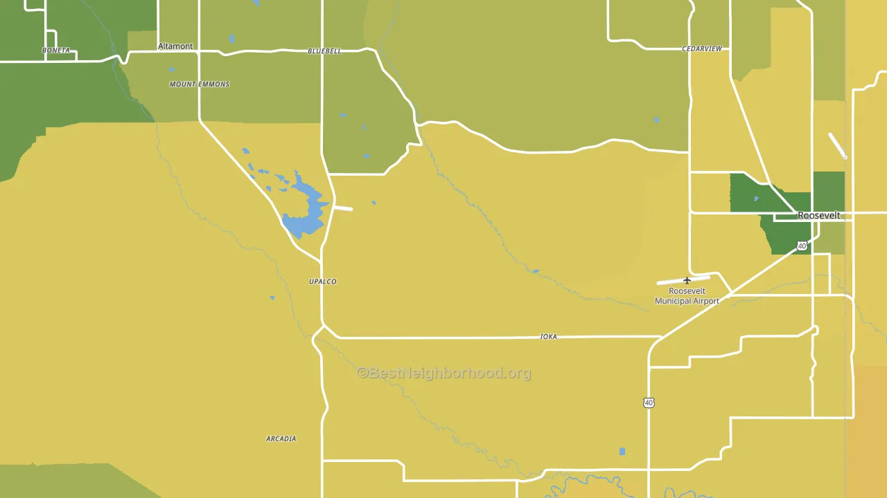
About 62% of adults in Duchesne County typically vote, near the U.S. average of about 62%. Among adults in Duchesne County, ~7% vote Democratic, ~55% Republican, and ~38% don't vote. The map below shows estimated turnout by block group.
How Duchesne County compares
Duchesne County runs about 54 points more Republican than Utah as a whole.
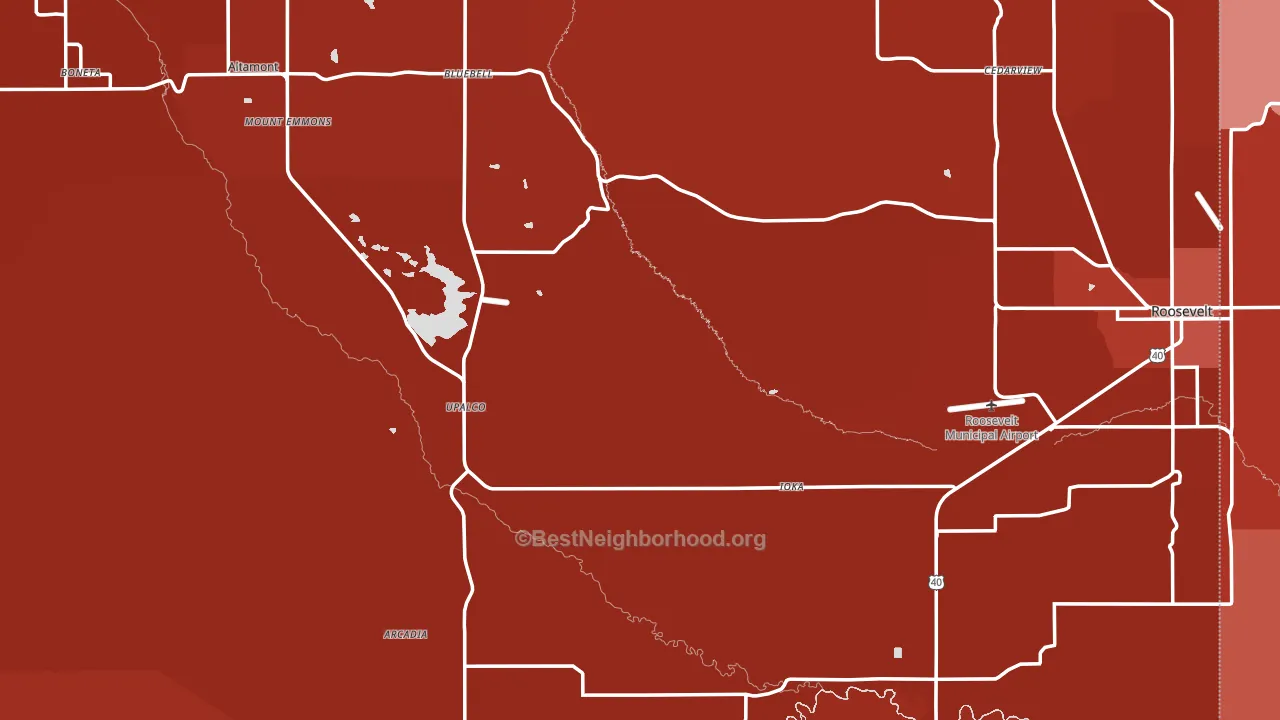
Politics vary noticeably by city within Duchesne County. The north side is the most Republican-leaning (R+85) and the west side is the least Republican-leaning (R+63), a spread of about 21 points.
Why Duchesne County leans the way it does
This analysis examined 14,881 data points per county to find what predicts political lean and turnout. The items below are a few correlations that stood out for Duchesne County, not a ranked or complete list of what matters most.
Areas with many family households vote Republican. About 78% of households in Duchesne County are family households, about 12 points above the U.S. average of 67%.
Homeownership and voter turnout
Places with homeowner-heavy households tend to turn out at a higher rate; Duchesne County, UT sits above the national average on this measure.
Why turnout in Duchesne County looks the way it does
Turnout in Duchesne County sits close to the national pattern. Routine healthcare access, homeownership, education, and food security all land near their national averages here. Learn more about the findings and methodology on the political spectrum map.
Nearby Counties
- Uintah County, UT R+67
- Daggett County, UT R+59
- Carbon County, UT R+56
- Wasatch County, UT R+33
- Uinta County, WY R+62
- Summit County, UT D+10
- Utah County, UT R+36
- Emery County, UT R+73
- Salt Lake County, UT D+10
- Juab County, UT R+71
Counties with Similar Populations
- Simpson County, KY R+42
- Marion County, KY R+50
- Lincoln County, WY R+66
- Wayne County, KY R+65
- Elbert County, GA R+35
- East Feliciana Parish, LA R+24
- Holmes County, FL R+71
- Gonzales County, TX R+41
- Macon County, AL D+57
- Jones County, TX R+47
Sources and methodology
Precinct-level voting records used to fit the model come from Utah Lieutenant Governor's Office, Elections, distributed by the Voting and Election Science Team. Demographic inputs come from the U.S. Census Bureau (ACS 5-year estimates and the 2020 Decennial Census). Health and environmental inputs come from the CDC (PLACES and the Environmental Justice Index). Land cover comes from the USGS and EPA. Election-day and lead-up weather come from PRISM 4km daily grids and the NOAA Global Historical Climatology Network. Mail-voting and election-administration patterns come from the MIT Election Lab's Survey of the Performance of American Elections. Block-group crime detail comes from CrimeGrade. Internet data and modeling support provided by ISPreports.org.
Modeling and analysis by the BestNeighborhood data science team. Full methodology and findings: political spectrum map.
Methodology reviewed by the BestNeighborhood data team. Last updated May 2026.