Fairmede-Hilltop is a Democratic stronghold. About 78% of voters here vote Democratic and 22% Republican.
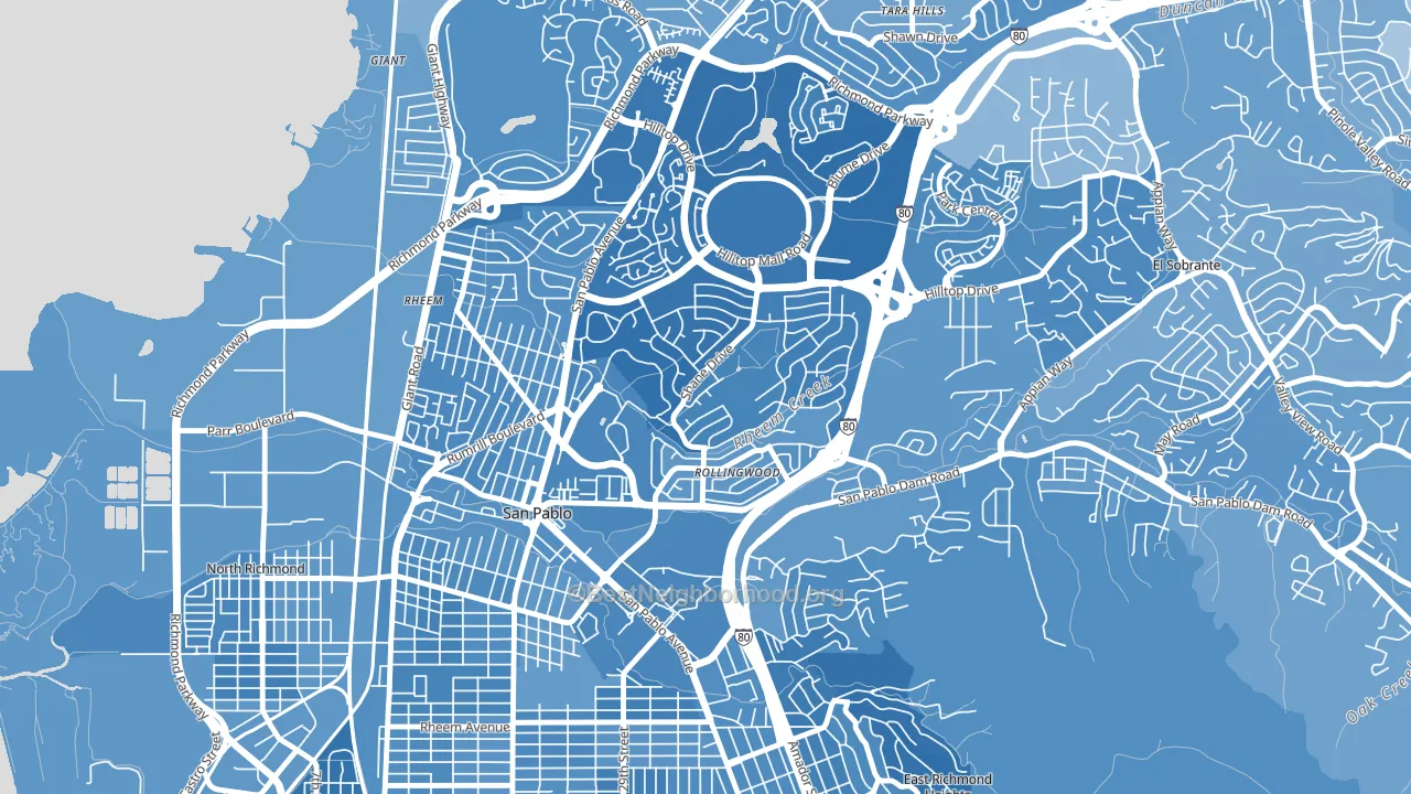
About 44% of adults in Fairmede-Hilltop typically vote, below the U.S. average of about 62%. Among adults in Fairmede-Hilltop, ~34% vote Democratic, ~10% Republican, and ~56% don't vote. The map below shows estimated turnout by block group.
How Fairmede-Hilltop compares
Among neighborhoods within 5 miles, Fairmede-Hilltop leans more Democratic than 5 of 10 neighbors.
Fairmede-Hilltop runs about 36 points more Democratic than California as a whole.
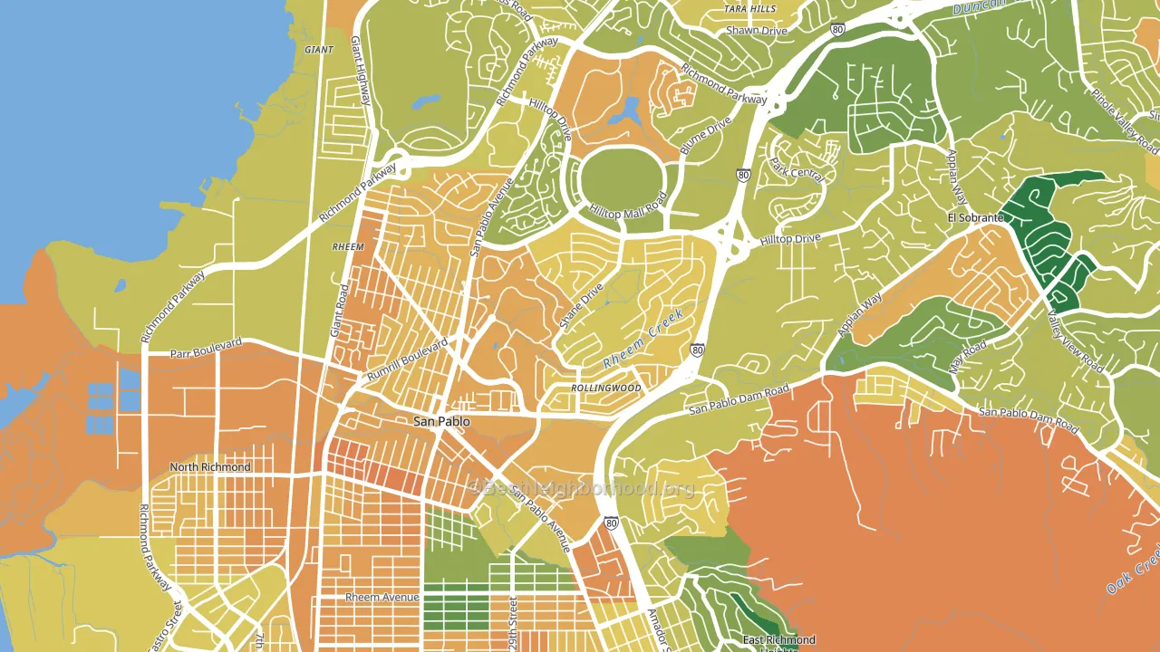
Politics vary noticeably by block within Fairmede-Hilltop. The northwest side is the most Democratic-leaning (D+71) and the south side is the least Democratic-leaning (D+40), a spread of about 31 points.
Why Fairmede-Hilltop leans the way it does
This analysis examined 14,881 data points per neighborhood to find what predicts political lean and turnout. The items below are a few correlations that stood out for Fairmede-Hilltop, not a ranked or complete list of what matters most.
Areas with many never-married adults vote Democratic. About 46% of adults in Fairmede-Hilltop have never been married, modestly above similar-sized neighborhoods (around 37%).
Walkability and Democratic lean
Places with a highly walkable street grid tend to lean Democratic; Fairmede-Hilltop, San Pablo, CA sits in the top quarter nationally on this measure. A walkable street grid does not change how people vote; it mostly reflects how urban a place is.
Why turnout in Fairmede-Hilltop looks the way it does
Turnout in Fairmede-Hilltop sits close to the national pattern. Routine healthcare access, homeownership, education, and food security all land near their national averages here. Learn more about the findings and methodology on the political spectrum map.
Nearby Neighborhoods
- North and East, Richmond, CA D+55
- Tara Hills, San Pablo, CA D+35
- East Richmond, Richmond, CA D+66
- Belding Woods, Richmond, CA D+49
- Iron Triangle, Richmond, CA D+54
- Cortez-Stege, Richmond, CA D+66
- Coronado, Richmond, CA D+64
- Atchison Woods, Richmond, CA D+55
- Richmond Annex, Richmond, CA D+64
- Point Richmond, Richmond, CA D+66
Neighborhoods with Similar Populations
- South End, Concord, NH D+34
- Cable-Westwood, San Antonio, TX D+26
- Mine Falls Park, Nashua, NH D+17
- Ventura, Palo Alto, CA D+49
- Fairview Park, Oakland, CA D+88
- Madison Park, Seattle, WA D+68
- Upper South Providence, Providence, RI D+46
- Chimney Rock Area, Abilene, TX R+46
- Fairfax, Colorado Springs, CO R+16
- Davie Heights, Davie, FL D+8
Sources and methodology
Precinct-level voting records used to fit the model come from California Secretary of State, Elections, distributed by the Voting and Election Science Team. Demographic inputs come from the U.S. Census Bureau (ACS 5-year estimates and the 2020 Decennial Census). Health and environmental inputs come from the CDC (PLACES and the Environmental Justice Index). Land cover comes from the USGS and EPA. Election-day and lead-up weather come from PRISM 4km daily grids and the NOAA Global Historical Climatology Network. Mail-voting and election-administration patterns come from the MIT Election Lab's Survey of the Performance of American Elections. Block-group crime detail comes from CrimeGrade. Internet data and modeling support provided by ISPreports.org.
Modeling and analysis by the BestNeighborhood data science team. Full methodology and findings: political spectrum map.
Methodology reviewed by the BestNeighborhood data team. Last updated May 2026.