Gates County leans Republican by roughly 28 points: about 36% of voters vote Democratic and 64% Republican.
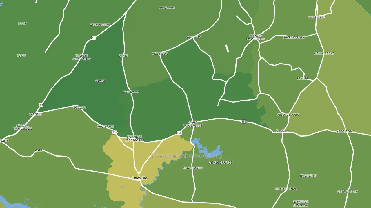
About 76% of adults in Gates County typically vote, above the U.S. average of about 62%. Among adults in Gates County, ~27% vote Democratic, ~49% Republican, and ~24% don't vote. The map below shows estimated turnout by block group.
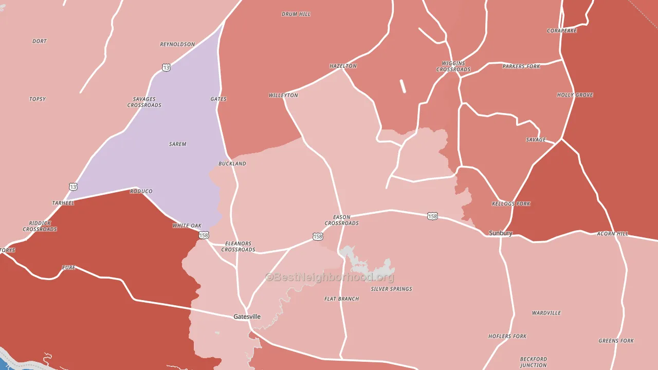
How Gates County compares
Among counties within 50 miles, Gates County leans more Republican than 22 of 26 neighbors.
Gates County runs about 26 points more Republican than North Carolina as a whole.
Politics vary noticeably by city within Gates County. The southwest side is the most Republican-leaning (R+53) and the northwest side is the least Republican-leaning (R+14), a spread of about 40 points.
Why Gates County leans the way it does
This analysis examined 14,881 data points per county to find what predicts political lean and turnout. The items below are a few correlations that stood out for Gates County, not a ranked or complete list of what matters most.
Rural areas vote Republican. About 5% of residents in Gates County live in densely developed areas, about 22 points below the North Carolina average of 27%. Low college attainment predicts Republican voting, and Gates County sits in the bottom quarter (about 11%, below 98% of counties).
Population density and Republican lean
Places with low population density tend to lean Republican; Gates County, NC sits in the bottom tenth nationally on this measure.
Why turnout in Gates County looks the way it does
Homeowners vote more often than renters. About 82% of households in Gates County own their home, about 8 points above the North Carolina average of 74%. Learn more about the findings and methodology on the political spectrum map.
Nearby Counties
- Hertford County, NC D+25
- Franklin City, VA D+32
- Suffolk City, VA D+20
- Chowan County, NC R+12
- Perquimans County, NC R+34
- Southampton County, VA R+22
- Pasquotank County, NC Even
- Camden County, NC R+48
- Bertie County, NC D+19
- Chesapeake City, VA D+9
Counties with Similar Populations
- Carbon County, MT R+38
- Washington County, ID R+57
- Cumberland County, IL R+60
- Leslie County, KY R+76
- Crawford County, IN R+52
- Bradley County, AR R+30
- Custer County, NE R+68
- Walsh County, ND R+46
- Mitchell County, IA R+36
- Bollinger County, MO R+70
Sources and methodology
Precinct-level voting records used to fit the model come from North Carolina State Board of Elections, distributed by the Voting and Election Science Team. Demographic inputs come from the U.S. Census Bureau (ACS 5-year estimates and the 2020 Decennial Census). Health and environmental inputs come from the CDC (PLACES and the Environmental Justice Index). Land cover comes from the USGS and EPA. Election-day and lead-up weather come from PRISM 4km daily grids and the NOAA Global Historical Climatology Network. Mail-voting and election-administration patterns come from the MIT Election Lab's Survey of the Performance of American Elections. Block-group crime detail comes from CrimeGrade. Internet data and modeling support provided by ISPreports.org.
Modeling and analysis by the BestNeighborhood data science team. Full methodology and findings: political spectrum map.
Methodology reviewed by the BestNeighborhood data team. Last updated May 2026.