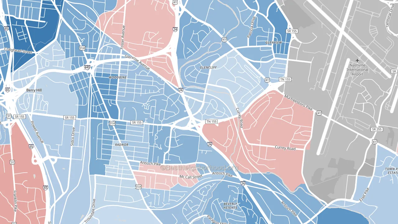
Glencliff leans Democratic by roughly 20 points: about 60% of voters vote Democratic and 40% Republican.
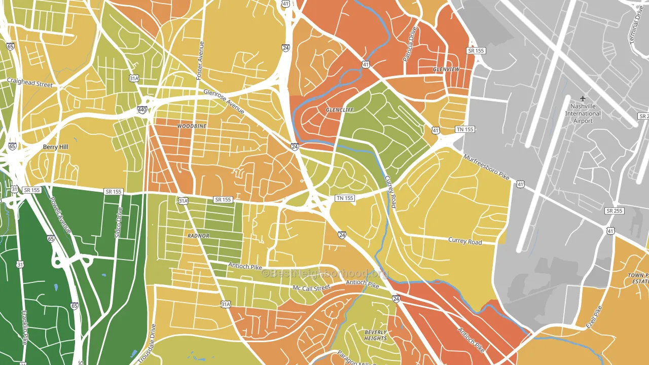
About 42% of adults in Glencliff typically vote, below the U.S. average of about 62%. Among adults in Glencliff, ~25% vote Democratic, ~17% Republican, and ~58% don't vote. The map below shows estimated turnout by block group.
How Glencliff compares
Among neighborhoods within 5 miles, Glencliff leans more Democratic than 3 of 14 neighbors.
Glencliff runs about 50 points more Democratic than Tennessee as a whole. Tennessee leans Republican overall, while Glencliff is one of the few Democratic-leaning pockets.
Politics vary noticeably by block within Glencliff. The north side is the most Democratic-leaning (D+31) and the east side is the least Democratic-leaning (D+2), a spread of about 29 points.
Why Glencliff leans the way it does
This analysis examined 14,881 data points per neighborhood to find what predicts political lean and turnout. The items below are a few correlations that stood out for Glencliff, not a ranked or complete list of what matters most.
Glencliff votes against the grain of Tennessee. Tennessee leans Republican overall, while Glencliff runs about 50 points more Democratic. A high never-married share predicts Democratic voting, and about 48% of adults in Glencliff have never been married, above 79% of neighborhoods.
High-school completion, uninsured rate, and voter turnout
Places that combine low high-school-completion share and a high uninsured rate tend to turn out at a lower rate, as Glencliff, Nashville, TN does.
Why turnout in Glencliff looks the way it does
Areas with limited routine healthcare access turn out at lower rates. Glencliff is in the bottom quarter nationally for routine-care measures such as insurance coverage, preventive screenings, and dental visits. The uninsured rate here is about 20%, about 8 points above the Tennessee average of 12%. Renters vote less often than owners, and about 63% of households in Glencliff rent, about 38 points above the U.S. average of 25%. Learn more about the findings and methodology on the political spectrum map.
Nearby Neighborhoods
- Woodbine, Nashville, TN D+26
- Southside, Nashville, TN D+74
- Melrose, Nashville, TN D+41
- Crieve Hall, Nashville, TN D+7
- Merry Oaks, Nashville, TN D+5
- Edgehill, Nashville, TN D+64
- McMurray-Huntingdon, Nashville, TN D+21
- Bellmont Hillsboro, Nashville, TN D+51
- Historic Edgefield, Nashville, TN D+60
- Lockeland Springs, Nashville, TN D+54
Neighborhoods with Similar Populations
- Montopolis, Austin, TX D+54
- South Side, Mount Vernon, NY D+75
- Maplewood, Fall River, MA R+6
- Pioneer Park, Las Vegas, NV D+16
- Carrick, Pittsburgh, PA D+18
- Winter Hill, Somerville, MA D+65
- Windsor Park, Chicago, IL D+81
- Columbus Park, Worcester, MA D+29
- North Broadway, Newark, NJ D+32
- Hillsdale, San Mateo, CA D+50
Sources and methodology
Precinct-level voting records used to fit the model come from Tennessee Secretary of State, Division of Elections, distributed by the Voting and Election Science Team. Demographic inputs come from the U.S. Census Bureau (ACS 5-year estimates and the 2020 Decennial Census). Health and environmental inputs come from the CDC (PLACES and the Environmental Justice Index). Land cover comes from the USGS and EPA. Election-day and lead-up weather come from PRISM 4km daily grids and the NOAA Global Historical Climatology Network. Mail-voting and election-administration patterns come from the MIT Election Lab's Survey of the Performance of American Elections. Block-group crime detail comes from CrimeGrade. Internet data and modeling support provided by ISPreports.org.
Modeling and analysis by the BestNeighborhood data science team. Full methodology and findings: political spectrum map.
Methodology reviewed by the BestNeighborhood data team. Last updated May 2026.